مرحبًا بك في قسم أعلى الخطوط — حيث تلتقي الشعبية بالجودة. هذه هي الخطوط الأكثر تنزيلًا واستخدامًا هذا العام من قبل مجتمعنا. إذا كنت بحاجة إلى اختيار موثوق للشعارات أو الويب أو وسائل التواصل، فابدأ من هنا.
يتميز كل خط رائج بتوازن جيد وقابلية قراءة وتعدد استخدامات. ستجد سان سيريف حديثة، وسكريبتات أنيقة، وسيريف كلاسيكية، وخطوط عرض minimal مختارة بعناية.
-
( Copyright (c) 2015, Impallari Type (www.impallari.com) )
A modern, italicized typeface with clean lines and excellent readability.
 تنزيل 172 التنزيلات@WebFont
 -
( Fonts by wep - Wahyu Eka Prasetya - Personal-use only. For commercial use please contact owner. )
A bold, playful handwritten font with dynamic and energetic characters.
![Basic Drawing تنزيل الخطوط]() تنزيل 172 التنزيلات@WebFont
تنزيل 172 التنزيلات@WebFont -
( Fonts by Manfred Klein. Free for private and charity use. Free for commercial with donation to organizations )
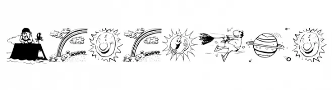
Wedding-themed pictorial dingbat font with detailed illustrations.
![WeddingPicts تنزيل الخطوط]() تنزيل 172 التنزيلات@WebFont
تنزيل 172 التنزيلات@WebFont -
( Fonts by www.typodermicfonts.com - Ray Larabie )
A playful font composed of heart-shaped patterns, perfect for romantic and whimsical designs.
![HeartSweetHeart-Regular تنزيل الخطوط]() تنزيل 172 التنزيلات@WebFont
تنزيل 172 التنزيلات@WebFont -
( Fonts by Suzuran San )
A dynamic, elegant cursive script with fluid, connected characters.
![Metal Pen تنزيل الخطوط]() تنزيل 172 التنزيلات@WebFont
تنزيل 172 التنزيلات@WebFont -
-
( Fonts by Daniel Midgley )
A modern, sans-serif font with rounded edges and consistent stroke width.
![Banksia-Regular تنزيل الخطوط]() تنزيل 172 التنزيلات@WebFont
تنزيل 172 التنزيلات@WebFont -
( Font by Sven Stuber - www.superlooper.de )
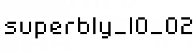
A pixelated, blocky font with a retro digital style.
![superbly_10_02 تنزيل الخطوط]() تنزيل 172 التنزيلات@WebFont
تنزيل 172 التنزيلات@WebFont -
( Daddi Daryawan )
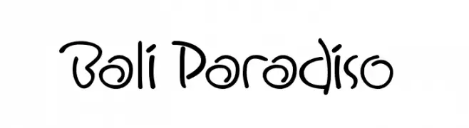
A playful handwritten font with smooth curves and a casual style.
![Bali Paradiso تنزيل الخطوط]() تنزيل 172 التنزيلات@WebFont
تنزيل 172 التنزيلات@WebFont -
( Fonts by Manfred Klein - manfred-klein.ina-mar.com )
Hand-drawn weather and nature-themed dingbat illustrations.
![MeteoSat تنزيل الخطوط]() تنزيل 172 التنزيلات@WebFont
تنزيل 172 التنزيلات@WebFont -
( Fonts by www.legacyofdefeat.com )
A bold, geometric font with sharp, angular characters for impactful designs.
![HMayhemBlack-Regular تنزيل الخطوط]() تنزيل 172 التنزيلات@WebFont
تنزيل 172 التنزيلات@WebFont


ما هي أبرز الخطوط الآن؟
تحظى Libre Franklin Italic, Basic Drawing, WeddingPicts, HeartSweetHeart-Regular and Metal Pen بشعبية لخطوطها النظيفة وتطبيقاتها الواسعة — من الهوية البصرية إلى الصفحات المقصودة والملصقات.
أي الخطوط تُستخدم كثيرًا في الشعارات؟
تُعد السان سيريف الهندسية (مثل Poppins وعائلات على نمط Gotham) خيارًا شائعًا لعلامات نظيفة قابلة للتوسع. ولإضفاء طابع ودي، تبقى السكريبت واليدوية خيارًا كلاسيكيًا. اجمع عنوانًا بارزًا مع خط نصي محايد لتحقيق التوازن والتميّز.
كم مرة يتم تحديث قائمة أعلى الخطوط؟
نحدّثها بانتظام استنادًا إلى التنزيلات والنشاط الفعلي. عُد إليها كثيرًا لاكتشاف النجوم الصاعدة مبكرًا.
💡 نصيحة: أضف هذه الصفحة إلى العلامات — تتغير الاتجاهات بسرعة وقد تُلهم خطوط اليوم الرائجة إعادة العلامة غدًا.