مرحبًا بك في قسم أعلى الخطوط — حيث تلتقي الشعبية بالجودة. هذه هي الخطوط الأكثر تنزيلًا واستخدامًا هذا العام من قبل مجتمعنا. إذا كنت بحاجة إلى اختيار موثوق للشعارات أو الويب أو وسائل التواصل، فابدأ من هنا.
يتميز كل خط رائج بتوازن جيد وقابلية قراءة وتعدد استخدامات. ستجد سان سيريف حديثة، وسكريبتات أنيقة، وسيريف كلاسيكية، وخطوط عرض minimal مختارة بعناية.
-
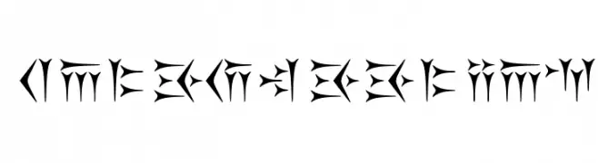
( Fonts by Keyvan Mahmoudi )
An angular, mystical font with sharp edges and high contrast.
 تنزيل 173 التنزيلات@WebFont
 -
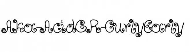
( Fonts by www.aka-acid.com )
A whimsical, curly font with playful loops and swirls.
![Aka-AcidGR-CurlyEarly تنزيل الخطوط]() تنزيل 173 التنزيلات@WebFont
تنزيل 173 التنزيلات@WebFont -
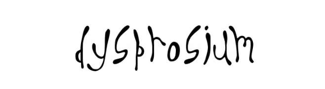
( Fonts by Divide By Zero! - fonts.tom7.com )
A playful, hand-drawn font with an organic, whimsical style.
![Dysprosium تنزيل الخطوط]() تنزيل 173 التنزيلات@WebFont
تنزيل 173 التنزيلات@WebFont -
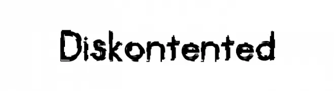
( Fonts by Kevin Richey - Personal-use only. For commercial use please contact owner. )
A bold, distressed font with a grunge, hand-drawn style.
![Diskontented تنزيل الخطوط]() تنزيل 173 التنزيلات@WebFont
تنزيل 173 التنزيلات@WebFont -
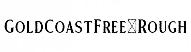
( Fonts by Craft Supply Co - Personal-use only. For commercial use please contact owner. )
A rough, textured font with a vintage, hand-crafted appearance.
![GoldCoastFree-Rough تنزيل الخطوط]() تنزيل 173 التنزيلات@WebFont
تنزيل 173 التنزيلات@WebFont -
-
![Expresiva تنزيل الخطوط]() تنزيل 173 التنزيلات@WebFont
تنزيل 173 التنزيلات@WebFont -
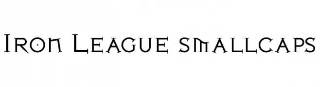
( Fonts by Levi Halmos )
A bold, angular serif font with decorative elements, ideal for dramatic and impactful designs.
![Iron League smallcaps تنزيل الخطوط]() تنزيل 173 التنزيلات@WebFont
تنزيل 173 التنزيلات@WebFont -
( Fonts by Letterhanna Type Foundry - Rinaldo Hasibuan - Personal-use only. For commercial use please contact owner. )
A bold, geometric font with intricate patterns and a maze-like appearance.
![Kufication تنزيل الخطوط]() تنزيل 173 التنزيلات@WebFont
تنزيل 173 التنزيلات@WebFont -
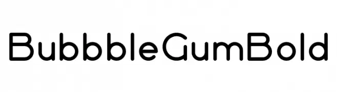
( Fonts by VPcreativeshop - Vladimir Fedotov - Personal-use only. For commercial use please contact owner. )
A playful, rounded font with smooth curves and uniform stroke width.
![Bubbble Gum Bold تنزيل الخطوط]() تنزيل 173 التنزيلات@WebFont
تنزيل 173 التنزيلات@WebFont -
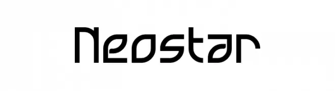
( Fonts by a Neale Davidson - www.pixelsagas.com. Personal-use only. For commercial use please contact owner. )
A futuristic, geometric font with bold, angular shapes and clean lines.
![Neostar تنزيل الخطوط]() تنزيل 173 التنزيلات@WebFont
تنزيل 173 التنزيلات@WebFont


ما هي أبرز الخطوط الآن؟
تحظى Kakoulookiam, Aka-AcidGR-CurlyEarly, Dysprosium, Diskontented and GoldCoastFree-Rough بشعبية لخطوطها النظيفة وتطبيقاتها الواسعة — من الهوية البصرية إلى الصفحات المقصودة والملصقات.
أي الخطوط تُستخدم كثيرًا في الشعارات؟
تُعد السان سيريف الهندسية (مثل Poppins وعائلات على نمط Gotham) خيارًا شائعًا لعلامات نظيفة قابلة للتوسع. ولإضفاء طابع ودي، تبقى السكريبت واليدوية خيارًا كلاسيكيًا. اجمع عنوانًا بارزًا مع خط نصي محايد لتحقيق التوازن والتميّز.
كم مرة يتم تحديث قائمة أعلى الخطوط؟
نحدّثها بانتظام استنادًا إلى التنزيلات والنشاط الفعلي. عُد إليها كثيرًا لاكتشاف النجوم الصاعدة مبكرًا.
💡 نصيحة: أضف هذه الصفحة إلى العلامات — تتغير الاتجاهات بسرعة وقد تُلهم خطوط اليوم الرائجة إعادة العلامة غدًا.