مرحبًا بك في قسم أعلى الخطوط — حيث تلتقي الشعبية بالجودة. هذه هي الخطوط الأكثر تنزيلًا واستخدامًا هذا العام من قبل مجتمعنا. إذا كنت بحاجة إلى اختيار موثوق للشعارات أو الويب أو وسائل التواصل، فابدأ من هنا.
يتميز كل خط رائج بتوازن جيد وقابلية قراءة وتعدد استخدامات. ستجد سان سيريف حديثة، وسكريبتات أنيقة، وسيريف كلاسيكية، وخطوط عرض minimal مختارة بعناية.
-
( Fonts by Apostrophic Lab )
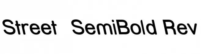
A modern, semi-bold sans-serif font with rounded characters and excellent readability.
 تنزيل 173 التنزيلات@WebFont
 -
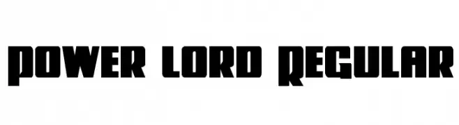
( Fonts by Iconian Fonts - Daniel Zadorozny )
A bold, blocky font with a modern and powerful design.
![Power Lord Regular تنزيل الخطوط]() تنزيل 173 التنزيلات@WebFont
تنزيل 173 التنزيلات@WebFont -
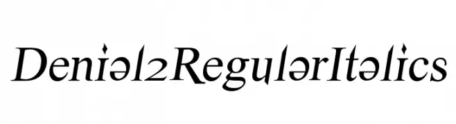
![Denial2RegularItalics تنزيل الخطوط]() تنزيل 173 التنزيلات@WebFont
تنزيل 173 التنزيلات@WebFont -
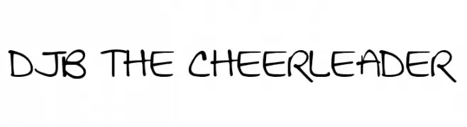
( Fonts by Darcy Baldwin - darcybaldwin.com. Free for personal use only )
A playful handwritten font with a casual and friendly style.
![DJB THE CHEERLEADER تنزيل الخطوط]() تنزيل 173 التنزيلات@WebFont
تنزيل 173 التنزيلات@WebFont -
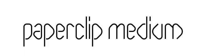
![Paperclip Medium تنزيل الخطوط]() تنزيل 173 التنزيلات@WebFont
تنزيل 173 التنزيلات@WebFont -
-
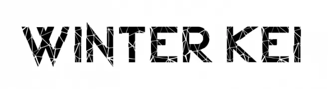
( Fonts by arukidz.fl )
A bold, geometric font with a modern, decorative style.
![Winter Kei تنزيل الخطوط]() تنزيل 173 التنزيلات@WebFont
تنزيل 173 التنزيلات@WebFont -
( Fonts by AV Type - Aldo Vesely - Personal-use only. For commercial use please contact owner. )
An elegant, flowing script font with a handwritten appearance.
![Delicious تنزيل الخطوط]() تنزيل 173 التنزيلات@WebFont
تنزيل 173 التنزيلات@WebFont -
( Fonts by Kong Font - fontkong.com - Personal-use only. For commercial use please contact owner. )
A modern, geometric sans-serif font with clean lines and uniform strokes.
![Sulcant تنزيل الخطوط]() تنزيل 173 التنزيلات@WebFont
تنزيل 173 التنزيلات@WebFont -
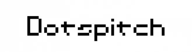
![Dotspitch تنزيل الخطوط]() تنزيل 173 التنزيلات@WebFont
تنزيل 173 التنزيلات@WebFont -
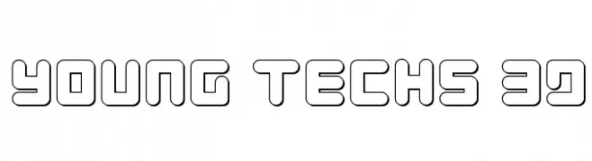
( Fonts by Daniel Zadorozny - www.iconian.com - Free for personal use )
A futuristic, tech-inspired font with bold, geometric outlines and a 3D effect.
![Young Techs 3D تنزيل الخطوط]() تنزيل 173 التنزيلات@WebFont
تنزيل 173 التنزيلات@WebFont


ما هي أبرز الخطوط الآن؟
تحظى Street SemiBold Rev, Power Lord Regular, Denial2RegularItalics, DJB THE CHEERLEADER and Paperclip Medium بشعبية لخطوطها النظيفة وتطبيقاتها الواسعة — من الهوية البصرية إلى الصفحات المقصودة والملصقات.
أي الخطوط تُستخدم كثيرًا في الشعارات؟
تُعد السان سيريف الهندسية (مثل Poppins وعائلات على نمط Gotham) خيارًا شائعًا لعلامات نظيفة قابلة للتوسع. ولإضفاء طابع ودي، تبقى السكريبت واليدوية خيارًا كلاسيكيًا. اجمع عنوانًا بارزًا مع خط نصي محايد لتحقيق التوازن والتميّز.
كم مرة يتم تحديث قائمة أعلى الخطوط؟
نحدّثها بانتظام استنادًا إلى التنزيلات والنشاط الفعلي. عُد إليها كثيرًا لاكتشاف النجوم الصاعدة مبكرًا.
💡 نصيحة: أضف هذه الصفحة إلى العلامات — تتغير الاتجاهات بسرعة وقد تُلهم خطوط اليوم الرائجة إعادة العلامة غدًا.