مرحبًا بك في قسم أعلى الخطوط — حيث تلتقي الشعبية بالجودة. هذه هي الخطوط الأكثر تنزيلًا واستخدامًا هذا العام من قبل مجتمعنا. إذا كنت بحاجة إلى اختيار موثوق للشعارات أو الويب أو وسائل التواصل، فابدأ من هنا.
يتميز كل خط رائج بتوازن جيد وقابلية قراءة وتعدد استخدامات. ستجد سان سيريف حديثة، وسكريبتات أنيقة، وسيريف كلاسيكية، وخطوط عرض minimal مختارة بعناية.
-
( Fonts by Mans Greback - Personal-use only. For commercial use please contact owner. )
A bold, italic font with a dynamic and modern style.
 تنزيل 174 التنزيلات@WebFont
 -
( Fonts by www.houseoflime.com )
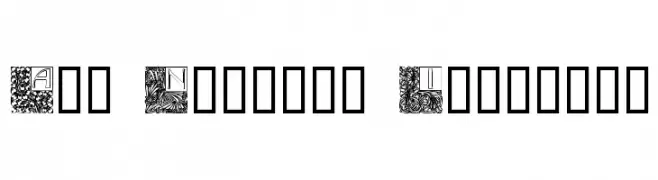
An ornamental Art Nouveau-inspired font with intricate floral patterns.
![Art Nouveau Initials تنزيل الخطوط]() تنزيل 174 التنزيلات@WebFont
تنزيل 174 التنزيلات@WebFont -
( Fonts by Michael Muranaka - muraknockout.com - Personal-use only. For commercial use please contact owner. )
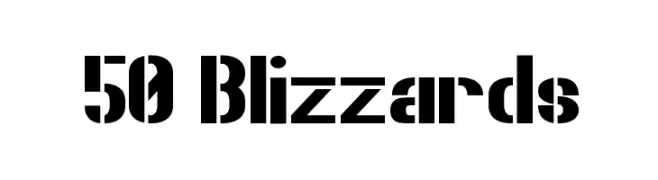
A bold, modern font with a stencil-like, industrial design.
![50 Blizzards تنزيل الخطوط]() تنزيل 174 التنزيلات@WebFont
تنزيل 174 التنزيلات@WebFont -
( Sarawut Anurak )
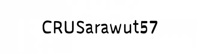
A modern sans-serif font with clean lines and uniform stroke width.
![CRU Sarawut 57 تنزيل الخطوط]() تنزيل 174 التنزيلات@WebFont
تنزيل 174 التنزيلات@WebFont -
( Fonts by Daniel Zadorozny - www.iconian.com - Free for personal use )
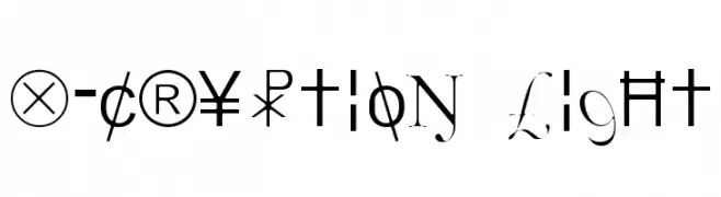
A decorative and eclectic font with unique embellishments and a mix of modern and vintage styles.
![X-Cryption Light تنزيل الخطوط]() تنزيل 174 التنزيلات@WebFont
تنزيل 174 التنزيلات@WebFont -
-
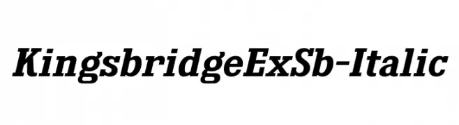
( Fonts by Typodermic Fonts )
A bold, italic serif font with strong character definition and elegant serifs.
![KingsbridgeExSb-Italic تنزيل الخطوط]() تنزيل 174 التنزيلات@WebFont
تنزيل 174 التنزيلات@WebFont -
( Fonts by Scratchones )
A playful, hand-drawn font with bold, rounded characters and a whimsical texture.
![Starlamp تنزيل الخطوط]() تنزيل 174 التنزيلات@WebFont
تنزيل 174 التنزيلات@WebFont -
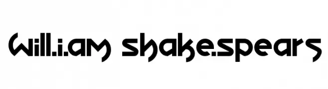
( Fonts by Zhalgas Kassymkulov - Personal-use only. For commercial use please contact owner. )
A bold, geometric font with angular shapes and a futuristic aesthetic.
![Will.i.am Shake.Spears تنزيل الخطوط]() تنزيل 174 التنزيلات@WebFont
تنزيل 174 التنزيلات@WebFont -
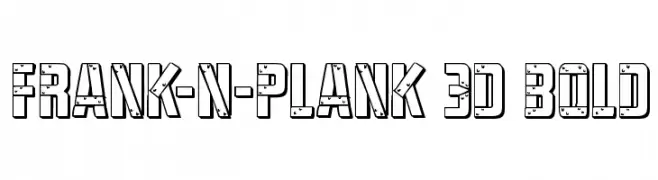
( Fonts by Daniel Zadorozny - www.iconian.com )
A bold, 3D decorative font with geometric shapes and textured details.
![Frank-n-Plank 3D Bold تنزيل الخطوط]() تنزيل 174 التنزيلات@WebFont
تنزيل 174 التنزيلات@WebFont -
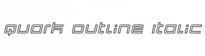
( Fonts by dustBUST - Andreas Nylin )
A modern, geometric outline font with an italic slant, ideal for futuristic designs.
![Quark Outline Italic تنزيل الخطوط]() تنزيل 174 التنزيلات@WebFont
تنزيل 174 التنزيلات@WebFont

ما هي أبرز الخطوط الآن؟
تحظى Famiar PERSONAL USE ONLY Black Italic, Art Nouveau Initials, 50 Blizzards, CRU Sarawut 57 and X-Cryption Light بشعبية لخطوطها النظيفة وتطبيقاتها الواسعة — من الهوية البصرية إلى الصفحات المقصودة والملصقات.
أي الخطوط تُستخدم كثيرًا في الشعارات؟
تُعد السان سيريف الهندسية (مثل Poppins وعائلات على نمط Gotham) خيارًا شائعًا لعلامات نظيفة قابلة للتوسع. ولإضفاء طابع ودي، تبقى السكريبت واليدوية خيارًا كلاسيكيًا. اجمع عنوانًا بارزًا مع خط نصي محايد لتحقيق التوازن والتميّز.
كم مرة يتم تحديث قائمة أعلى الخطوط؟
نحدّثها بانتظام استنادًا إلى التنزيلات والنشاط الفعلي. عُد إليها كثيرًا لاكتشاف النجوم الصاعدة مبكرًا.
💡 نصيحة: أضف هذه الصفحة إلى العلامات — تتغير الاتجاهات بسرعة وقد تُلهم خطوط اليوم الرائجة إعادة العلامة غدًا.