مرحبًا بك في قسم أعلى الخطوط — حيث تلتقي الشعبية بالجودة. هذه هي الخطوط الأكثر تنزيلًا واستخدامًا هذا العام من قبل مجتمعنا. إذا كنت بحاجة إلى اختيار موثوق للشعارات أو الويب أو وسائل التواصل، فابدأ من هنا.
يتميز كل خط رائج بتوازن جيد وقابلية قراءة وتعدد استخدامات. ستجد سان سيريف حديثة، وسكريبتات أنيقة، وسيريف كلاسيكية، وخطوط عرض minimal مختارة بعناية.
-
 تنزيل 178 التنزيلات@WebFont
 -
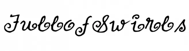
![FullofSwirls تنزيل الخطوط]() تنزيل 178 التنزيلات@WebFont
تنزيل 178 التنزيلات@WebFont -
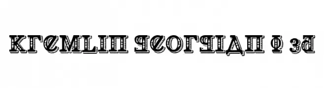
![Kremlin Georgian I 3D تنزيل الخطوط]() تنزيل 178 التنزيلات@WebFont
تنزيل 178 التنزيلات@WebFont -
( Fonts by www.houseoflime.com )
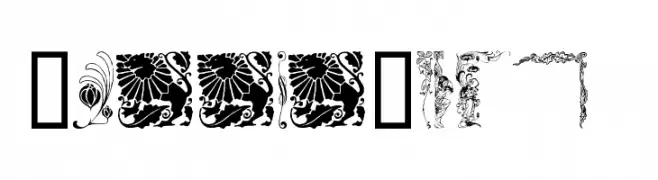
An ornate and decorative font with intricate floral and mythical designs.
![MirrorImage تنزيل الخطوط]() تنزيل 178 التنزيلات@WebFont
تنزيل 178 التنزيلات@WebFont -
( Fonts by Daniel Zadorozny - www.iconian.com - Free for personal use )
A bold, expanded font with a modern, dynamic style.
![Chardin Doihle Expanded تنزيل الخطوط]() تنزيل 178 التنزيلات@WebFont
تنزيل 178 التنزيلات@WebFont -
-
( Southype - Rodrigo Gonzalez - www.southype.com )
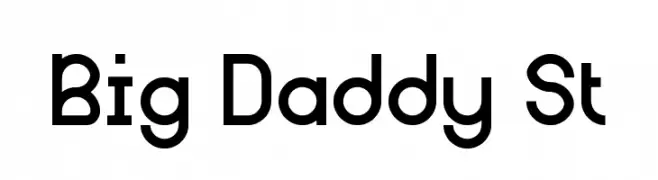
A bold, geometric font with a modern and clean design.
![Big Daddy St تنزيل الخطوط]() تنزيل 178 التنزيلات@WebFont
تنزيل 178 التنزيلات@WebFont -
( Fonts by creatype designer )
Playful, rounded sans-serif font.
![Minimalize تنزيل الخطوط]() تنزيل 178 التنزيلات@WebFont
تنزيل 178 التنزيلات@WebFont -
( Fonts by Jprint Studio )
A whimsical, decorative font with curly, artistic flourishes.
![Sweet Gracia Demo تنزيل الخطوط]() تنزيل 178 التنزيلات@WebFont
تنزيل 178 التنزيلات@WebFont -
( Fonts by Iconian Fonts )
A bold, geometric font with a futuristic and industrial design.
![Cyborg Rooster Expanded تنزيل الخطوط]() تنزيل 178 التنزيلات@WebFont
تنزيل 178 التنزيلات@WebFont -
( www.decloedtkristof.be )
A bold, playful font with a hand-drawn, whimsical style.
![Pleej تنزيل الخطوط]() تنزيل 178 التنزيلات@WebFont
تنزيل 178 التنزيلات@WebFont


ما هي أبرز الخطوط الآن؟
تحظى Kinderfeld, FullofSwirls, Kremlin Georgian I 3D, MirrorImage and Chardin Doihle Expanded بشعبية لخطوطها النظيفة وتطبيقاتها الواسعة — من الهوية البصرية إلى الصفحات المقصودة والملصقات.
أي الخطوط تُستخدم كثيرًا في الشعارات؟
تُعد السان سيريف الهندسية (مثل Poppins وعائلات على نمط Gotham) خيارًا شائعًا لعلامات نظيفة قابلة للتوسع. ولإضفاء طابع ودي، تبقى السكريبت واليدوية خيارًا كلاسيكيًا. اجمع عنوانًا بارزًا مع خط نصي محايد لتحقيق التوازن والتميّز.
كم مرة يتم تحديث قائمة أعلى الخطوط؟
نحدّثها بانتظام استنادًا إلى التنزيلات والنشاط الفعلي. عُد إليها كثيرًا لاكتشاف النجوم الصاعدة مبكرًا.
💡 نصيحة: أضف هذه الصفحة إلى العلامات — تتغير الاتجاهات بسرعة وقد تُلهم خطوط اليوم الرائجة إعادة العلامة غدًا.