مرحبًا بك في قسم أعلى الخطوط — حيث تلتقي الشعبية بالجودة. هذه هي الخطوط الأكثر تنزيلًا واستخدامًا هذا العام من قبل مجتمعنا. إذا كنت بحاجة إلى اختيار موثوق للشعارات أو الويب أو وسائل التواصل، فابدأ من هنا.
يتميز كل خط رائج بتوازن جيد وقابلية قراءة وتعدد استخدامات. ستجد سان سيريف حديثة، وسكريبتات أنيقة، وسيريف كلاسيكية، وخطوط عرض minimal مختارة بعناية.
-
 تنزيل 180 التنزيلات@WebFont
 -
( Fonts by Giga Typography - GigaType - www.deviantart.com/wolves-fonts - Personal-use only. For commercial use please contact owner. )
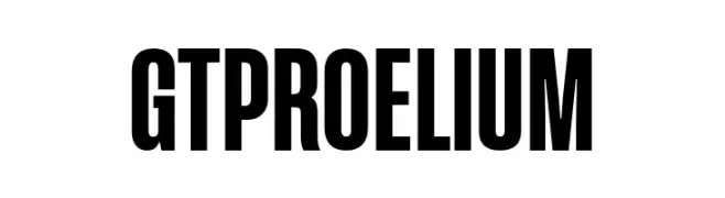
Bold, condensed sans-serif font for impactful designs.
![GT Proelium تنزيل الخطوط]() تنزيل 180 التنزيلات@WebFont
تنزيل 180 التنزيلات@WebFont -
( Fonts by mlkwsn - www.mlkwsn.com - Personal-use only. For commercial use please contact owner. )
A bold, condensed font with tall, narrow letterforms and minimal contrast.
![GULDENZ تنزيل الخطوط]() تنزيل 180 التنزيلات@WebFont
تنزيل 180 التنزيلات@WebFont -
( Maulana Creative - Gilang Maulana - maulanacreative.net/ )
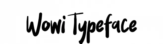
A bold, expressive handwritten font with dynamic strokes and a playful style.
![Wowi Typeface تنزيل الخطوط]() تنزيل 180 التنزيلات@WebFont
تنزيل 180 التنزيلات@WebFont -
( Fonts by Zetafonts - Personal-use only. For commercial use please contact owner. )
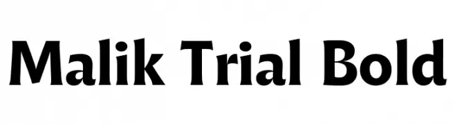
A bold serif font with strong, angular serifs and a dynamic slant.
![Malik Trial Bold تنزيل الخطوط]() تنزيل 180 التنزيلات@WebFont
تنزيل 180 التنزيلات@WebFont -
-
( Fonts by Apostrophic Lab )
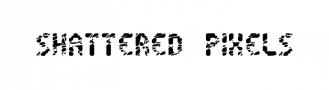
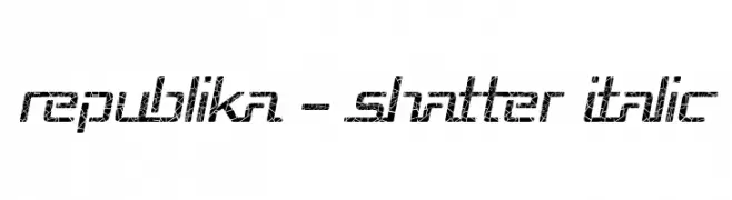
A dynamic, shattered italic font with a bold, modern aesthetic.
![Republika - Shatter Italic تنزيل الخطوط]() تنزيل 180 التنزيلات@WebFont
تنزيل 180 التنزيلات@WebFont -
( Fonts by Daniel Zadorozny - www.iconian.com )
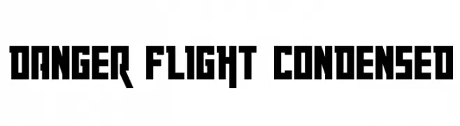
A bold, condensed font with a geometric and modern style.
![Danger Flight Condensed تنزيل الخطوط]() تنزيل 180 التنزيلات@WebFont
تنزيل 180 التنزيلات@WebFont -
( Fonts by Woodcutter Manero - http://www.woodcutter.es - Personal-use only. For commercial use please contact owner. )
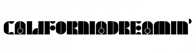
A bold, geometric font with circular and semi-circular elements.
![California Dreamin' تنزيل الخطوط]() تنزيل 180 التنزيلات@WebFont
تنزيل 180 التنزيلات@WebFont -
( Fonts by Iconian Fonts )
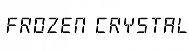
A digital, segmented font inspired by LED displays, offering a modern and technical look.
![Frozen Crystal تنزيل الخطوط]() تنزيل 180 التنزيلات@WebFont
تنزيل 180 التنزيلات@WebFont -
( https://www.behance.net/poemhaiku )
A bold, brushstroke font with a wild, untamed aesthetic.
![Into the Wild Demo Version تنزيل الخطوط]() تنزيل 180 التنزيلات@WebFont
تنزيل 180 التنزيلات@WebFont

ما هي أبرز الخطوط الآن؟
تحظى Shattered Pixels, GT Proelium, GULDENZ, Wowi Typeface and Malik Trial Bold بشعبية لخطوطها النظيفة وتطبيقاتها الواسعة — من الهوية البصرية إلى الصفحات المقصودة والملصقات.
أي الخطوط تُستخدم كثيرًا في الشعارات؟
تُعد السان سيريف الهندسية (مثل Poppins وعائلات على نمط Gotham) خيارًا شائعًا لعلامات نظيفة قابلة للتوسع. ولإضفاء طابع ودي، تبقى السكريبت واليدوية خيارًا كلاسيكيًا. اجمع عنوانًا بارزًا مع خط نصي محايد لتحقيق التوازن والتميّز.
كم مرة يتم تحديث قائمة أعلى الخطوط؟
نحدّثها بانتظام استنادًا إلى التنزيلات والنشاط الفعلي. عُد إليها كثيرًا لاكتشاف النجوم الصاعدة مبكرًا.
💡 نصيحة: أضف هذه الصفحة إلى العلامات — تتغير الاتجاهات بسرعة وقد تُلهم خطوط اليوم الرائجة إعادة العلامة غدًا.