مرحبًا بك في قسم أعلى الخطوط — حيث تلتقي الشعبية بالجودة. هذه هي الخطوط الأكثر تنزيلًا واستخدامًا هذا العام من قبل مجتمعنا. إذا كنت بحاجة إلى اختيار موثوق للشعارات أو الويب أو وسائل التواصل، فابدأ من هنا.
يتميز كل خط رائج بتوازن جيد وقابلية قراءة وتعدد استخدامات. ستجد سان سيريف حديثة، وسكريبتات أنيقة، وسيريف كلاسيكية، وخطوط عرض minimal مختارة بعناية.
-
 تنزيل 182 التنزيلات@WebFont
 -
( Chequered Ink - chequered.ink/ )
A bold and robust font with thick strokes and a strong presence.
![Jemboree تنزيل الخطوط]() تنزيل 182 التنزيلات@WebFont
تنزيل 182 التنزيلات@WebFont -
( Fonts by Vladimir Nikolic )
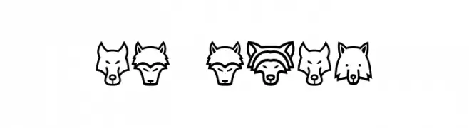
Animal head icons form each character in a playful, outlined style.
![Wolves Regular تنزيل الخطوط]() تنزيل 182 التنزيلات@WebFont
تنزيل 182 التنزيلات@WebFont -
( Fonts by Apostrophic Lab )
Bold, italicized font with a college-inspired, outlined style.
![Republika IV Exp - College Italic تنزيل الخطوط]() تنزيل 182 التنزيلات@WebFont
تنزيل 182 التنزيلات@WebFont -
![Minguarana تنزيل الخطوط]() تنزيل 182 التنزيلات@WebFont
تنزيل 182 التنزيلات@WebFont -
-
( Fonts by Nico Rützel - Personal-use only. For commercial use please contact owner. )
A modern, rounded sans-serif font with uniform strokes and high legibility.
![Boleon تنزيل الخطوط]() تنزيل 182 التنزيلات@WebFont
تنزيل 182 التنزيلات@WebFont -
( Angst )
A whimsical, playful font with rounded, elongated letterforms.
![Magic Mush تنزيل الخطوط]() تنزيل 182 التنزيلات
تنزيل 182 التنزيلات -
( Letterhend Studio - Hendry Juanda - creativemarket.com/letterhend )
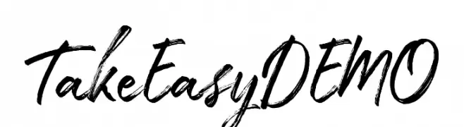
A bold, expressive handwritten font with dynamic strokes and a brush-like texture.
![TakeEasyDEMO تنزيل الخطوط]() تنزيل 182 التنزيلات@WebFont
تنزيل 182 التنزيلات@WebFont -
( Fonts by Syaf Rizal - www.creativefabrica.com/ref/53/ - Personal-use only. For commercial use please contact owner. )
A bold, brush-like font with an expressive, hand-painted style.
![Fontix تنزيل الخطوط]() تنزيل 182 التنزيلات@WebFont
تنزيل 182 التنزيلات@WebFont -
( Noto is a trademark of Google Inc. Noto fonts are open source. All Noto fonts are published under the SIL Open Font License, Version 1.1 )
A bold, modern font with thick strokes and excellent readability.
![Noto Sans Arabic ExtraBold تنزيل الخطوط]() تنزيل 182 التنزيلات@WebFont
تنزيل 182 التنزيلات@WebFont


ما هي أبرز الخطوط الآن؟
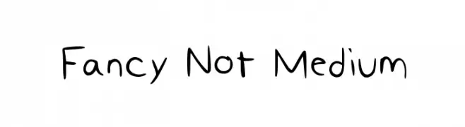
تحظى Fancy Not Medium, Jemboree, Wolves Regular, Republika IV Exp - College Italic and Minguarana بشعبية لخطوطها النظيفة وتطبيقاتها الواسعة — من الهوية البصرية إلى الصفحات المقصودة والملصقات.
أي الخطوط تُستخدم كثيرًا في الشعارات؟
تُعد السان سيريف الهندسية (مثل Poppins وعائلات على نمط Gotham) خيارًا شائعًا لعلامات نظيفة قابلة للتوسع. ولإضفاء طابع ودي، تبقى السكريبت واليدوية خيارًا كلاسيكيًا. اجمع عنوانًا بارزًا مع خط نصي محايد لتحقيق التوازن والتميّز.
كم مرة يتم تحديث قائمة أعلى الخطوط؟
نحدّثها بانتظام استنادًا إلى التنزيلات والنشاط الفعلي. عُد إليها كثيرًا لاكتشاف النجوم الصاعدة مبكرًا.
💡 نصيحة: أضف هذه الصفحة إلى العلامات — تتغير الاتجاهات بسرعة وقد تُلهم خطوط اليوم الرائجة إعادة العلامة غدًا.