مرحبًا بك في قسم أعلى الخطوط — حيث تلتقي الشعبية بالجودة. هذه هي الخطوط الأكثر تنزيلًا واستخدامًا هذا العام من قبل مجتمعنا. إذا كنت بحاجة إلى اختيار موثوق للشعارات أو الويب أو وسائل التواصل، فابدأ من هنا.
يتميز كل خط رائج بتوازن جيد وقابلية قراءة وتعدد استخدامات. ستجد سان سيريف حديثة، وسكريبتات أنيقة، وسيريف كلاسيكية، وخطوط عرض minimal مختارة بعناية.
-
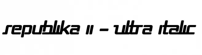
( Fonts by Apostrophic Lab )
A bold, italicized font with a futuristic and sporty design.
 تنزيل 183 التنزيلات@WebFont
 -
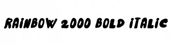
( Fonts by GGBotNet )
A bold, playful, and italicized font with rounded strokes and close spacing.
![Rainbow 2000 Bold Italic تنزيل الخطوط]() تنزيل 183 التنزيلات@WebFont
تنزيل 183 التنزيلات@WebFont -
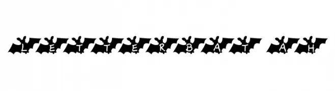
![LetterBat AH تنزيل الخطوط]() تنزيل 183 التنزيلات@WebFont
تنزيل 183 التنزيلات@WebFont -
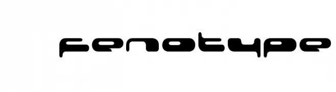
( Fonts by Fenotype - Personal-use only. For commercial use please contact owner. )
A futuristic, bold font with rounded, geometric letterforms and low contrast.
![08 02 03 Fenotype تنزيل الخطوط]() تنزيل 183 التنزيلات@WebFont
تنزيل 183 التنزيلات@WebFont -
( Fonts by Andi Moz )
A playful, whimsical font with tall, narrow letters and decorative loops.
![Seafood تنزيل الخطوط]() تنزيل 183 التنزيلات@WebFont
تنزيل 183 التنزيلات@WebFont -
-
خط بواسطة danny91194. For commercial use please contact the owner.
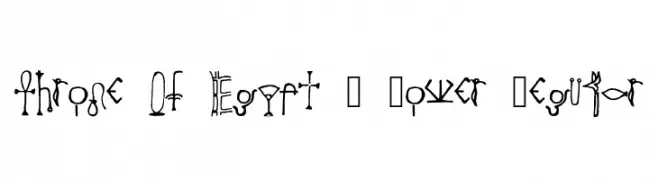
( July 16, 2004 – 2013 . Noger . Speed Stack )
An artistic font inspired by ancient Egyptian hieroglyphs, featuring intricate and bold designs.
![Throne Of Egypt _ Lower Regular تنزيل الخطوط]() تنزيل 183 التنزيلات@WebFont
تنزيل 183 التنزيلات@WebFont -
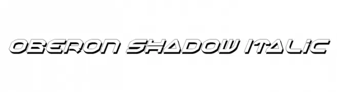
( Fonts by Daniel Zadorozny - www.iconian.com )
A bold, italicized font with a futuristic shadow effect.
![Oberon Shadow Italic تنزيل الخطوط]() تنزيل 183 التنزيلات@WebFont
تنزيل 183 التنزيلات@WebFont -
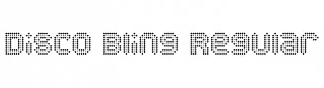
( Pixel Kitchen )
A decorative font composed of small dots, creating a retro and playful appearance.
![Disco Bling Regular تنزيل الخطوط]() تنزيل 183 التنزيلات@WebFont
تنزيل 183 التنزيلات@WebFont -
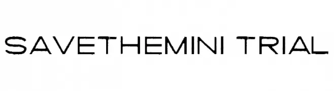
( Fonts by billyargel.blogspot.com - Billy Argel )
A modern, distressed font with a clean yet edgy appearance.
![SAVETHEMINI-TRIAL تنزيل الخطوط]() تنزيل 183 التنزيلات@WebFont
تنزيل 183 التنزيلات@WebFont -
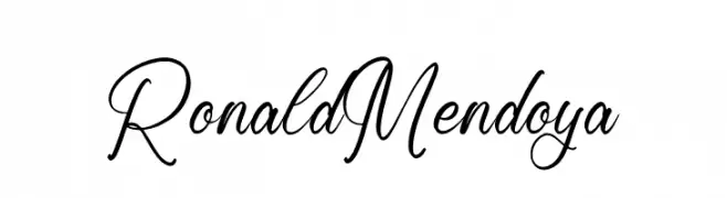
( Fonts by Letterena Studios )
An elegant, flowing script font with smooth, cursive lines and graceful curves.
![Ronald Mendoya تنزيل الخطوط]() تنزيل 183 التنزيلات@WebFont
تنزيل 183 التنزيلات@WebFont

ما هي أبرز الخطوط الآن؟
تحظى Republika II - Ultra Italic, Rainbow 2000 Bold Italic, LetterBat AH, 08 02 03 Fenotype and Seafood بشعبية لخطوطها النظيفة وتطبيقاتها الواسعة — من الهوية البصرية إلى الصفحات المقصودة والملصقات.
أي الخطوط تُستخدم كثيرًا في الشعارات؟
تُعد السان سيريف الهندسية (مثل Poppins وعائلات على نمط Gotham) خيارًا شائعًا لعلامات نظيفة قابلة للتوسع. ولإضفاء طابع ودي، تبقى السكريبت واليدوية خيارًا كلاسيكيًا. اجمع عنوانًا بارزًا مع خط نصي محايد لتحقيق التوازن والتميّز.
كم مرة يتم تحديث قائمة أعلى الخطوط؟
نحدّثها بانتظام استنادًا إلى التنزيلات والنشاط الفعلي. عُد إليها كثيرًا لاكتشاف النجوم الصاعدة مبكرًا.
💡 نصيحة: أضف هذه الصفحة إلى العلامات — تتغير الاتجاهات بسرعة وقد تُلهم خطوط اليوم الرائجة إعادة العلامة غدًا.