مرحبًا بك في قسم أعلى الخطوط — حيث تلتقي الشعبية بالجودة. هذه هي الخطوط الأكثر تنزيلًا واستخدامًا هذا العام من قبل مجتمعنا. إذا كنت بحاجة إلى اختيار موثوق للشعارات أو الويب أو وسائل التواصل، فابدأ من هنا.
يتميز كل خط رائج بتوازن جيد وقابلية قراءة وتعدد استخدامات. ستجد سان سيريف حديثة، وسكريبتات أنيقة، وسيريف كلاسيكية، وخطوط عرض minimal مختارة بعناية.
-
( Fonts by JoannaVu - https://ioannaladopoulou.design - Personal-use only. For commercial use please contact owner. )
A modern, geometric font with a sleek and futuristic style.
 تنزيل 183 التنزيلات@WebFont
 -
![Mandroid BB تنزيل الخطوط]() تنزيل 183 التنزيلات@WebFont
تنزيل 183 التنزيلات@WebFont -
( Fonts by Daniel Zadorozny - www.iconian.com )
A bold, italic, and geometric font with a futuristic style.
![Stuntman Italic تنزيل الخطوط]() تنزيل 183 التنزيلات@WebFont
تنزيل 183 التنزيلات@WebFont -
( Fonts by Mans Greback - www.mawns.com )
A bold, ultra-expanded font with thick strokes and a commanding presence.
![Rider Widest Ultra-expanded ExtraBlack تنزيل الخطوط]() تنزيل 183 التنزيلات@WebFont
تنزيل 183 التنزيلات@WebFont -
( Fonts by Basni.std )
Elegant script font with a handwritten style.
![Valestine تنزيل الخطوط]() تنزيل 183 التنزيلات@WebFont
تنزيل 183 التنزيلات@WebFont -
-
( Fonts by www.gliphmaker.com. Personal-use only. For commercial use please contact owner. )
A geometric Art Deco font with elegant lines and symmetry.
![Evgenia Deco تنزيل الخطوط]() تنزيل 183 التنزيلات@WebFont
تنزيل 183 التنزيلات@WebFont -
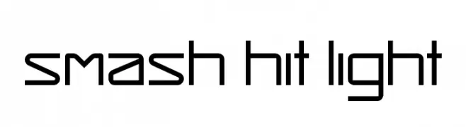
( Henrik Johansson - mediocre.se )
A modern, geometric font with clean lines and a minimalist aesthetic.
![Smash Hit Light تنزيل الخطوط]() تنزيل 183 التنزيلات@WebFont
تنزيل 183 التنزيلات@WebFont -
( John Singer - www.graphic-design.com/type/singer/default.html )
A bold, high-contrast font with ornate serifs and dramatic style.
![AspenFont تنزيل الخطوط]() تنزيل 183 التنزيلات@WebFont
تنزيل 183 التنزيلات@WebFont -
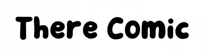
( Fonts by Khurasan )
A playful, bold font with rounded, bubbly characters ideal for fun and creative projects.
![There Comic تنزيل الخطوط]() تنزيل 183 التنزيلات@WebFont
تنزيل 183 التنزيلات@WebFont -
( Fonts by Jeff Levine. FREEWARE )
Retro 1950s-themed icon and dingbat set with bold, playful illustrations.
![Nifty 50's Icons 3 JL تنزيل الخطوط]() تنزيل 183 التنزيلات@WebFont
تنزيل 183 التنزيلات@WebFont


ما هي أبرز الخطوط الآن؟
تحظى cupofcoffee, Mandroid BB, Stuntman Italic, Rider Widest Ultra-expanded ExtraBlack and Valestine بشعبية لخطوطها النظيفة وتطبيقاتها الواسعة — من الهوية البصرية إلى الصفحات المقصودة والملصقات.
أي الخطوط تُستخدم كثيرًا في الشعارات؟
تُعد السان سيريف الهندسية (مثل Poppins وعائلات على نمط Gotham) خيارًا شائعًا لعلامات نظيفة قابلة للتوسع. ولإضفاء طابع ودي، تبقى السكريبت واليدوية خيارًا كلاسيكيًا. اجمع عنوانًا بارزًا مع خط نصي محايد لتحقيق التوازن والتميّز.
كم مرة يتم تحديث قائمة أعلى الخطوط؟
نحدّثها بانتظام استنادًا إلى التنزيلات والنشاط الفعلي. عُد إليها كثيرًا لاكتشاف النجوم الصاعدة مبكرًا.
💡 نصيحة: أضف هذه الصفحة إلى العلامات — تتغير الاتجاهات بسرعة وقد تُلهم خطوط اليوم الرائجة إعادة العلامة غدًا.