مرحبًا بك في قسم أعلى الخطوط — حيث تلتقي الشعبية بالجودة. هذه هي الخطوط الأكثر تنزيلًا واستخدامًا هذا العام من قبل مجتمعنا. إذا كنت بحاجة إلى اختيار موثوق للشعارات أو الويب أو وسائل التواصل، فابدأ من هنا.
يتميز كل خط رائج بتوازن جيد وقابلية قراءة وتعدد استخدامات. ستجد سان سيريف حديثة، وسكريبتات أنيقة، وسيريف كلاسيكية، وخطوط عرض minimal مختارة بعناية.
-
 تنزيل 184 التنزيلات@WebFont
 -
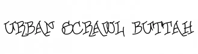
( Fonts by or from www.graffitifonts.net )
A bold, graffiti-inspired font with dynamic curves and a playful, artistic style.
![Urban Scrawl Buttah تنزيل الخطوط]() تنزيل 184 التنزيلات
تنزيل 184 التنزيلات -
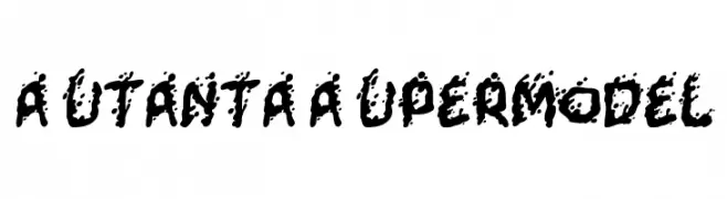
( Fonts by Nate Piekos - www.blambot.com )
A bold, splattered font with a dynamic and chaotic style.
![Mutant-Supermodel تنزيل الخطوط]() تنزيل 184 التنزيلات@WebFont
تنزيل 184 التنزيلات@WebFont -
( memesbruh03 - Aaron D. Chand )
A pixelated, retro-style font with a digital, blocky appearance.
![2A03 تنزيل الخطوط]() تنزيل 184 التنزيلات@WebFont
تنزيل 184 التنزيلات@WebFont -
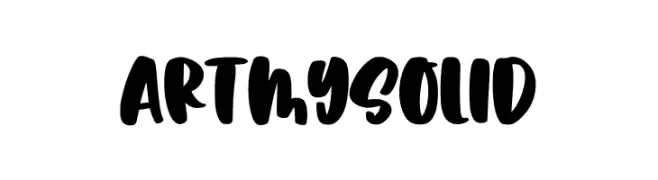
( Fonts by Abo Daniel Studio )
A bold, playful font with thick, rounded strokes and a hand-drawn feel.
![Artmy Solid تنزيل الخطوط]() تنزيل 184 التنزيلات@WebFont
تنزيل 184 التنزيلات@WebFont -
-
( Fonts by Mikko Sumulong - Mix Fonts - mixfonts.com - Personal-use only. For commercial use please contact owner. )
A playful, bold font with rounded edges and a modern aesthetic.
![MixJib تنزيل الخطوط]() تنزيل 184 التنزيلات@WebFont
تنزيل 184 التنزيلات@WebFont -
( Fonts by www.fenotype.com )
A decorative icon font with bold stars and Japanese-themed illustrations.
![Nippon Noodle [demo] fenotype تنزيل الخطوط]() تنزيل 184 التنزيلات@WebFont
تنزيل 184 التنزيلات@WebFont -
( imagex - www.imagex-fonts.com )
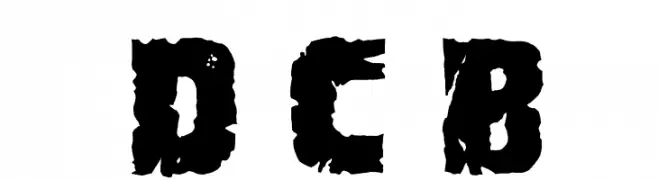
A bold, distressed font with a cracked, rugged appearance.
![Demolition Crack Black تنزيل الخطوط]() تنزيل 184 التنزيلات@WebFont
تنزيل 184 التنزيلات@WebFont -
( Fonts by Apostrophic Lab )
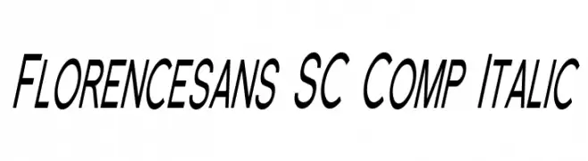
A modern, italic, condensed sans-serif font with uniform stroke width.
![Florencesans SC Comp Italic تنزيل الخطوط]() تنزيل 184 التنزيلات@WebFont
تنزيل 184 التنزيلات@WebFont -
( Fonts by www.houseoflime.com )
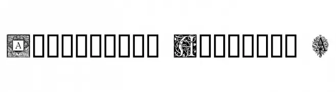
An ornamental and decorative font with intricate designs for each uppercase letter.
![Ornamental Initials A تنزيل الخطوط]() تنزيل 184 التنزيلات@WebFont
تنزيل 184 التنزيلات@WebFont


![Nippon Noodle [demo] fenotype تنزيل الخطوط](https://d144mzi0q5mijx.cloudfront.net/img/N/I/Nippon-Noodle-demo-fenotype.webp)
ما هي أبرز الخطوط الآن؟
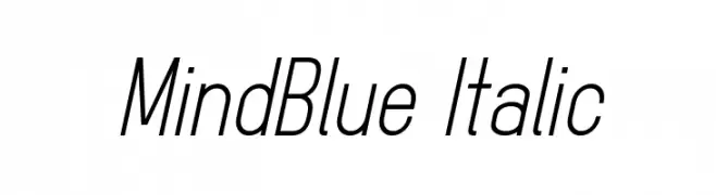
تحظى MindBlue Italic, Urban Scrawl Buttah, Mutant-Supermodel, 2A03 and Artmy Solid بشعبية لخطوطها النظيفة وتطبيقاتها الواسعة — من الهوية البصرية إلى الصفحات المقصودة والملصقات.
أي الخطوط تُستخدم كثيرًا في الشعارات؟
تُعد السان سيريف الهندسية (مثل Poppins وعائلات على نمط Gotham) خيارًا شائعًا لعلامات نظيفة قابلة للتوسع. ولإضفاء طابع ودي، تبقى السكريبت واليدوية خيارًا كلاسيكيًا. اجمع عنوانًا بارزًا مع خط نصي محايد لتحقيق التوازن والتميّز.
كم مرة يتم تحديث قائمة أعلى الخطوط؟
نحدّثها بانتظام استنادًا إلى التنزيلات والنشاط الفعلي. عُد إليها كثيرًا لاكتشاف النجوم الصاعدة مبكرًا.
💡 نصيحة: أضف هذه الصفحة إلى العلامات — تتغير الاتجاهات بسرعة وقد تُلهم خطوط اليوم الرائجة إعادة العلامة غدًا.