مرحبًا بك في قسم أعلى الخطوط — حيث تلتقي الشعبية بالجودة. هذه هي الخطوط الأكثر تنزيلًا واستخدامًا هذا العام من قبل مجتمعنا. إذا كنت بحاجة إلى اختيار موثوق للشعارات أو الويب أو وسائل التواصل، فابدأ من هنا.
يتميز كل خط رائج بتوازن جيد وقابلية قراءة وتعدد استخدامات. ستجد سان سيريف حديثة، وسكريبتات أنيقة، وسيريف كلاسيكية، وخطوط عرض minimal مختارة بعناية.
-
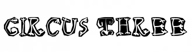
( Fonts by Manfred Klein. Free for private and charity use. Free for commercial with donation to organizations )
A bold, playful font with a vintage circus theme and decorative details.
 تنزيل 185 التنزيلات
 -
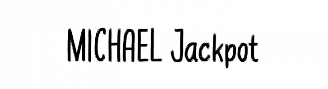
( Fonts by Tan Cundrawan - cove703 - creativemarket.com/cove703 - Personal-use only. For commercial use please contact owner. )
A bold, brush-style font with a hand-drawn, artistic flair.
![MICHAEL Jackpot تنزيل الخطوط]() تنزيل 185 التنزيلات@WebFont
تنزيل 185 التنزيلات@WebFont -
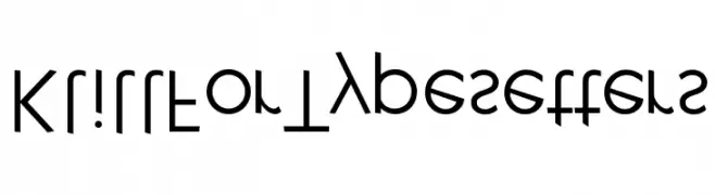
( Fonts by Manfred Klein - manfred-klein.ina-mar.com )
A modern, geometric font with clean lines and a minimalist design.
![KlillForTypesetters تنزيل الخطوط]() تنزيل 185 التنزيلات@WebFont
تنزيل 185 التنزيلات@WebFont -
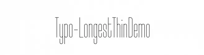
( Studio Typo - www.studiotypo.com )
A modern, ultra-thin, elongated font with a sleek and elegant style.
![Typo-Longest Thin Demo تنزيل الخطوط]() تنزيل 185 التنزيلات@WebFont
تنزيل 185 التنزيلات@WebFont -
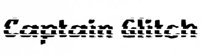
( Fonts by wep )
A bold, glitch-style font with a fragmented, digital appearance.
![Captain Glitch تنزيل الخطوط]() تنزيل 185 التنزيلات@WebFont
تنزيل 185 التنزيلات@WebFont -
-
( گالری فانت فارسی پژوهش آريانا - only compatible with Farsi and Arabic )
A bold, modern font with thick strokes and a strong presence.
![Mitraa Bold تنزيل الخطوط]() تنزيل 185 التنزيلات@WebFont
تنزيل 185 التنزيلات@WebFont -
![Aimee تنزيل الخطوط]() تنزيل 185 التنزيلات@WebFont
تنزيل 185 التنزيلات@WebFont -
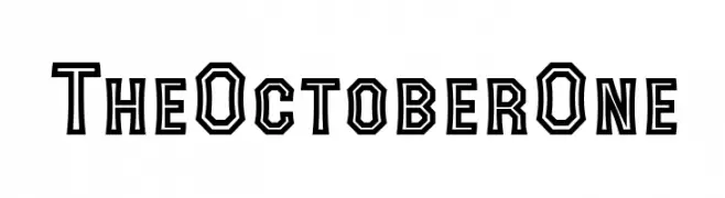
( 7NTypes - Situjuh Nazara - 7ntypes.com )
A bold, geometric font with angular shapes and a double-line effect.
![The October One تنزيل الخطوط]() تنزيل 185 التنزيلات@WebFont
تنزيل 185 التنزيلات@WebFont -
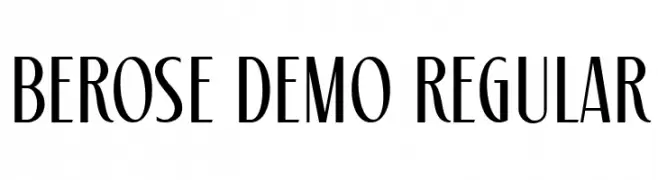
( Fonts by surotype - Adil Budianto - Personal-use only. For commercial use please contact owner. )
A refined and elegant font with high contrast and slender, elongated characters.
![Berose Demo Regular تنزيل الخطوط]() تنزيل 185 التنزيلات@WebFont
تنزيل 185 التنزيلات@WebFont -
( Fonts by 38.lineart )
A rustic, textured font with a hand-drawn, organic feel.
![Kid Knowledge 2 Rustic تنزيل الخطوط]() تنزيل 185 التنزيلات@WebFont
تنزيل 185 التنزيلات@WebFont


ما هي أبرز الخطوط الآن؟
تحظى Circus Three, MICHAEL Jackpot, KlillForTypesetters, Typo-Longest Thin Demo and Captain Glitch بشعبية لخطوطها النظيفة وتطبيقاتها الواسعة — من الهوية البصرية إلى الصفحات المقصودة والملصقات.
أي الخطوط تُستخدم كثيرًا في الشعارات؟
تُعد السان سيريف الهندسية (مثل Poppins وعائلات على نمط Gotham) خيارًا شائعًا لعلامات نظيفة قابلة للتوسع. ولإضفاء طابع ودي، تبقى السكريبت واليدوية خيارًا كلاسيكيًا. اجمع عنوانًا بارزًا مع خط نصي محايد لتحقيق التوازن والتميّز.
كم مرة يتم تحديث قائمة أعلى الخطوط؟
نحدّثها بانتظام استنادًا إلى التنزيلات والنشاط الفعلي. عُد إليها كثيرًا لاكتشاف النجوم الصاعدة مبكرًا.
💡 نصيحة: أضف هذه الصفحة إلى العلامات — تتغير الاتجاهات بسرعة وقد تُلهم خطوط اليوم الرائجة إعادة العلامة غدًا.