مرحبًا بك في قسم أعلى الخطوط — حيث تلتقي الشعبية بالجودة. هذه هي الخطوط الأكثر تنزيلًا واستخدامًا هذا العام من قبل مجتمعنا. إذا كنت بحاجة إلى اختيار موثوق للشعارات أو الويب أو وسائل التواصل، فابدأ من هنا.
يتميز كل خط رائج بتوازن جيد وقابلية قراءة وتعدد استخدامات. ستجد سان سيريف حديثة، وسكريبتات أنيقة، وسيريف كلاسيكية، وخطوط عرض minimal مختارة بعناية.
-
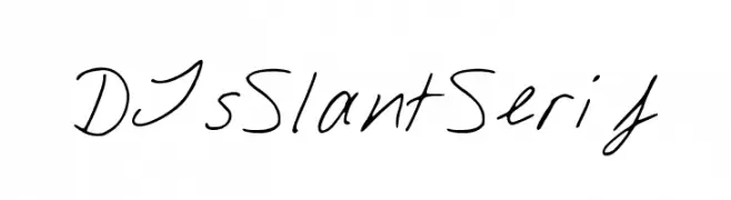
( ClockworkFonts - DJ )
A dynamic, slanted handwritten font with a casual elegance.
 تنزيل 219 التنزيلات@WebFont
 -
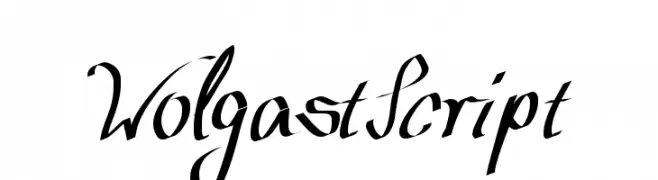
( Fonts by Peter Wiegel - www.peter-wiegel.de )
An elegant and flowing script font with ornate loops and flourishes.
![WolgastScript تنزيل الخطوط]() تنزيل 219 التنزيلات@WebFont
تنزيل 219 التنزيلات@WebFont -
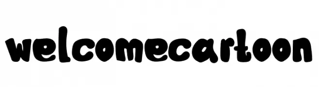
( Fonts by Mr.Soon Design )
A bold, playful font with a cartoonish style and rounded characters.
![Welcome Cartoon تنزيل الخطوط]() تنزيل 219 التنزيلات@WebFont
تنزيل 219 التنزيلات@WebFont -
( Fonts by Daniel Zadorozny - www.iconian.com )
A bold, expanded font with a geometric, industrial style.
![Bummer Expanded تنزيل الخطوط]() تنزيل 219 التنزيلات@WebFont
تنزيل 219 التنزيلات@WebFont -
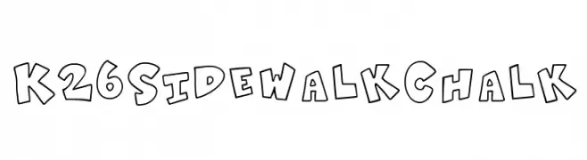
( Fonts by K26 Fonts )
A playful, hand-drawn chalk-style font with bold, irregular letterforms.
![K26SidewalkChalk تنزيل الخطوط]() تنزيل 219 التنزيلات@WebFont
تنزيل 219 التنزيلات@WebFont -
-
( Fonts by Manfred Klein. Free for private and charity use. Free for commercial with donation to organizations )
A playful, handwritten font with thin, elongated characters and whimsical curves.
![Jonas-Light تنزيل الخطوط]() تنزيل 219 التنزيلات@WebFont
تنزيل 219 التنزيلات@WebFont -
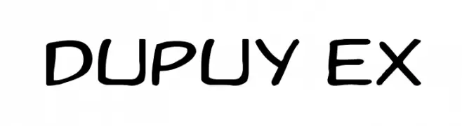
( Fonts by David Rakowski )
A playful handwritten font with smooth curves and a casual style.
![Dupuy Ex تنزيل الخطوط]() تنزيل 219 التنزيلات@WebFont
تنزيل 219 التنزيلات@WebFont -
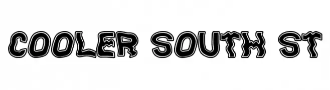
( Fonts by Southype )
A bold, playful font with thick outlines and a cartoonish style.
![Cooler South St تنزيل الخطوط]() تنزيل 219 التنزيلات@WebFont
تنزيل 219 التنزيلات@WebFont -
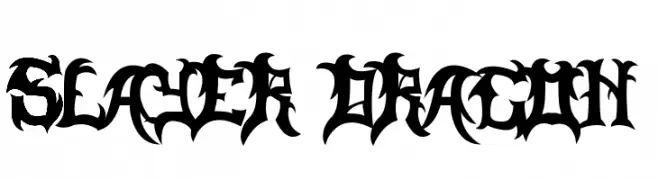
( Fonts by MuraKnockout Media + Design - muraknockout.com. Personal-use only. For commercial use please contact owner. )
A bold, gothic-inspired font with sharp, angular edges and intricate details.
![Slayer Dragon تنزيل الخطوط]() تنزيل 219 التنزيلات@WebFont
تنزيل 219 التنزيلات@WebFont -
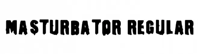
![Masturbator Regular تنزيل الخطوط]() تنزيل 219 التنزيلات@WebFont
تنزيل 219 التنزيلات@WebFont


ما هي أبرز الخطوط الآن؟
تحظى DJsSlantSerif, WolgastScript, Welcome Cartoon, Bummer Expanded and K26SidewalkChalk بشعبية لخطوطها النظيفة وتطبيقاتها الواسعة — من الهوية البصرية إلى الصفحات المقصودة والملصقات.
أي الخطوط تُستخدم كثيرًا في الشعارات؟
تُعد السان سيريف الهندسية (مثل Poppins وعائلات على نمط Gotham) خيارًا شائعًا لعلامات نظيفة قابلة للتوسع. ولإضفاء طابع ودي، تبقى السكريبت واليدوية خيارًا كلاسيكيًا. اجمع عنوانًا بارزًا مع خط نصي محايد لتحقيق التوازن والتميّز.
كم مرة يتم تحديث قائمة أعلى الخطوط؟
نحدّثها بانتظام استنادًا إلى التنزيلات والنشاط الفعلي. عُد إليها كثيرًا لاكتشاف النجوم الصاعدة مبكرًا.
💡 نصيحة: أضف هذه الصفحة إلى العلامات — تتغير الاتجاهات بسرعة وقد تُلهم خطوط اليوم الرائجة إعادة العلامة غدًا.