مرحبًا بك في قسم أعلى الخطوط — حيث تلتقي الشعبية بالجودة. هذه هي الخطوط الأكثر تنزيلًا واستخدامًا هذا العام من قبل مجتمعنا. إذا كنت بحاجة إلى اختيار موثوق للشعارات أو الويب أو وسائل التواصل، فابدأ من هنا.
يتميز كل خط رائج بتوازن جيد وقابلية قراءة وتعدد استخدامات. ستجد سان سيريف حديثة، وسكريبتات أنيقة، وسيريف كلاسيكية، وخطوط عرض minimal مختارة بعناية.
-
( Fonts by junkohanhero )
A bold, distressed font with a grunge texture, ideal for impactful designs.
 تنزيل 221 التنزيلات@WebFont
 -
( Fonts by New Typography - Vernon Adams. Personal-use only. For commercial use please contact owner. )
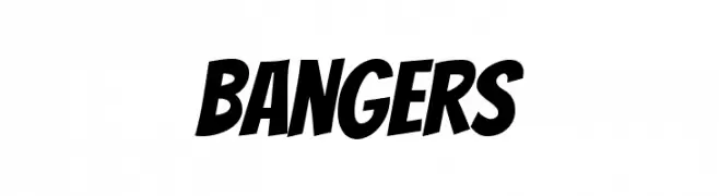
A bold, slanted, and energetic font with a playful style.
![Bangers تنزيل الخطوط]() تنزيل 221 التنزيلات@WebFont
تنزيل 221 التنزيلات@WebFont -
( Fonts by Daniel Zadorozny - www.iconian.com )
A bold, expanded font with a geometric, industrial style.
![Bummer Expanded تنزيل الخطوط]() تنزيل 221 التنزيلات@WebFont
تنزيل 221 التنزيلات@WebFont -
( Fonts by Daniel Zadorozny - www.iconian.com )
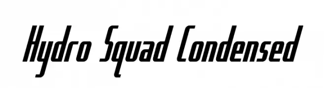
A bold, condensed font with a modern, dynamic style.
![Hydro Squad Condensed تنزيل الخطوط]() تنزيل 221 التنزيلات@WebFont
تنزيل 221 التنزيلات@WebFont -
( Fonts by a Neale Davidson - www.pixelsagas.com. Personal-use only. For commercial use please contact owner. )
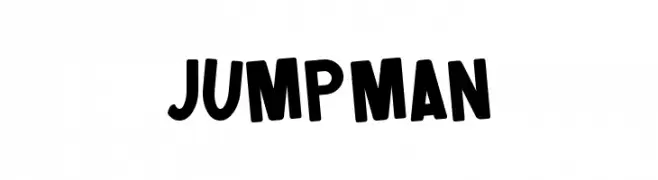
A bold, playful font with a retro-modern appeal and unique star symbols.
![Jumpman تنزيل الخطوط]() تنزيل 221 التنزيلات@WebFont
تنزيل 221 التنزيلات@WebFont -
-
( Fonts by Daniel Gauthier )
A bold, playful font with a bubbly, textured design and thick outlines.
![Scab تنزيل الخطوط]() تنزيل 221 التنزيلات@WebFont
تنزيل 221 التنزيلات@WebFont -
( Fonts by Sorkin Type Co )
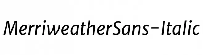
A modern, italic sans-serif font with clean lines and balanced proportions.
![MerriweatherSans-Italic تنزيل الخطوط]() تنزيل 221 التنزيلات@WebFont
تنزيل 221 التنزيلات@WebFont -
( Fonts by Andreas Hofeld - www.fontgrube.de )
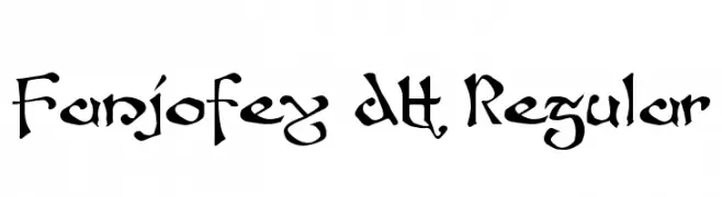
A bold, calligraphic font with intricate details and a modern flair.
![Fanjofey AH Regular تنزيل الخطوط]() تنزيل 221 التنزيلات@WebFont
تنزيل 221 التنزيلات@WebFont -
( Fonts by www.aka-acid.com )
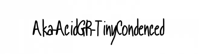
A playful, handwritten font with a condensed and casual style.
![Aka-AcidGR-TinyCondenced تنزيل الخطوط]() تنزيل 221 التنزيلات@WebFont
تنزيل 221 التنزيلات@WebFont -
( Fonts by Octotype - www.foundmyfont.com - Personal-use only. For commercial use please contact owner. )
A bold, flowing script font with dynamic and elegant connections.
![Original Factory تنزيل الخطوط]() تنزيل 221 التنزيلات@WebFont
تنزيل 221 التنزيلات@WebFont


ما هي أبرز الخطوط الآن؟
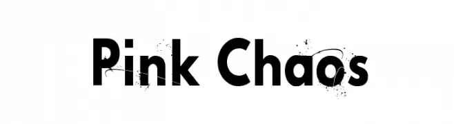
تحظى Pink Chaos, Bangers, Bummer Expanded, Hydro Squad Condensed and Jumpman بشعبية لخطوطها النظيفة وتطبيقاتها الواسعة — من الهوية البصرية إلى الصفحات المقصودة والملصقات.
أي الخطوط تُستخدم كثيرًا في الشعارات؟
تُعد السان سيريف الهندسية (مثل Poppins وعائلات على نمط Gotham) خيارًا شائعًا لعلامات نظيفة قابلة للتوسع. ولإضفاء طابع ودي، تبقى السكريبت واليدوية خيارًا كلاسيكيًا. اجمع عنوانًا بارزًا مع خط نصي محايد لتحقيق التوازن والتميّز.
كم مرة يتم تحديث قائمة أعلى الخطوط؟
نحدّثها بانتظام استنادًا إلى التنزيلات والنشاط الفعلي. عُد إليها كثيرًا لاكتشاف النجوم الصاعدة مبكرًا.
💡 نصيحة: أضف هذه الصفحة إلى العلامات — تتغير الاتجاهات بسرعة وقد تُلهم خطوط اليوم الرائجة إعادة العلامة غدًا.