مرحبًا بك في قسم أعلى الخطوط — حيث تلتقي الشعبية بالجودة. هذه هي الخطوط الأكثر تنزيلًا واستخدامًا هذا العام من قبل مجتمعنا. إذا كنت بحاجة إلى اختيار موثوق للشعارات أو الويب أو وسائل التواصل، فابدأ من هنا.
يتميز كل خط رائج بتوازن جيد وقابلية قراءة وتعدد استخدامات. ستجد سان سيريف حديثة، وسكريبتات أنيقة، وسيريف كلاسيكية، وخطوط عرض minimal مختارة بعناية.
-
( Fonts by www.gliphmaker.com. Personal-use only. For commercial use please contact owner. )
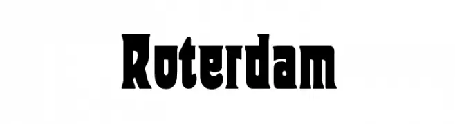
A bold, high-contrast font with a modern vintage flair.
 تنزيل 222 التنزيلات@WebFont
 -
( Fonts by Manfred Klein - manfred-klein.ina-mar.com )
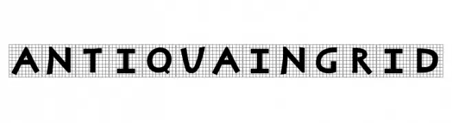
A bold, geometric font with Art Deco influences, combining modern and vintage elements.
![AntiquaInGrid تنزيل الخطوط]() تنزيل 222 التنزيلات@WebFont
تنزيل 222 التنزيلات@WebFont -
( Fonts by Galdino Otten Fonts - www.galdinootten.com - Personal-use only. For commercial use please contact owner. )
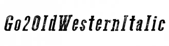
A bold, italicized font with a distressed, vintage Western style.
![Go 2 Old Western Italic تنزيل الخطوط]() تنزيل 222 التنزيلات@WebFont
تنزيل 222 التنزيلات@WebFont -
( Fonts by Baka - Kyakirun - bakafonts.kyakirun.com )
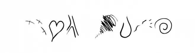
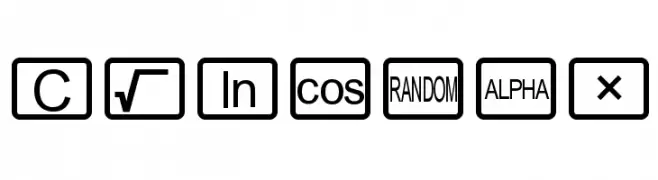
Hand-drawn doodle-style symbol and icon set.
![The-ManPu تنزيل الخطوط]() تنزيل 222 التنزيلات@WebFont
تنزيل 222 التنزيلات@WebFont -
![CalcHux تنزيل الخطوط]() تنزيل 222 التنزيلات@WebFont
تنزيل 222 التنزيلات@WebFont -
-
( Fonts by Austin Perri )
A futuristic and geometric font with dynamic striped elements.
![BEAMS تنزيل الخطوط]() تنزيل 222 التنزيلات@WebFont
تنزيل 222 التنزيلات@WebFont -
( Fonts by Syaf Rizal - Khurasan - Personal-use only. For commercial use please contact owner. )
A bold, brush-style handwritten font with dynamic strokes.
![Saltino تنزيل الخطوط]() تنزيل 222 التنزيلات@WebFont
تنزيل 222 التنزيلات@WebFont -
( Fonts by Des Gomez )
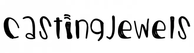
A playful, whimsical handwritten font with irregular and quirky letterforms.
![CastingJewels تنزيل الخطوط]() تنزيل 222 التنزيلات@WebFont
تنزيل 222 التنزيلات@WebFont -
( Fonts by Peax Webdesign - www.peax-webdesign.com. Personal-use only. For commercial use please contact owner. )
A playful, bold, hand-drawn font with a speckled texture.
![PW403 تنزيل الخطوط]() تنزيل 222 التنزيلات@WebFont
تنزيل 222 التنزيلات@WebFont -
( Fonts by imagex - Personal-use only. For commercial use please contact owner. )
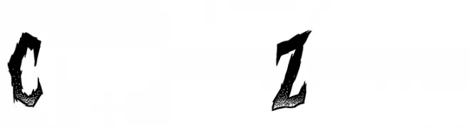
A bold, jagged font with a horror-themed, distressed appearance.
![Curse of the Zombie تنزيل الخطوط]() تنزيل 222 التنزيلات@WebFont
تنزيل 222 التنزيلات@WebFont


ما هي أبرز الخطوط الآن؟
تحظى Roterdam, AntiquaInGrid, Go 2 Old Western Italic, The-ManPu and CalcHux بشعبية لخطوطها النظيفة وتطبيقاتها الواسعة — من الهوية البصرية إلى الصفحات المقصودة والملصقات.
أي الخطوط تُستخدم كثيرًا في الشعارات؟
تُعد السان سيريف الهندسية (مثل Poppins وعائلات على نمط Gotham) خيارًا شائعًا لعلامات نظيفة قابلة للتوسع. ولإضفاء طابع ودي، تبقى السكريبت واليدوية خيارًا كلاسيكيًا. اجمع عنوانًا بارزًا مع خط نصي محايد لتحقيق التوازن والتميّز.
كم مرة يتم تحديث قائمة أعلى الخطوط؟
نحدّثها بانتظام استنادًا إلى التنزيلات والنشاط الفعلي. عُد إليها كثيرًا لاكتشاف النجوم الصاعدة مبكرًا.
💡 نصيحة: أضف هذه الصفحة إلى العلامات — تتغير الاتجاهات بسرعة وقد تُلهم خطوط اليوم الرائجة إعادة العلامة غدًا.