مرحبًا بك في قسم أعلى الخطوط — حيث تلتقي الشعبية بالجودة. هذه هي الخطوط الأكثر تنزيلًا واستخدامًا هذا العام من قبل مجتمعنا. إذا كنت بحاجة إلى اختيار موثوق للشعارات أو الويب أو وسائل التواصل، فابدأ من هنا.
يتميز كل خط رائج بتوازن جيد وقابلية قراءة وتعدد استخدامات. ستجد سان سيريف حديثة، وسكريبتات أنيقة، وسيريف كلاسيكية، وخطوط عرض minimal مختارة بعناية.
-
( Fonts by Apostrophic Lab )
A bold serif font with angular serifs and a commanding presence.
 تنزيل 932 التنزيلات@WebFont
 -
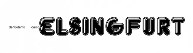
( Fonts by www.fenotype.com )
A bold, decorative font with a hollow, outlined design and modern appeal.
![FT Helsingfurt تنزيل الخطوط]() تنزيل 932 التنزيلات@WebFont
تنزيل 932 التنزيلات@WebFont -
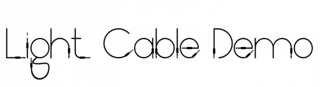
( Fonts by RaisProject )
A modern, geometric font with thin lines and a sleek, futuristic design.
![Light Cable Demo تنزيل الخطوط]() تنزيل 931 التنزيلات@WebFont
تنزيل 931 التنزيلات@WebFont -
( Michael D. Adams - www.triskele.com/roadgeek-fonts/ )
A bold, modern sans-serif font with excellent legibility and a slightly condensed style.
![Roadgeek 2005 Series 6B تنزيل الخطوط]() تنزيل 931 التنزيلات@WebFont
تنزيل 931 التنزيلات@WebFont -
( alifirman - Ali Firman - www.creativefabrica.com/designer/meutuwah/ref/20027/ )
A cursive, handwritten font with elegant, flowing strokes.
![alana you تنزيل الخطوط]() تنزيل 931 التنزيلات@WebFont
تنزيل 931 التنزيلات@WebFont -
( Iconian Fonts - Daniel Zadorozny - www.iconian.com )
A bold, italicized font with angular lines and a dynamic style.
![Soloist تنزيل الخطوط]() تنزيل 931 التنزيلات@WebFont
تنزيل 931 التنزيلات@WebFont -
( Fonts by youssef-habchi.com - Personal-use only. For commercial use please contact owner. )
A bold, handwritten font with smooth, flowing curves and a casual elegance.
![Quinzey-Bold تنزيل الخطوط]() تنزيل 931 التنزيلات@WebFont
تنزيل 931 التنزيلات@WebFont -
( Copyright (c) 2011, Mariela Monsalve (marmonsalve@gmail.com) )
A modern sans-serif font with geometric and balanced letterforms.
![Ruda Regular تنزيل الخطوط]() تنزيل 931 التنزيلات@WebFont
تنزيل 931 التنزيلات@WebFont -
( Fonts by Vigilante Typeface Corporation Larry Yerkes. Personal-use only. For commercial use please contact owner. )
A bold, tribal-inspired font with sharp, angular detailing.
![Tribal تنزيل الخطوط]() تنزيل 931 التنزيلات@WebFont
تنزيل 931 التنزيلات@WebFont -
( Copyright 2013 Seoul Metropolitan Government (gonabis@seoul.go.kr) )
A modern sans-serif font with clean lines and balanced proportions.
![SeoulHangang CL تنزيل الخطوط]() تنزيل 931 التنزيلات@WebFont
تنزيل 931 التنزيلات@WebFont -
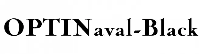
( Fonts by Castcraft Software - opti.netii.net - check the website before use )
A bold, high-contrast serif font with a classic and authoritative style.
![OPTINaval-Black تنزيل الخطوط]() تنزيل 931 التنزيلات@WebFont
تنزيل 931 التنزيلات@WebFont -
![TheStarsThatShineAbove تنزيل الخطوط]() تنزيل 931 التنزيلات@WebFont
تنزيل 931 التنزيلات@WebFont -
![se7en تنزيل الخطوط]() تنزيل 931 التنزيلات@WebFont
تنزيل 931 التنزيلات@WebFont -
![Etruscan mid/late Bold تنزيل الخطوط]() تنزيل 931 التنزيلات@WebFont
تنزيل 931 التنزيلات@WebFont -
![Gold Regular تنزيل الخطوط]() تنزيل 931 التنزيلات@WebFont
تنزيل 931 التنزيلات@WebFont -
![ja تنزيل الخطوط]() تنزيل 931 التنزيلات@WebFont
تنزيل 931 التنزيلات@WebFont -
( Fonts by Daniel Zadorozny - www.iconian.com - Free for personal use )
A bold, dynamic font with sharp, jagged edges and an aggressive style.
![Flying Leatherneck تنزيل الخطوط]() تنزيل 931 التنزيلات@WebFont
تنزيل 931 التنزيلات@WebFont -
( Fonts by Scratch Design )
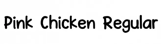
A playful, rounded font with a hand-drawn, whimsical style.
![Pink Chicken Regular تنزيل الخطوط]() تنزيل 930 التنزيلات@WebFont
تنزيل 930 التنزيلات@WebFont -
( Fonts by Subectype )
A playful, rounded sans-serif font with a bold and friendly appearance.
![Good Feeling Sans تنزيل الخطوط]() تنزيل 930 التنزيلات@WebFont
تنزيل 930 التنزيلات@WebFont -
( fontsme )
A playful, handwritten font with a whimsical and dynamic style.
![Ecuador Regular تنزيل الخطوط]() تنزيل 930 التنزيلات@WebFont
تنزيل 930 التنزيلات@WebFont -
( Fonts by youssef-habchi.com - Personal-use only. For commercial use please contact owner. )
A vintage-modern font with tall, narrow, hand-drawn letterforms.
![TastyBirds-Fried تنزيل الخطوط]() تنزيل 930 التنزيلات@WebFont
تنزيل 930 التنزيلات@WebFont -
( Fonts by Levi Szekeres - www.loremipsum.ro. Personal-use only. For commercial use please contact owner. )
A bold, rounded sans-serif font with uniform strokes and a modern look.
![Ruler Bold تنزيل الخطوط]() تنزيل 930 التنزيلات@WebFont
تنزيل 930 التنزيلات@WebFont -
![Warrior Sports Brand 2 تنزيل الخطوط]() تنزيل 930 التنزيلات@WebFont
تنزيل 930 التنزيلات@WebFont -
![Cotte-VMF تنزيل الخطوط]() تنزيل 930 التنزيلات@WebFont
تنزيل 930 التنزيلات@WebFont -
( Fonts by Luedecke Design Font Co. - ldfonts.weebly.com )
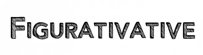
A bold, sketch-style font with textured, hand-drawn characters.
![Figurativative تنزيل الخطوط]() تنزيل 930 التنزيلات@WebFont
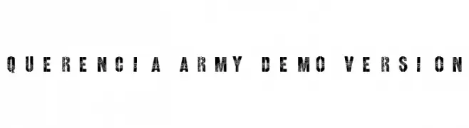
تنزيل 930 التنزيلات@WebFont -
![Querencia Army DEMO VERSION تنزيل الخطوط]() تنزيل 930 التنزيلات@WebFont
تنزيل 930 التنزيلات@WebFont -
( Fonts by a kmzero font foundry - www.zetafonts.com. Personal-use only. For commercial use please contact owner. )
A modern, geometric sans-serif font with a sleek, condensed design.
![[z] Prozak تنزيل الخطوط]() تنزيل 930 التنزيلات@WebFont
تنزيل 930 التنزيلات@WebFont -
![Aquanaut تنزيل الخطوط]() تنزيل 930 التنزيلات@WebFont
تنزيل 930 التنزيلات@WebFont -
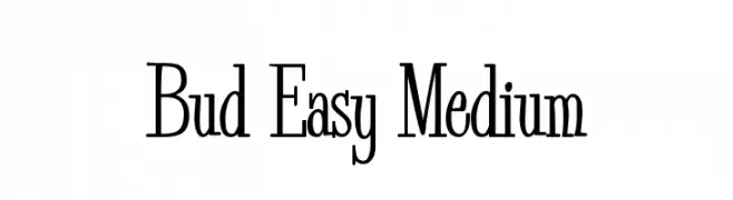
( Fonts by John David www.easywriter.com/fonts/ )
A modern serif font with elegant curves and decorative elements.
![Bud Easy Medium تنزيل الخطوط]() تنزيل 930 التنزيلات@WebFont
تنزيل 930 التنزيلات@WebFont -
![Beat My Guest تنزيل الخطوط]() تنزيل 930 التنزيلات@WebFont
تنزيل 930 التنزيلات@WebFont -
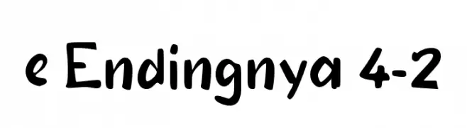
( Fonts by wep )
A bold, playful handwritten font with dynamic and irregular letterforms.
![e Endingnya 4-2 تنزيل الخطوط]() تنزيل 929 التنزيلات@WebFont
تنزيل 929 التنزيلات@WebFont -
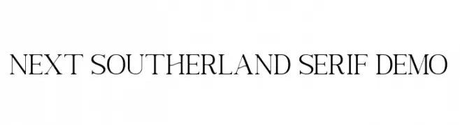
( Fonts by vilogsign - Nur Kholis - Personal-use only. For commercial use please contact owner. )
An elegant serif font with elongated strokes and sharp serifs, blending classic and modern styles.
![Next Southerland Serif DEMO تنزيل الخطوط]() تنزيل 929 التنزيلات@WebFont
تنزيل 929 التنزيلات@WebFont -
( Fonts by Namara Creative Studio - Personal-use only. For commercial use please contact owner. )
An elegant, flowing script font with bold, cursive strokes.
![Harland Roselyn تنزيل الخطوط]() تنزيل 929 التنزيلات@WebFont
تنزيل 929 التنزيلات@WebFont -
( Fonts by Katatrad Team, changes by Cristiano Sobral - Personal-use only. For commercial use please contact owner. )
A bold, italicized font with strong, consistent strokes and a dynamic slant.
![Dizhitl Bold Italic تنزيل الخطوط]() تنزيل 929 التنزيلات@WebFont
تنزيل 929 التنزيلات@WebFont -
( Zetafonts - www.zetafonts.com )
A modern, rounded font with geometric shapes and uniform stroke width.
![Aristotelica Small Caps Regular تنزيل الخطوط]() تنزيل 929 التنزيلات@WebFont
تنزيل 929 التنزيلات@WebFont


![[z] Prozak تنزيل الخطوط](https://d144mzi0q5mijx.cloudfront.net/img/0/Z/z-Prozak.webp)


ما هي أبرز الخطوط الآن؟
تحظى Lady Copra, FT Helsingfurt, Light Cable Demo, Roadgeek 2005 Series 6B and alana you بشعبية لخطوطها النظيفة وتطبيقاتها الواسعة — من الهوية البصرية إلى الصفحات المقصودة والملصقات.
أي الخطوط تُستخدم كثيرًا في الشعارات؟
تُعد السان سيريف الهندسية (مثل Poppins وعائلات على نمط Gotham) خيارًا شائعًا لعلامات نظيفة قابلة للتوسع. ولإضفاء طابع ودي، تبقى السكريبت واليدوية خيارًا كلاسيكيًا. اجمع عنوانًا بارزًا مع خط نصي محايد لتحقيق التوازن والتميّز.
كم مرة يتم تحديث قائمة أعلى الخطوط؟
نحدّثها بانتظام استنادًا إلى التنزيلات والنشاط الفعلي. عُد إليها كثيرًا لاكتشاف النجوم الصاعدة مبكرًا.
💡 نصيحة: أضف هذه الصفحة إلى العلامات — تتغير الاتجاهات بسرعة وقد تُلهم خطوط اليوم الرائجة إعادة العلامة غدًا.