مرحبًا بك في قسم أعلى الخطوط — حيث تلتقي الشعبية بالجودة. هذه هي الخطوط الأكثر تنزيلًا واستخدامًا هذا العام من قبل مجتمعنا. إذا كنت بحاجة إلى اختيار موثوق للشعارات أو الويب أو وسائل التواصل، فابدأ من هنا.
يتميز كل خط رائج بتوازن جيد وقابلية قراءة وتعدد استخدامات. ستجد سان سيريف حديثة، وسكريبتات أنيقة، وسيريف كلاسيكية، وخطوط عرض minimal مختارة بعناية.
-
( Fonts by Vladimir Nikolic - www.creativefabrica.com/designer/vladimirnikolic/ - Personal-use only. For commercial use please contact owner. )
A bold, geometric italic font with a modern and dynamic style.
 تنزيل 223 التنزيلات@WebFont
 -
( Fonts by wep )
A bold, hand-painted style font with dynamic, brush-like strokes.
![Instead تنزيل الخطوط]() تنزيل 223 التنزيلات@WebFont
تنزيل 223 التنزيلات@WebFont -
( Fonts by wep - Wahyu Eka Prasetya - Personal-use only. For commercial use please contact owner. )
A playful, handwritten-style font with bold, irregular strokes.
![Ablasco تنزيل الخطوط]() تنزيل 223 التنزيلات@WebFont
تنزيل 223 التنزيلات@WebFont -
( 3rd Eye Graphics )
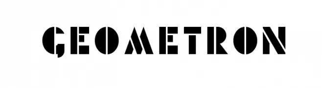
A bold, geometric font with angular shapes and a modern aesthetic.
![Geometron تنزيل الخطوط]() تنزيل 223 التنزيلات@WebFont
تنزيل 223 التنزيلات@WebFont -
( Fonts by dartcanada.tripod.com - Darren Rigby )
A bold, modern take on traditional blackletter styles with sharp angles and strong lines.
![IntruderAlert تنزيل الخطوط]() تنزيل 223 التنزيلات@WebFont
تنزيل 223 التنزيلات@WebFont -
-
( Fonts by Studio Typo )
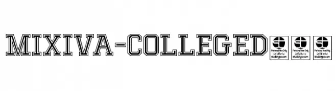
A bold, outlined collegiate-style font with a strong, structured appearance.
![MIXIVA-COLLEGE Demo تنزيل الخطوط]() تنزيل 223 التنزيلات@WebFont
تنزيل 223 التنزيلات@WebFont -
( Fonts by U.S. Web Design System )
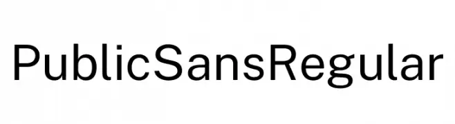
A modern, clean sans-serif font with uniform stroke width and excellent readability.
![Public Sans Regular تنزيل الخطوط]() تنزيل 223 التنزيلات@WebFont
تنزيل 223 التنزيلات@WebFont -
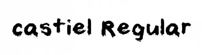
( Fonts by cahstiel )
A bold, brushstroke-style font with a textured, hand-painted look.
![castiel Regular تنزيل الخطوط]() تنزيل 223 التنزيلات@WebFont
تنزيل 223 التنزيلات@WebFont -
( Free for personal use - Fonts by Markus Schroppel. For commercial license please donate to http://www.die-gute-schrift.de/donation.html )
A pixelated, retro-style font with a digital aesthetic.
![LLPikseli تنزيل الخطوط]() تنزيل 223 التنزيلات@WebFont
تنزيل 223 التنزيلات@WebFont -
( Fonts by Kat`s Fun Fonts - Personal-use only. For commercial use please contact owner. )
A bold, dynamic font with thick strokes and a slight slant, perfect for impactful statements.
![KR Gunz تنزيل الخطوط]() تنزيل 223 التنزيلات@WebFont
تنزيل 223 التنزيلات@WebFont


ما هي أبرز الخطوط الآن؟
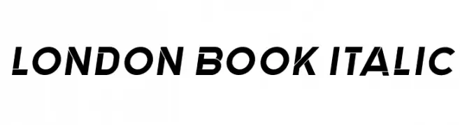
تحظى London Book Italic, Instead, Ablasco, Geometron and IntruderAlert بشعبية لخطوطها النظيفة وتطبيقاتها الواسعة — من الهوية البصرية إلى الصفحات المقصودة والملصقات.
أي الخطوط تُستخدم كثيرًا في الشعارات؟
تُعد السان سيريف الهندسية (مثل Poppins وعائلات على نمط Gotham) خيارًا شائعًا لعلامات نظيفة قابلة للتوسع. ولإضفاء طابع ودي، تبقى السكريبت واليدوية خيارًا كلاسيكيًا. اجمع عنوانًا بارزًا مع خط نصي محايد لتحقيق التوازن والتميّز.
كم مرة يتم تحديث قائمة أعلى الخطوط؟
نحدّثها بانتظام استنادًا إلى التنزيلات والنشاط الفعلي. عُد إليها كثيرًا لاكتشاف النجوم الصاعدة مبكرًا.
💡 نصيحة: أضف هذه الصفحة إلى العلامات — تتغير الاتجاهات بسرعة وقد تُلهم خطوط اليوم الرائجة إعادة العلامة غدًا.