مرحبًا بك في قسم أعلى الخطوط — حيث تلتقي الشعبية بالجودة. هذه هي الخطوط الأكثر تنزيلًا واستخدامًا هذا العام من قبل مجتمعنا. إذا كنت بحاجة إلى اختيار موثوق للشعارات أو الويب أو وسائل التواصل، فابدأ من هنا.
يتميز كل خط رائج بتوازن جيد وقابلية قراءة وتعدد استخدامات. ستجد سان سيريف حديثة، وسكريبتات أنيقة، وسيريف كلاسيكية، وخطوط عرض minimal مختارة بعناية.
-
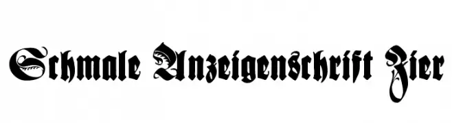
( Fonts by Dieter Steffmann )
A bold, ornate Blackletter font with intricate flourishes and a historical feel.
 تنزيل 225 التنزيلات@WebFont
 -
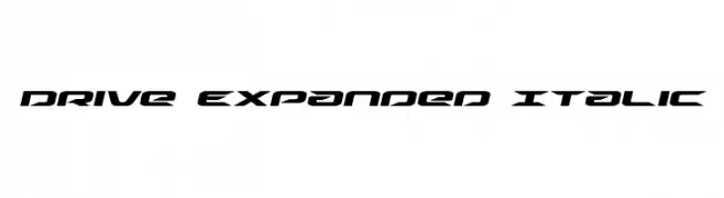
( Fonts by Daniel Zadorozny - www.iconian.com )
A bold, expanded, and italicized font with a futuristic and dynamic design.
![Drive Expanded Italic تنزيل الخطوط]() تنزيل 225 التنزيلات@WebFont
تنزيل 225 التنزيلات@WebFont -
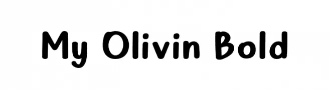
( Fonts by Alifinart Studio - Personal-use only. For commercial use please contact owner. )
A bold, playful font with rounded edges and a friendly appearance.
![My Olivin Bold تنزيل الخطوط]() تنزيل 225 التنزيلات@WebFont
تنزيل 225 التنزيلات@WebFont -
( Fonts by Bartek Nowak - www.nowak.tv/fontoholic/ )
A bold, italic typeface with a dynamic and playful style.
![InfantylItalic تنزيل الخطوط]() تنزيل 225 التنزيلات@WebFont
تنزيل 225 التنزيلات@WebFont -
( Fonts by Zetafonts - Personal-use only. For commercial use please contact owner. )
A graceful, light, and italicized font with elegant curves and a sophisticated style.
![Holden Trial Light Italic تنزيل الخطوط]() تنزيل 225 التنزيلات@WebFont
تنزيل 225 التنزيلات@WebFont -
-
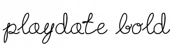
( Fonts by Heather T. - oohlalaartsy.blogspot.com )
A playful, whimsical script font with flowing, connected letters.
![Playdate Bold تنزيل الخطوط]() تنزيل 225 التنزيلات@WebFont
تنزيل 225 التنزيلات@WebFont -
( Fonts by Graham Meade - GemFonts )
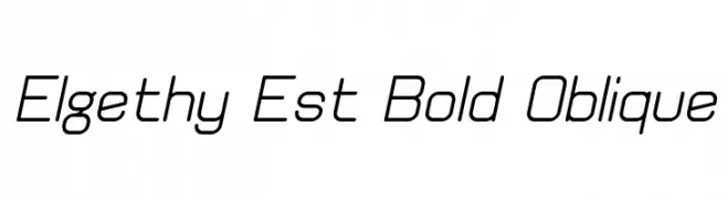
A modern, oblique font with uniform stroke width and rounded edges.
![Elgethy Est Bold Oblique تنزيل الخطوط]() تنزيل 225 التنزيلات@WebFont
تنزيل 225 التنزيلات@WebFont -
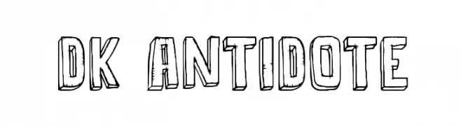
![DK Antidote تنزيل الخطوط]() تنزيل 225 التنزيلات@WebFont
تنزيل 225 التنزيلات@WebFont -
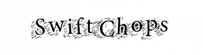
( Fonts by a Max Infeld - XEROGRAPHER FONTS - xerographer.blogspot.com . Personal-use only. For commercial use please contact owner. )
A bold, textured serif font with a hand-drawn, artistic style.
![SwiftChops تنزيل الخطوط]() تنزيل 225 التنزيلات@WebFont
تنزيل 225 التنزيلات@WebFont -
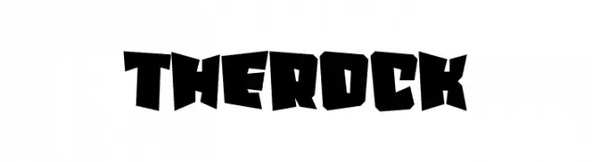
( Fonts by Erik Studio )
A bold, angular font with a rugged, dynamic design.
![The Rock تنزيل الخطوط]() تنزيل 225 التنزيلات@WebFont
تنزيل 225 التنزيلات@WebFont


ما هي أبرز الخطوط الآن؟
تحظى Schmale Anzeigenschrift Zier, Drive Expanded Italic, My Olivin Bold, InfantylItalic and Holden Trial Light Italic بشعبية لخطوطها النظيفة وتطبيقاتها الواسعة — من الهوية البصرية إلى الصفحات المقصودة والملصقات.
أي الخطوط تُستخدم كثيرًا في الشعارات؟
تُعد السان سيريف الهندسية (مثل Poppins وعائلات على نمط Gotham) خيارًا شائعًا لعلامات نظيفة قابلة للتوسع. ولإضفاء طابع ودي، تبقى السكريبت واليدوية خيارًا كلاسيكيًا. اجمع عنوانًا بارزًا مع خط نصي محايد لتحقيق التوازن والتميّز.
كم مرة يتم تحديث قائمة أعلى الخطوط؟
نحدّثها بانتظام استنادًا إلى التنزيلات والنشاط الفعلي. عُد إليها كثيرًا لاكتشاف النجوم الصاعدة مبكرًا.
💡 نصيحة: أضف هذه الصفحة إلى العلامات — تتغير الاتجاهات بسرعة وقد تُلهم خطوط اليوم الرائجة إعادة العلامة غدًا.