مرحبًا بك في قسم أعلى الخطوط — حيث تلتقي الشعبية بالجودة. هذه هي الخطوط الأكثر تنزيلًا واستخدامًا هذا العام من قبل مجتمعنا. إذا كنت بحاجة إلى اختيار موثوق للشعارات أو الويب أو وسائل التواصل، فابدأ من هنا.
يتميز كل خط رائج بتوازن جيد وقابلية قراءة وتعدد استخدامات. ستجد سان سيريف حديثة، وسكريبتات أنيقة، وسيريف كلاسيكية، وخطوط عرض minimal مختارة بعناية.
-
 تنزيل 228 التنزيلات@WebFont
 -
![Count and Spell تنزيل الخطوط]() تنزيل 228 التنزيلات@WebFont
تنزيل 228 التنزيلات@WebFont -
( Fonts by Luke Owens - Personal-use only. For commercial use please contact owner. )
An elegant italic serif font with a classic and sophisticated style.
![Portland LDO Italic تنزيل الخطوط]() تنزيل 228 التنزيلات@WebFont
تنزيل 228 التنزيلات@WebFont -
( Fonts by wep - Wahyu Eka Prasetya - Personal-use only. For commercial use please contact owner. )
A playful, handwritten font with bold, rounded strokes and a whimsical style.
![ARBEI BERRY تنزيل الخطوط]() تنزيل 228 التنزيلات@WebFont
تنزيل 228 التنزيلات@WebFont -
( Fonts by Situjuh Nazara - 7ntypes.com - Personal-use only. For commercial use please contact owner. )
A playful, handwritten font with smooth curves and a friendly appearance.
![Beelova تنزيل الخطوط]() تنزيل 228 التنزيلات@WebFont
تنزيل 228 التنزيلات@WebFont -
-
( Fonts by Jeri Ingalls - littlehouse.homestead.com )
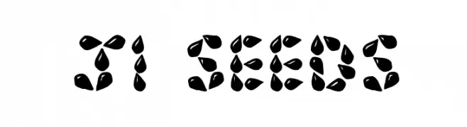
A decorative font with characters formed by seed-like shapes, offering a playful and organic look.
![JI Seeds تنزيل الخطوط]() تنزيل 228 التنزيلات@WebFont
تنزيل 228 التنزيلات@WebFont -
( Fonts by Christophe Feray - www.wcfonts.com )
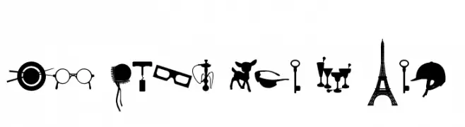
A pictogram dingbat font featuring diverse object silhouettes.
![WC Sold Out A Bta تنزيل الخطوط]() تنزيل 228 التنزيلات@WebFont
تنزيل 228 التنزيلات@WebFont -
( Fonts by Youssef Habchi - youssef-habchi.com - Personal-use only. For commercial use please contact owner. )
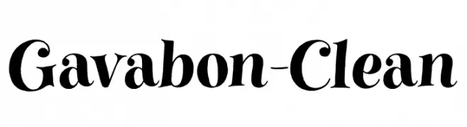
A bold and expressive serif font with dramatic curves and modern flair.
![Gavabon-Clean تنزيل الخطوط]() تنزيل 228 التنزيلات@WebFont
تنزيل 228 التنزيلات@WebFont -
( Fonts by Mooniak - Personal-use only. For commercial use please contact owner. )
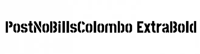
A bold, geometric font with high contrast and strong visual impact.
![PostNoBillsColombo ExtraBold تنزيل الخطوط]() تنزيل 228 التنزيلات@WebFont
تنزيل 228 التنزيلات@WebFont -
( Fonts by Peter Wiegel - www.peter-wiegel.de - Personal-use only. For commercial use please contact owner. )
A modern serif font with elegant lines and balanced proportions.
![CATLinz تنزيل الخطوط]() تنزيل 228 التنزيلات@WebFont
تنزيل 228 التنزيلات@WebFont


ما هي أبرز الخطوط الآن؟
تحظى Delphinium Pro, Count and Spell, Portland LDO Italic, ARBEI BERRY and Beelova بشعبية لخطوطها النظيفة وتطبيقاتها الواسعة — من الهوية البصرية إلى الصفحات المقصودة والملصقات.
أي الخطوط تُستخدم كثيرًا في الشعارات؟
تُعد السان سيريف الهندسية (مثل Poppins وعائلات على نمط Gotham) خيارًا شائعًا لعلامات نظيفة قابلة للتوسع. ولإضفاء طابع ودي، تبقى السكريبت واليدوية خيارًا كلاسيكيًا. اجمع عنوانًا بارزًا مع خط نصي محايد لتحقيق التوازن والتميّز.
كم مرة يتم تحديث قائمة أعلى الخطوط؟
نحدّثها بانتظام استنادًا إلى التنزيلات والنشاط الفعلي. عُد إليها كثيرًا لاكتشاف النجوم الصاعدة مبكرًا.
💡 نصيحة: أضف هذه الصفحة إلى العلامات — تتغير الاتجاهات بسرعة وقد تُلهم خطوط اليوم الرائجة إعادة العلامة غدًا.