مرحبًا بك في قسم أعلى الخطوط — حيث تلتقي الشعبية بالجودة. هذه هي الخطوط الأكثر تنزيلًا واستخدامًا هذا العام من قبل مجتمعنا. إذا كنت بحاجة إلى اختيار موثوق للشعارات أو الويب أو وسائل التواصل، فابدأ من هنا.
يتميز كل خط رائج بتوازن جيد وقابلية قراءة وتعدد استخدامات. ستجد سان سيريف حديثة، وسكريبتات أنيقة، وسيريف كلاسيكية، وخطوط عرض minimal مختارة بعناية.
-
( Fonts by Iconian Fonts )
A bold, 3D font with a shadow effect and rounded edges.
 تنزيل 230 التنزيلات@WebFont
 -
( Fonts by www.peter-wiegel.de. Personal-use only. For commercial use please contact owner. )
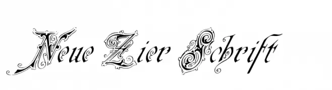
An ornate and decorative font with intricate swirls and embellishments.
![Neue Zier Schrift تنزيل الخطوط]() تنزيل 230 التنزيلات@WebFont
تنزيل 230 التنزيلات@WebFont -
( Ana - www.anasfonts.com/ )
A bold, expressive handwritten font with dynamic brush-like strokes.
![RecklessSample تنزيل الخطوط]() تنزيل 230 التنزيلات@WebFont
تنزيل 230 التنزيلات@WebFont -
( Fonts by Arkandis Digital Foundry )
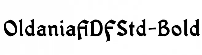
A bold, gothic-inspired font with sharp, angular lines and strong presence.
![OldaniaADFStd-Bold تنزيل الخطوط]() تنزيل 230 التنزيلات@WebFont
تنزيل 230 التنزيلات@WebFont -
( Fonts by Manfred Klein. Free for private and charity use. Free for commercial with donation to organizations )
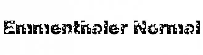
A bold, decorative font with circular cutouts for a playful, cheese-like appearance.
![Emmenthaler Normal تنزيل الخطوط]() تنزيل 230 التنزيلات@WebFont
تنزيل 230 التنزيلات@WebFont -
-
( Fonts by Vít Čondák )
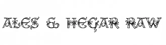
An ornate and decorative font with intricate flourishes and vintage motifs.
![Ales & Hegar Raw تنزيل الخطوط]() تنزيل 230 التنزيلات@WebFont
تنزيل 230 التنزيلات@WebFont -
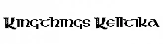
( Font by kingthingsfonts.co.uk )
A decorative, Celtic-inspired font with intricate details and embellishments.
![Kingthings Kelltika تنزيل الخطوط]() تنزيل 230 التنزيلات@WebFont
تنزيل 230 التنزيلات@WebFont -
![Ulanbatar تنزيل الخطوط]() تنزيل 230 التنزيلات@WebFont
تنزيل 230 التنزيلات@WebFont -
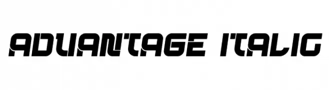
( Fonts by vladimirnikolic - Personal-use only. For commercial use please contact owner. )
A bold, italicized font with a futuristic and dynamic design.
![Advantage Italic تنزيل الخطوط]() تنزيل 230 التنزيلات@WebFont
تنزيل 230 التنزيلات@WebFont -
( Copyright 2018 The Krub Project Authors (https://github.com/cadsondemak/Krub) )
A modern, light sans-serif font with low contrast and excellent readability.
![Krub Light تنزيل الخطوط]() تنزيل 230 التنزيلات@WebFont
تنزيل 230 التنزيلات@WebFont


ما هي أبرز الخطوط الآن؟
تحظى Left Hand Luke 3D, Neue Zier Schrift, RecklessSample, OldaniaADFStd-Bold and Emmenthaler Normal بشعبية لخطوطها النظيفة وتطبيقاتها الواسعة — من الهوية البصرية إلى الصفحات المقصودة والملصقات.
أي الخطوط تُستخدم كثيرًا في الشعارات؟
تُعد السان سيريف الهندسية (مثل Poppins وعائلات على نمط Gotham) خيارًا شائعًا لعلامات نظيفة قابلة للتوسع. ولإضفاء طابع ودي، تبقى السكريبت واليدوية خيارًا كلاسيكيًا. اجمع عنوانًا بارزًا مع خط نصي محايد لتحقيق التوازن والتميّز.
كم مرة يتم تحديث قائمة أعلى الخطوط؟
نحدّثها بانتظام استنادًا إلى التنزيلات والنشاط الفعلي. عُد إليها كثيرًا لاكتشاف النجوم الصاعدة مبكرًا.
💡 نصيحة: أضف هذه الصفحة إلى العلامات — تتغير الاتجاهات بسرعة وقد تُلهم خطوط اليوم الرائجة إعادة العلامة غدًا.