مرحبًا بك في قسم أعلى الخطوط — حيث تلتقي الشعبية بالجودة. هذه هي الخطوط الأكثر تنزيلًا واستخدامًا هذا العام من قبل مجتمعنا. إذا كنت بحاجة إلى اختيار موثوق للشعارات أو الويب أو وسائل التواصل، فابدأ من هنا.
يتميز كل خط رائج بتوازن جيد وقابلية قراءة وتعدد استخدامات. ستجد سان سيريف حديثة، وسكريبتات أنيقة، وسيريف كلاسيكية، وخطوط عرض minimal مختارة بعناية.
-
 تنزيل 230 التنزيلات@WebFont
 -
( Fonts by akbarmeasalaro - Personal-use only. For commercial use please contact owner. )
A graceful script font with flowing, cursive characters and consistent stroke width.
![Aurum تنزيل الخطوط]() تنزيل 230 التنزيلات@WebFont
تنزيل 230 التنزيلات@WebFont -
( Fonts by David Espinosa - http://issuu.com/davidespinosa5/ )
A modern, bold italic font with sleek, elongated characters.
![Daniela Italic Bold تنزيل الخطوط]() تنزيل 230 التنزيلات@WebFont
تنزيل 230 التنزيلات@WebFont -
( Fonts by Docallisme HAS - Ryal - docallisme.blogspot.com - Personal-use only. For commercial use please contact owner. )
A playful, cloud-like decorative font with bold, rounded outlines.
![AWAN NUSANTARA تنزيل الخطوط]() تنزيل 230 التنزيلات@WebFont
تنزيل 230 التنزيلات@WebFont -
( Fonts by www.houseoflime.com )
Ornamental font with Japanese-inspired emblematic illustrations.
![Dover Japanese Design تنزيل الخطوط]() تنزيل 230 التنزيلات@WebFont
تنزيل 230 التنزيلات@WebFont -
-
( Iconian Fonts - Daniel Zadorozny - www.iconian.com )
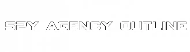
A bold, geometric outline font with a futuristic and technical style.
![Spy Agency Outline تنزيل الخطوط]() تنزيل 230 التنزيلات@WebFont
تنزيل 230 التنزيلات@WebFont -
( Fonts by Manfred Klein. Free for private and charity use. Free for commercial with donation to organizations )
A traditional Blackletter font with ornate, angular letterforms and a gothic aesthetic.
![CuxhavenFraktur تنزيل الخطوط]() تنزيل 230 التنزيلات@WebFont
تنزيل 230 التنزيلات@WebFont -
( Lukas Schiltknecht - www.getthepro.ch )
A modern sans-serif font with clean lines and a geometric touch.
![phatOtto تنزيل الخطوط]() تنزيل 230 التنزيلات@WebFont
تنزيل 230 التنزيلات@WebFont -
![ODINS SPEAR تنزيل الخطوط]() تنزيل 230 التنزيلات@WebFont
تنزيل 230 التنزيلات@WebFont -
( Fonts by Misti`s Fonts - mistifonts.com - Personal-use only. For commercial use please contact owner. )
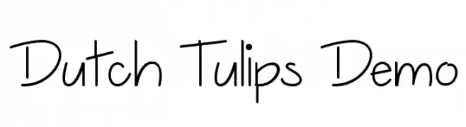
A playful, handwritten font with rounded edges and a casual style.
![Dutch Tulips Demo تنزيل الخطوط]() تنزيل 230 التنزيلات@WebFont
تنزيل 230 التنزيلات@WebFont


ما هي أبرز الخطوط الآن؟
تحظى CooperHewitt-BookItalic, Aurum, Daniela Italic Bold, AWAN NUSANTARA and Dover Japanese Design بشعبية لخطوطها النظيفة وتطبيقاتها الواسعة — من الهوية البصرية إلى الصفحات المقصودة والملصقات.
أي الخطوط تُستخدم كثيرًا في الشعارات؟
تُعد السان سيريف الهندسية (مثل Poppins وعائلات على نمط Gotham) خيارًا شائعًا لعلامات نظيفة قابلة للتوسع. ولإضفاء طابع ودي، تبقى السكريبت واليدوية خيارًا كلاسيكيًا. اجمع عنوانًا بارزًا مع خط نصي محايد لتحقيق التوازن والتميّز.
كم مرة يتم تحديث قائمة أعلى الخطوط؟
نحدّثها بانتظام استنادًا إلى التنزيلات والنشاط الفعلي. عُد إليها كثيرًا لاكتشاف النجوم الصاعدة مبكرًا.
💡 نصيحة: أضف هذه الصفحة إلى العلامات — تتغير الاتجاهات بسرعة وقد تُلهم خطوط اليوم الرائجة إعادة العلامة غدًا.