مرحبًا بك في قسم أعلى الخطوط — حيث تلتقي الشعبية بالجودة. هذه هي الخطوط الأكثر تنزيلًا واستخدامًا هذا العام من قبل مجتمعنا. إذا كنت بحاجة إلى اختيار موثوق للشعارات أو الويب أو وسائل التواصل، فابدأ من هنا.
يتميز كل خط رائج بتوازن جيد وقابلية قراءة وتعدد استخدامات. ستجد سان سيريف حديثة، وسكريبتات أنيقة، وسيريف كلاسيكية، وخطوط عرض minimal مختارة بعناية.
-
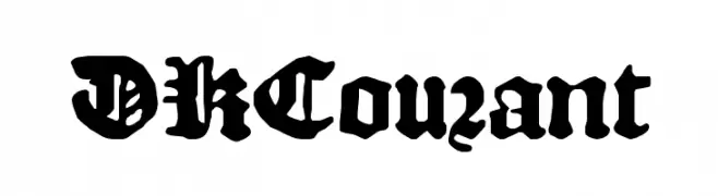
( Fonts by David Kerkhoff - www.hanodedphotography.com )
A bold, gothic-style font with intricate details and a medieval flair.
 تنزيل 231 التنزيلات@WebFont
 -
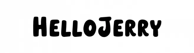
( Fonts by Weape Studio )
A bold, playful font with rounded, thick strokes and a whimsical style.
![HelloJerry تنزيل الخطوط]() تنزيل 231 التنزيلات@WebFont
تنزيل 231 التنزيلات@WebFont -
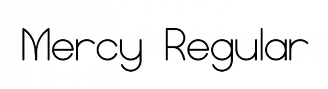
( Fonts by vladimirnikolic - Personal-use only. For commercial use please contact owner. )
A modern, geometric font with rounded edges and uniform stroke width.
![Mercy Regular تنزيل الخطوط]() تنزيل 231 التنزيلات@WebFont
تنزيل 231 التنزيلات@WebFont -
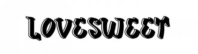
( Fonts by Mr.Soon Design )
A bold, playful font with a three-dimensional graffiti-inspired style.
![Love Sweet تنزيل الخطوط]() تنزيل 231 التنزيلات@WebFont
تنزيل 231 التنزيلات@WebFont -
( Noto is a trademark of Google Inc. Noto fonts are open source. All Noto fonts are published under the SIL Open Font License, Version 1.1 )
Elegant serif font with italic slant, extra-condensed width, and semi-bold weight.
![Noto Serif Display ExtraCondensed SemiBold Italic تنزيل الخطوط]() تنزيل 231 التنزيلات@WebFont
تنزيل 231 التنزيلات@WebFont -
-
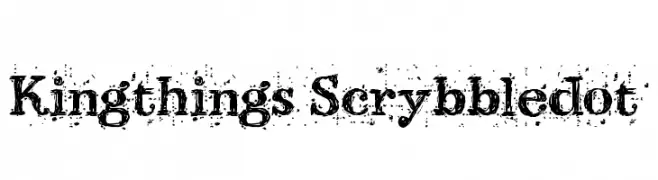
( Font by kingthingsfonts.co.uk )
A bold, distressed font with a hand-drawn, textured style.
![Kingthings Scrybbledot تنزيل الخطوط]() تنزيل 231 التنزيلات@WebFont
تنزيل 231 التنزيلات@WebFont -
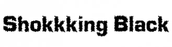
![Shokkking Black تنزيل الخطوط]() تنزيل 231 التنزيلات@WebFont
تنزيل 231 التنزيلات@WebFont -
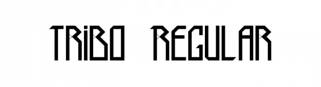
( Fonts by Mixi Ignacio )
A geometric, angular font with a bold, futuristic style.
![Tribo Regular تنزيل الخطوط]() تنزيل 231 التنزيلات@WebFont
تنزيل 231 التنزيلات@WebFont -
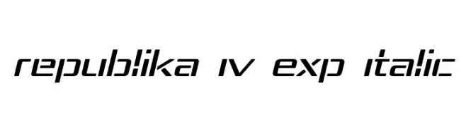
( Fonts by Apostrophic Lab )
A modern, italicized font with expanded, geometric shapes and clean lines.
![Republika IV Exp Italic تنزيل الخطوط]() تنزيل 231 التنزيلات@WebFont
تنزيل 231 التنزيلات@WebFont -
( Fonts by TypeOff )
A bold, modern sans-serif font with a strong and assertive appearance.
![Martel Sans ExtraBold تنزيل الخطوط]() تنزيل 231 التنزيلات@WebFont
تنزيل 231 التنزيلات@WebFont

ما هي أبرز الخطوط الآن؟
تحظى DKCourant, HelloJerry, Mercy Regular, Love Sweet and Noto Serif Display ExtraCondensed SemiBold Italic بشعبية لخطوطها النظيفة وتطبيقاتها الواسعة — من الهوية البصرية إلى الصفحات المقصودة والملصقات.
أي الخطوط تُستخدم كثيرًا في الشعارات؟
تُعد السان سيريف الهندسية (مثل Poppins وعائلات على نمط Gotham) خيارًا شائعًا لعلامات نظيفة قابلة للتوسع. ولإضفاء طابع ودي، تبقى السكريبت واليدوية خيارًا كلاسيكيًا. اجمع عنوانًا بارزًا مع خط نصي محايد لتحقيق التوازن والتميّز.
كم مرة يتم تحديث قائمة أعلى الخطوط؟
نحدّثها بانتظام استنادًا إلى التنزيلات والنشاط الفعلي. عُد إليها كثيرًا لاكتشاف النجوم الصاعدة مبكرًا.
💡 نصيحة: أضف هذه الصفحة إلى العلامات — تتغير الاتجاهات بسرعة وقد تُلهم خطوط اليوم الرائجة إعادة العلامة غدًا.