مرحبًا بك في قسم أعلى الخطوط — حيث تلتقي الشعبية بالجودة. هذه هي الخطوط الأكثر تنزيلًا واستخدامًا هذا العام من قبل مجتمعنا. إذا كنت بحاجة إلى اختيار موثوق للشعارات أو الويب أو وسائل التواصل، فابدأ من هنا.
يتميز كل خط رائج بتوازن جيد وقابلية قراءة وتعدد استخدامات. ستجد سان سيريف حديثة، وسكريبتات أنيقة، وسيريف كلاسيكية، وخطوط عرض minimal مختارة بعناية.
-
( Adha Azzaki - www.visitkabkendal.com )
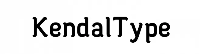
A bold, rounded font with a modern and approachable style.
 تنزيل 242 التنزيلات@WebFont
 -
( Fonts by junkohanhero )
A bold, distressed font with a vintage, grunge aesthetic.
![Long distance call تنزيل الخطوط]() تنزيل 242 التنزيلات@WebFont
تنزيل 242 التنزيلات@WebFont -
( Fonts by Mr. Basharat Ali - Personal-use only. For commercial use please contact owner. )
A classic serif font with elegant, sharp serifs and a sophisticated appearance.
![KhushaNuma Regular تنزيل الخطوط]() تنزيل 241 التنزيلات@WebFont
تنزيل 241 التنزيلات@WebFont -
( Fonts by www.chequered.ink - Chequered Ink - Personal-use only. For commercial use please contact owner. )
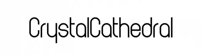
A modern, geometric font with clean lines and a condensed style.
![Crystal Cathedral تنزيل الخطوط]() تنزيل 241 التنزيلات@WebFont
تنزيل 241 التنزيلات@WebFont -
( Fonts by Spork Thug Typography - Josh Wilhelm - www.lifewithouttaffy.com/taffy/blog )
A bold, geometric font with a vintage yet modern appeal, ideal for impactful headlines.
![Quite Blunt تنزيل الخطوط]() تنزيل 241 التنزيلات@WebFont
تنزيل 241 التنزيلات@WebFont -
-
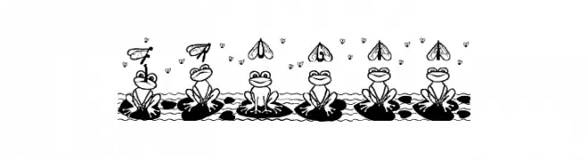
![Frogii تنزيل الخطوط]() تنزيل 241 التنزيلات@WebFont
تنزيل 241 التنزيلات@WebFont -
( Fonts by Manfred Klein. Free for private and charity use. Free for commercial with donation to organizations )
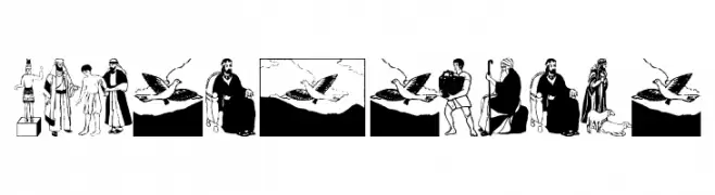
Illustrative, story-driven font with biblical and ancient motifs.
![OldTestament تنزيل الخطوط]() تنزيل 241 التنزيلات@WebFont
تنزيل 241 التنزيلات@WebFont -
( Fonts by Mr Fisk - Mike Larsson - fontorama.net )
A chaotic, splattered font with irregular shapes and varying stroke thicknesses.
![Evil-Mail تنزيل الخطوط]() تنزيل 241 التنزيلات@WebFont
تنزيل 241 التنزيلات@WebFont -
( Fonts by MJType )
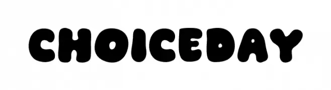
A bold, playful font with rounded, bubbly characters ideal for fun designs.
![Choice Day تنزيل الخطوط]() تنزيل 241 التنزيلات@WebFont
تنزيل 241 التنزيلات@WebFont -
![Stucked in Gears تنزيل الخطوط]() تنزيل 241 التنزيلات@WebFont
تنزيل 241 التنزيلات@WebFont


ما هي أبرز الخطوط الآن؟
تحظى Kendal Type, Long distance call, KhushaNuma Regular, Crystal Cathedral and Quite Blunt بشعبية لخطوطها النظيفة وتطبيقاتها الواسعة — من الهوية البصرية إلى الصفحات المقصودة والملصقات.
أي الخطوط تُستخدم كثيرًا في الشعارات؟
تُعد السان سيريف الهندسية (مثل Poppins وعائلات على نمط Gotham) خيارًا شائعًا لعلامات نظيفة قابلة للتوسع. ولإضفاء طابع ودي، تبقى السكريبت واليدوية خيارًا كلاسيكيًا. اجمع عنوانًا بارزًا مع خط نصي محايد لتحقيق التوازن والتميّز.
كم مرة يتم تحديث قائمة أعلى الخطوط؟
نحدّثها بانتظام استنادًا إلى التنزيلات والنشاط الفعلي. عُد إليها كثيرًا لاكتشاف النجوم الصاعدة مبكرًا.
💡 نصيحة: أضف هذه الصفحة إلى العلامات — تتغير الاتجاهات بسرعة وقد تُلهم خطوط اليوم الرائجة إعادة العلامة غدًا.