مرحبًا بك في قسم أعلى الخطوط — حيث تلتقي الشعبية بالجودة. هذه هي الخطوط الأكثر تنزيلًا واستخدامًا هذا العام من قبل مجتمعنا. إذا كنت بحاجة إلى اختيار موثوق للشعارات أو الويب أو وسائل التواصل، فابدأ من هنا.
يتميز كل خط رائج بتوازن جيد وقابلية قراءة وتعدد استخدامات. ستجد سان سيريف حديثة، وسكريبتات أنيقة، وسيريف كلاسيكية، وخطوط عرض minimal مختارة بعناية.
-
( Fonts by German Olaya - www.typo5.com )
An expressive, hand-drawn font with irregular, artistic strokes.
 تنزيل 251 التنزيلات@WebFont
 -
( Fonts by Sorkin Type Co )
A modern, bold, italic sans-serif font with medium contrast and compact spacing.
![MerriweatherSans-BoldItalic تنزيل الخطوط]() تنزيل 251 التنزيلات@WebFont
تنزيل 251 التنزيلات@WebFont -
( Fonts by Michel Martinsson - lunchtype.com - Personal-use only. For commercial use please contact owner. )
A bold, condensed font with a strong vertical emphasis, perfect for impactful headlines.
![Ballbase تنزيل الخطوط]() تنزيل 251 التنزيلات@WebFont
تنزيل 251 التنزيلات@WebFont -
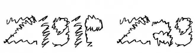
![Zigie Zag تنزيل الخطوط]() تنزيل 251 التنزيلات@WebFont
تنزيل 251 التنزيلات@WebFont -
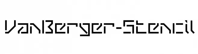
( This font is freeware. www.thenorthernblock.co.uk )
A bold, geometric stencil font with sharp angles and clean lines.
![VanBerger-Stencil تنزيل الخطوط]() تنزيل 251 التنزيلات@WebFont
تنزيل 251 التنزيلات@WebFont -
-
![Penmanship Birds and Ornaments Free تنزيل الخطوط]() تنزيل 251 التنزيلات@WebFont
تنزيل 251 التنزيلات@WebFont -
( Fonts by Syaf Rizal - Khurasan - Personal-use only. For commercial use please contact owner. )
A bold, brush-style font with an energetic and dynamic appearance.
![Oldex تنزيل الخطوط]() تنزيل 251 التنزيلات@WebFont
تنزيل 251 التنزيلات@WebFont -
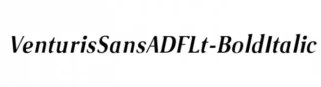
( Fonts by Arkandis Digital Foundry )
A bold italic font with modern elegance and medium contrast, ideal for dynamic designs.
![VenturisSansADFLt-BoldItalic تنزيل الخطوط]() تنزيل 250 التنزيلات@WebFont
تنزيل 250 التنزيلات@WebFont -
( Fonts by Eko Bimantara - Personal-use only. For commercial use please contact owner. )
A bold, oblique font with a modern and assertive style.
![Altone Trial Bold Oblique تنزيل الخطوط]() تنزيل 250 التنزيلات@WebFont
تنزيل 250 التنزيلات@WebFont -
( Fonts by Daniel Zadorozny - www.iconian.com )
A playful, bubble-like outline font with rounded edges and a whimsical style.
![Bubble Butt Outline Regular تنزيل الخطوط]() تنزيل 250 التنزيلات@WebFont
تنزيل 250 التنزيلات@WebFont


ما هي أبرز الخطوط الآن؟
تحظى Gim, MerriweatherSans-BoldItalic, Ballbase, Zigie Zag and VanBerger-Stencil بشعبية لخطوطها النظيفة وتطبيقاتها الواسعة — من الهوية البصرية إلى الصفحات المقصودة والملصقات.
أي الخطوط تُستخدم كثيرًا في الشعارات؟
تُعد السان سيريف الهندسية (مثل Poppins وعائلات على نمط Gotham) خيارًا شائعًا لعلامات نظيفة قابلة للتوسع. ولإضفاء طابع ودي، تبقى السكريبت واليدوية خيارًا كلاسيكيًا. اجمع عنوانًا بارزًا مع خط نصي محايد لتحقيق التوازن والتميّز.
كم مرة يتم تحديث قائمة أعلى الخطوط؟
نحدّثها بانتظام استنادًا إلى التنزيلات والنشاط الفعلي. عُد إليها كثيرًا لاكتشاف النجوم الصاعدة مبكرًا.
💡 نصيحة: أضف هذه الصفحة إلى العلامات — تتغير الاتجاهات بسرعة وقد تُلهم خطوط اليوم الرائجة إعادة العلامة غدًا.