مرحبًا بك في قسم أعلى الخطوط — حيث تلتقي الشعبية بالجودة. هذه هي الخطوط الأكثر تنزيلًا واستخدامًا هذا العام من قبل مجتمعنا. إذا كنت بحاجة إلى اختيار موثوق للشعارات أو الويب أو وسائل التواصل، فابدأ من هنا.
يتميز كل خط رائج بتوازن جيد وقابلية قراءة وتعدد استخدامات. ستجد سان سيريف حديثة، وسكريبتات أنيقة، وسيريف كلاسيكية، وخطوط عرض minimal مختارة بعناية.
-
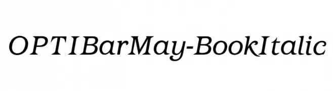
( Fonts by Castcraft Software - opti.netii.net - check the website before use )
Elegant serif font with an italic slant and moderate stroke contrast.
 تنزيل 256 التنزيلات@WebFont
 -
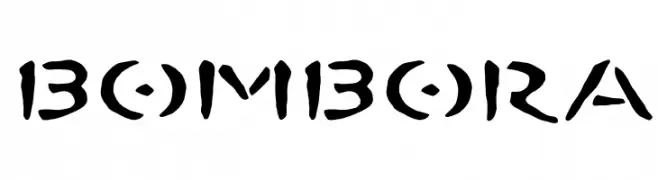
![BOMBORA تنزيل الخطوط]() تنزيل 256 التنزيلات@WebFont
تنزيل 256 التنزيلات@WebFont -
( Fonts by Arkandis Digital Foundry )
A bold, italic serif font with a classic and elegant style.
![VenturisOldADF-BoldItalic تنزيل الخطوط]() تنزيل 256 التنزيلات@WebFont
تنزيل 256 التنزيلات@WebFont -
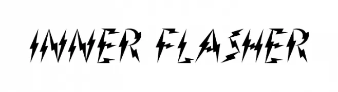
( Fonts by www.waltervelezart.com )
A bold, angular font with a lightning-like, energetic design.
![Inner Flasher تنزيل الخطوط]() تنزيل 256 التنزيلات@WebFont
تنزيل 256 التنزيلات@WebFont -
( Fonts by Wino S Kadir - weknow - www.revolge.com/shop/weknow/ - Personal-use only. For commercial use please contact owner. )
A bold, geometric font with a modern, industrial aesthetic.
![underground تنزيل الخطوط]() تنزيل 256 التنزيلات@WebFont
تنزيل 256 التنزيلات@WebFont -
-
( Noto is a trademark of Google Inc. Noto fonts are open source. All Noto fonts are published under the SIL Open Font License, Version 1.1 )
A bold, structured font with medium contrast and elegant serif elements.
![Noto Serif Ethiopic Bold تنزيل الخطوط]() تنزيل 256 التنزيلات@WebFont
تنزيل 256 التنزيلات@WebFont -
( Cooldesignlab - Kurniadi Saputra - creativemarket.com/cooldesignlab?u=cooldesignlab )
An elegant script font with flowing, cursive letterforms and high contrast strokes.
![paulinescript تنزيل الخطوط]() تنزيل 256 التنزيلات@WebFont
تنزيل 256 التنزيلات@WebFont -
( Fonts by www.blambot.com )
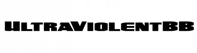
A bold, futuristic font with sharp angles and a strong presence.
![UltraViolentBB تنزيل الخطوط]() تنزيل 256 التنزيلات@WebFont
تنزيل 256 التنزيلات@WebFont -
( Fonts by Attype Studio )
A flowing cursive font with a natural, handwritten style.
![Yamatha Regular تنزيل الخطوط]() تنزيل 256 التنزيلات@WebFont
تنزيل 256 التنزيلات@WebFont -
( Fonts by a Neale Davidson - www.pixelsagas.com. Personal-use only. For commercial use please contact owner. )
A bold, pixelated font inspired by retro digital displays.
![Pixel Intv تنزيل الخطوط]() تنزيل 256 التنزيلات@WebFont
تنزيل 256 التنزيلات@WebFont


ما هي أبرز الخطوط الآن؟
تحظى OPTIBarMay-BookItalic, BOMBORA, VenturisOldADF-BoldItalic, Inner Flasher and underground بشعبية لخطوطها النظيفة وتطبيقاتها الواسعة — من الهوية البصرية إلى الصفحات المقصودة والملصقات.
أي الخطوط تُستخدم كثيرًا في الشعارات؟
تُعد السان سيريف الهندسية (مثل Poppins وعائلات على نمط Gotham) خيارًا شائعًا لعلامات نظيفة قابلة للتوسع. ولإضفاء طابع ودي، تبقى السكريبت واليدوية خيارًا كلاسيكيًا. اجمع عنوانًا بارزًا مع خط نصي محايد لتحقيق التوازن والتميّز.
كم مرة يتم تحديث قائمة أعلى الخطوط؟
نحدّثها بانتظام استنادًا إلى التنزيلات والنشاط الفعلي. عُد إليها كثيرًا لاكتشاف النجوم الصاعدة مبكرًا.
💡 نصيحة: أضف هذه الصفحة إلى العلامات — تتغير الاتجاهات بسرعة وقد تُلهم خطوط اليوم الرائجة إعادة العلامة غدًا.