مرحبًا بك في قسم أعلى الخطوط — حيث تلتقي الشعبية بالجودة. هذه هي الخطوط الأكثر تنزيلًا واستخدامًا هذا العام من قبل مجتمعنا. إذا كنت بحاجة إلى اختيار موثوق للشعارات أو الويب أو وسائل التواصل، فابدأ من هنا.
يتميز كل خط رائج بتوازن جيد وقابلية قراءة وتعدد استخدامات. ستجد سان سيريف حديثة، وسكريبتات أنيقة، وسيريف كلاسيكية، وخطوط عرض minimal مختارة بعناية.
-
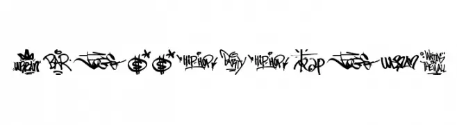
( Fonts by www.woodcutter.es - woodcutter Manero - Personal-use only. For commercial use please contact owner. )
A dynamic and expressive graffiti-style font with exaggerated curves and sharp angles.
 تنزيل 280 التنزيلات@WebFont
 -
( Fonts by www.paintblackeditions.org )
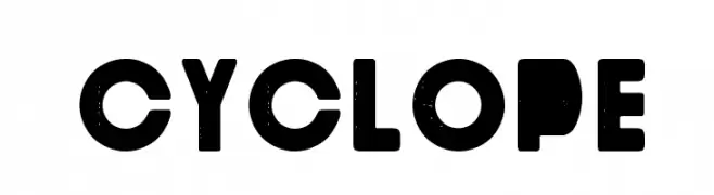
A bold, geometric font with a vintage, distressed texture.
![Cyclope تنزيل الخطوط]() تنزيل 280 التنزيلات@WebFont
تنزيل 280 التنزيلات@WebFont -
( Fonts by Douglas Vitkauskas - www.vtksdesign.com. Personal-use only. For commercial use please contact owner. )
A bold, brush-style font with dynamic and expressive characters.
![vtks Lemon Drop تنزيل الخطوط]() تنزيل 280 التنزيلات@WebFont
تنزيل 280 التنزيلات@WebFont -
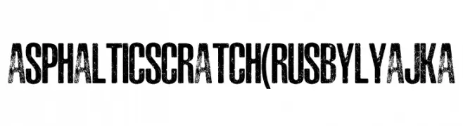
( Fonts by FONTS BY LYAJKA - Personal-use only. For commercial use please contact owner. )
A bold, distressed font with a gritty, textured appearance ideal for edgy designs.
![ASPHALTIC SCRATCH(RUS BY LYAJKA تنزيل الخطوط]() تنزيل 280 التنزيلات@WebFont
تنزيل 280 التنزيلات@WebFont -
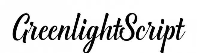
( Fonts by Great Studio - Mulkan Nazir - Personal-use only. For commercial use please contact owner. )
A lively, cursive script font with smooth, connected strokes and medium contrast.
![GreenlightScript تنزيل الخطوط]() تنزيل 280 التنزيلات@WebFont
تنزيل 280 التنزيلات@WebFont -
-
![DS_Cosmo Semi-expanded SemiBold تنزيل الخطوط]() تنزيل 280 التنزيلات@WebFont
تنزيل 280 التنزيلات@WebFont -
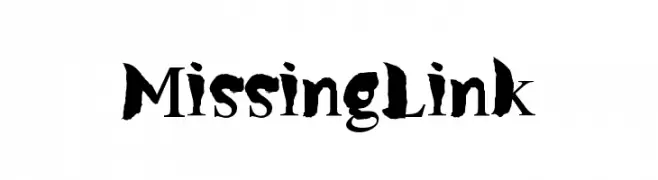
( Fonts by Daniel Gauthier )
A bold, brush-like font with a dramatic and artistic style.
![MissingLink تنزيل الخطوط]() تنزيل 280 التنزيلات@WebFont
تنزيل 280 التنزيلات@WebFont -
( Fonts by Allouse Studio - Personal-use only. For commercial use please contact owner. )
A playful, casual handwritten font with rounded, consistent strokes.
![The August تنزيل الخطوط]() تنزيل 280 التنزيلات@WebFont
تنزيل 280 التنزيلات@WebFont -
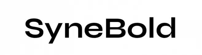
( Fonts by Bonjour Monde )
A bold, geometric sans-serif font with a modern and clean design.
![Syne Bold تنزيل الخطوط]() تنزيل 280 التنزيلات@WebFont
تنزيل 280 التنزيلات@WebFont -
( Fonts by William Jeovah de Medeiros )
A playful, bold handwritten font with rounded strokes and an informal style.
![Decalk تنزيل الخطوط]() تنزيل 280 التنزيلات@WebFont
تنزيل 280 التنزيلات@WebFont


ما هي أبرز الخطوط الآن؟
تحظى Graffiti Tags, Cyclope, vtks Lemon Drop, ASPHALTIC SCRATCH(RUS BY LYAJKA and GreenlightScript بشعبية لخطوطها النظيفة وتطبيقاتها الواسعة — من الهوية البصرية إلى الصفحات المقصودة والملصقات.
أي الخطوط تُستخدم كثيرًا في الشعارات؟
تُعد السان سيريف الهندسية (مثل Poppins وعائلات على نمط Gotham) خيارًا شائعًا لعلامات نظيفة قابلة للتوسع. ولإضفاء طابع ودي، تبقى السكريبت واليدوية خيارًا كلاسيكيًا. اجمع عنوانًا بارزًا مع خط نصي محايد لتحقيق التوازن والتميّز.
كم مرة يتم تحديث قائمة أعلى الخطوط؟
نحدّثها بانتظام استنادًا إلى التنزيلات والنشاط الفعلي. عُد إليها كثيرًا لاكتشاف النجوم الصاعدة مبكرًا.
💡 نصيحة: أضف هذه الصفحة إلى العلامات — تتغير الاتجاهات بسرعة وقد تُلهم خطوط اليوم الرائجة إعادة العلامة غدًا.