مرحبًا بك في قسم أعلى الخطوط — حيث تلتقي الشعبية بالجودة. هذه هي الخطوط الأكثر تنزيلًا واستخدامًا هذا العام من قبل مجتمعنا. إذا كنت بحاجة إلى اختيار موثوق للشعارات أو الويب أو وسائل التواصل، فابدأ من هنا.
يتميز كل خط رائج بتوازن جيد وقابلية قراءة وتعدد استخدامات. ستجد سان سيريف حديثة، وسكريبتات أنيقة، وسيريف كلاسيكية، وخطوط عرض minimal مختارة بعناية.
-
( Copyright (c) 2015, Cadson Demak (info@cadsondemak.com) )
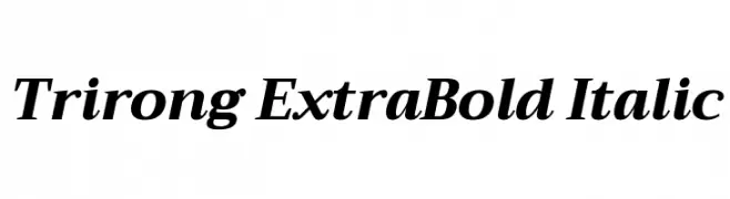
A bold, italic serif font with a classic and elegant style.
 تنزيل 282 التنزيلات@WebFont
 -
( Fonts by Saji Johnny Kundukulam - Personal-use only. For commercial use please contact owner. )
A bold, jagged, and distressed font with a grunge aesthetic.
![SAINT تنزيل الخطوط]() تنزيل 282 التنزيلات@WebFont
تنزيل 282 التنزيلات@WebFont -
( Fonts by Dieter Steffmann )
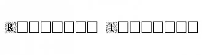
Ornate, decorative initials with intricate borders, ideal for elegant designs.
![Roycroft Initials تنزيل الخطوط]() تنزيل 282 التنزيلات@WebFont
تنزيل 282 التنزيلات@WebFont -
( Fonts by www.blambot.com )
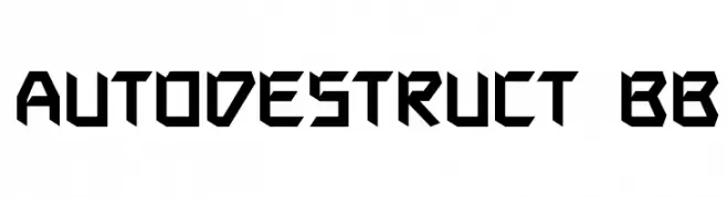
A bold, angular font with a futuristic and geometric design.
![Autodestruct BB تنزيل الخطوط]() تنزيل 282 التنزيلات@WebFont
تنزيل 282 التنزيلات@WebFont -
( Fonts by Sunset Gallery - Personal-use only. For commercial use please contact owner. )
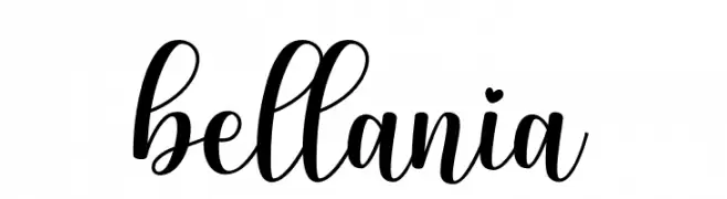
A graceful and elegant script font with flowing cursive letters.
![bellania تنزيل الخطوط]() تنزيل 282 التنزيلات@WebFont
تنزيل 282 التنزيلات@WebFont -
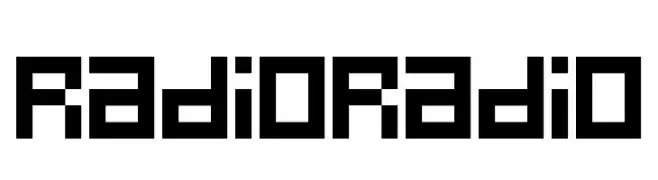
-
![RadioRadio تنزيل الخطوط]() تنزيل 282 التنزيلات@WebFont
تنزيل 282 التنزيلات@WebFont -
( Fonts by Rich Gast - www.greywolfwebworks.com OFF SITE )
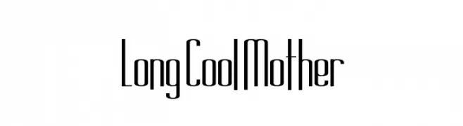
A tall, narrow font with a sleek, modern design and minimal contrast.
![Long Cool Mother تنزيل الخطوط]() تنزيل 282 التنزيلات
تنزيل 282 التنزيلات -
( Fonts by Studio Hello Good )
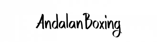
A bold, expressive font with dynamic strokes and a modern artistic style.
![Andalan Boxing تنزيل الخطوط]() تنزيل 282 التنزيلات@WebFont
تنزيل 282 التنزيلات@WebFont -
( Fonts by Apostrophic Lab )
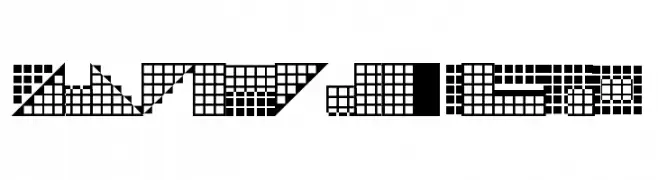
A decorative, geometric font with a pixelated, grid-like design.
![Pica Hole - SIM تنزيل الخطوط]() تنزيل 282 التنزيلات@WebFont
تنزيل 282 التنزيلات@WebFont -
( Fonts by HyFont Studio - www.hyfont.com - Personal-use only. For commercial use please contact owner. )
A bold, angular font with a geometric and modern design.
![HFLacrimosa تنزيل الخطوط]() تنزيل 282 التنزيلات@WebFont
تنزيل 282 التنزيلات@WebFont

ما هي أبرز الخطوط الآن؟
تحظى Trirong ExtraBold Italic, SAINT, Roycroft Initials, Autodestruct BB and bellania بشعبية لخطوطها النظيفة وتطبيقاتها الواسعة — من الهوية البصرية إلى الصفحات المقصودة والملصقات.
أي الخطوط تُستخدم كثيرًا في الشعارات؟
تُعد السان سيريف الهندسية (مثل Poppins وعائلات على نمط Gotham) خيارًا شائعًا لعلامات نظيفة قابلة للتوسع. ولإضفاء طابع ودي، تبقى السكريبت واليدوية خيارًا كلاسيكيًا. اجمع عنوانًا بارزًا مع خط نصي محايد لتحقيق التوازن والتميّز.
كم مرة يتم تحديث قائمة أعلى الخطوط؟
نحدّثها بانتظام استنادًا إلى التنزيلات والنشاط الفعلي. عُد إليها كثيرًا لاكتشاف النجوم الصاعدة مبكرًا.
💡 نصيحة: أضف هذه الصفحة إلى العلامات — تتغير الاتجاهات بسرعة وقد تُلهم خطوط اليوم الرائجة إعادة العلامة غدًا.