مرحبًا بك في قسم أعلى الخطوط — حيث تلتقي الشعبية بالجودة. هذه هي الخطوط الأكثر تنزيلًا واستخدامًا هذا العام من قبل مجتمعنا. إذا كنت بحاجة إلى اختيار موثوق للشعارات أو الويب أو وسائل التواصل، فابدأ من هنا.
يتميز كل خط رائج بتوازن جيد وقابلية قراءة وتعدد استخدامات. ستجد سان سيريف حديثة، وسكريبتات أنيقة، وسيريف كلاسيكية، وخطوط عرض minimal مختارة بعناية.
-
 تنزيل 290 التنزيلات@WebFont
 -
( Fonts by Ruggero Motta - ruggeromotta.com - Personal-use only. For commercial use please contact owner. )
A bold, modern font with thick strokes and a geometric influence, ideal for impactful headlines.
![Fatfont تنزيل الخطوط]() تنزيل 290 التنزيلات@WebFont
تنزيل 290 التنزيلات@WebFont -
( Fonts by zamjump - Ahmad Zamzami - Personal-use only. For commercial use please contact owner. )
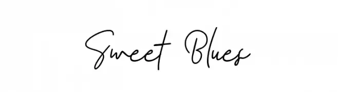
A flowing, cursive font with elegant loops and smooth transitions.
![Sweet Blues تنزيل الخطوط]() تنزيل 290 التنزيلات@WebFont
تنزيل 290 التنزيلات@WebFont -
( Fonts by Dan P. Lyons - Personal-use only. For commercial use please contact owner. )
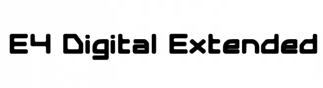
A futuristic, digital font with rounded edges and geometric structure.
![E4 Digital Extended تنزيل الخطوط]() تنزيل 290 التنزيلات@WebFont
تنزيل 290 التنزيلات@WebFont -
خط بواسطة JuanCasco. For commercial use please contact the owner.
( Fonts by Juan Casco - www.juancasco.net )
A bold, Gothic-style font with sharp, angular lines and intricate detailing.
![Neue Goth تنزيل الخطوط]() تنزيل 290 التنزيلات@WebFont
تنزيل 290 التنزيلات@WebFont -
-
( Fonts by Gassstype )
A bold, playful font with a hand-drawn, irregular style.
![Not Found تنزيل الخطوط]() تنزيل 290 التنزيلات@WebFont
تنزيل 290 التنزيلات@WebFont -
( Fonts by Burhan Afif - hanscostudio.com - Personal-use only. For commercial use please contact owner. )
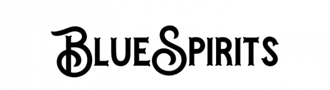
A decorative and bold font with whimsical uppercase letters and straightforward lowercase characters.
![Blue Spirits تنزيل الخطوط]() تنزيل 290 التنزيلات@WebFont
تنزيل 290 التنزيلات@WebFont -
( Fonts by www.crudfactory.com )
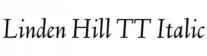
An elegant serif italic font with a refined and sophisticated style.
![Linden Hill TT Italic تنزيل الخطوط]() تنزيل 290 التنزيلات@WebFont
تنزيل 290 التنزيلات@WebFont -
( Fonts by Impallari Type - Personal-use only. For commercial use please contact owner. )
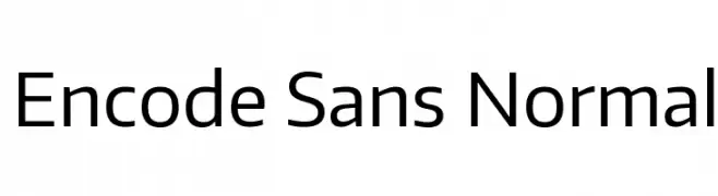
A clean, modern sans-serif typeface with excellent legibility.
![Encode Sans Normal تنزيل الخطوط]() تنزيل 290 التنزيلات@WebFont
تنزيل 290 التنزيلات@WebFont -
![Gabrial Ator تنزيل الخطوط]() تنزيل 290 التنزيلات@WebFont
تنزيل 290 التنزيلات@WebFont


ما هي أبرز الخطوط الآن؟
تحظى PHONIE, Fatfont, Sweet Blues, E4 Digital Extended and Neue Goth بشعبية لخطوطها النظيفة وتطبيقاتها الواسعة — من الهوية البصرية إلى الصفحات المقصودة والملصقات.
أي الخطوط تُستخدم كثيرًا في الشعارات؟
تُعد السان سيريف الهندسية (مثل Poppins وعائلات على نمط Gotham) خيارًا شائعًا لعلامات نظيفة قابلة للتوسع. ولإضفاء طابع ودي، تبقى السكريبت واليدوية خيارًا كلاسيكيًا. اجمع عنوانًا بارزًا مع خط نصي محايد لتحقيق التوازن والتميّز.
كم مرة يتم تحديث قائمة أعلى الخطوط؟
نحدّثها بانتظام استنادًا إلى التنزيلات والنشاط الفعلي. عُد إليها كثيرًا لاكتشاف النجوم الصاعدة مبكرًا.
💡 نصيحة: أضف هذه الصفحة إلى العلامات — تتغير الاتجاهات بسرعة وقد تُلهم خطوط اليوم الرائجة إعادة العلامة غدًا.