مرحبًا بك في قسم أعلى الخطوط — حيث تلتقي الشعبية بالجودة. هذه هي الخطوط الأكثر تنزيلًا واستخدامًا هذا العام من قبل مجتمعنا. إذا كنت بحاجة إلى اختيار موثوق للشعارات أو الويب أو وسائل التواصل، فابدأ من هنا.
يتميز كل خط رائج بتوازن جيد وقابلية قراءة وتعدد استخدامات. ستجد سان سيريف حديثة، وسكريبتات أنيقة، وسيريف كلاسيكية، وخطوط عرض minimal مختارة بعناية.
-
( Ana - www.anasfonts.com/ )
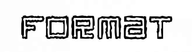
A modern, clean sans-serif font with consistent stroke width and excellent readability.
 تنزيل 294 التنزيلات@WebFont
 -
![Format تنزيل الخطوط]() تنزيل 294 التنزيلات@WebFont
تنزيل 294 التنزيلات@WebFont -
( Fonts by Muhammad Afif )
A bold, playful font with rounded edges and a friendly appearance.
![Positive Forward تنزيل الخطوط]() تنزيل 294 التنزيلات@WebFont
تنزيل 294 التنزيلات@WebFont -
( Fonts by Daniel Werneck )
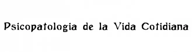
A bold, hand-drawn font with a gothic influence and dynamic strokes.
![Psicopatologia de la Vida Cotidiana تنزيل الخطوط]() تنزيل 294 التنزيلات@WebFont
تنزيل 294 التنزيلات@WebFont -
( Copyright (c) 2009, Mark Simonson (http://www.ms-studio.com, mark@marksimonson.com) )
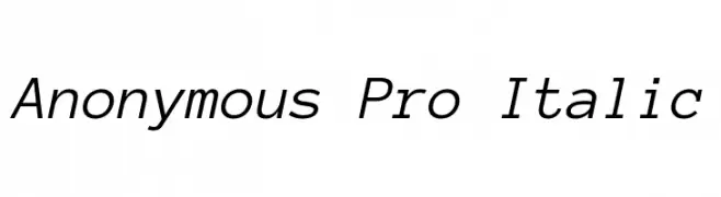
A modern, italic font with clean lines and consistent stroke width.
![Anonymous Pro Italic تنزيل الخطوط]() تنزيل 294 التنزيلات@WebFont
تنزيل 294 التنزيلات@WebFont -
-
( Fonts by Divide By Zero! - fonts.tom7.com )
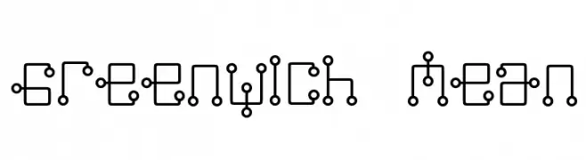
A futuristic, geometric font with interconnected lines and circles.
![Greenwich Mean تنزيل الخطوط]() تنزيل 294 التنزيلات@WebFont
تنزيل 294 التنزيلات@WebFont -
( Fonts by Billy Argel )
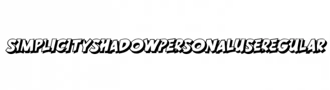
A bold, shadowed font with a dynamic, three-dimensional style.
![SIMPLICITY SHADOW PERSONAL USE Regular تنزيل الخطوط]() تنزيل 294 التنزيلات@WebFont
تنزيل 294 التنزيلات@WebFont -
( Fonts by Fonts by Rasmus Andersson / Changes by Cristiano Sobral with parts from Marc Monis - Personal-use only. For commercial use please contact owner. )
A bold, italicized sans-serif font with a modern and dynamic style.
![LinikSans-BoldItalic تنزيل الخطوط]() تنزيل 294 التنزيلات@WebFont
تنزيل 294 التنزيلات@WebFont -
( www.behance.net/Poemhaiku )
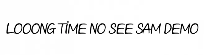
A playful, casual handwritten font with smooth, flowing strokes.
![Looong time no see Sam Demo تنزيل الخطوط]() تنزيل 294 التنزيلات@WebFont
تنزيل 294 التنزيلات@WebFont -
( Fonts by a Neale Davidson - www.pixelsagas.com. Personal-use only. For commercial use please contact owner. )
A bold, angular font with a modern, geometric style.
![Harker تنزيل الخطوط]() تنزيل 294 التنزيلات@WebFont
تنزيل 294 التنزيلات@WebFont


ما هي أبرز الخطوط الآن؟
تحظى CallingCards, Format, Positive Forward, Psicopatologia de la Vida Cotidiana and Anonymous Pro Italic بشعبية لخطوطها النظيفة وتطبيقاتها الواسعة — من الهوية البصرية إلى الصفحات المقصودة والملصقات.
أي الخطوط تُستخدم كثيرًا في الشعارات؟
تُعد السان سيريف الهندسية (مثل Poppins وعائلات على نمط Gotham) خيارًا شائعًا لعلامات نظيفة قابلة للتوسع. ولإضفاء طابع ودي، تبقى السكريبت واليدوية خيارًا كلاسيكيًا. اجمع عنوانًا بارزًا مع خط نصي محايد لتحقيق التوازن والتميّز.
كم مرة يتم تحديث قائمة أعلى الخطوط؟
نحدّثها بانتظام استنادًا إلى التنزيلات والنشاط الفعلي. عُد إليها كثيرًا لاكتشاف النجوم الصاعدة مبكرًا.
💡 نصيحة: أضف هذه الصفحة إلى العلامات — تتغير الاتجاهات بسرعة وقد تُلهم خطوط اليوم الرائجة إعادة العلامة غدًا.