مرحبًا بك في قسم أعلى الخطوط — حيث تلتقي الشعبية بالجودة. هذه هي الخطوط الأكثر تنزيلًا واستخدامًا هذا العام من قبل مجتمعنا. إذا كنت بحاجة إلى اختيار موثوق للشعارات أو الويب أو وسائل التواصل، فابدأ من هنا.
يتميز كل خط رائج بتوازن جيد وقابلية قراءة وتعدد استخدامات. ستجد سان سيريف حديثة، وسكريبتات أنيقة، وسيريف كلاسيكية، وخطوط عرض minimal مختارة بعناية.
-
 تنزيل 298 التنزيلات@WebFont
 -
( Fonts by www.aenigmafonts.com )
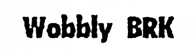
A playful, wobbly font with bold, irregular strokes and a hand-drawn feel.
![Wobbly BRK تنزيل الخطوط]() تنزيل 298 التنزيلات@WebFont
تنزيل 298 التنزيلات@WebFont -
( Fonts by a Max Infeld - XEROGRAPHER FONTS - xerographer.blogspot.com . Personal-use only. For commercial use please contact owner. )
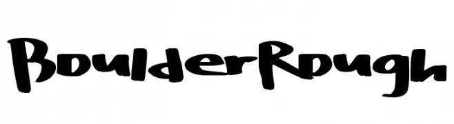
A bold, hand-drawn font with an energetic and rugged style.
![BoulderRough تنزيل الخطوط]() تنزيل 298 التنزيلات@WebFont
تنزيل 298 التنزيلات@WebFont -
( Fonts by Utopia - www.daleharris.com )
A bold, distressed font with a chaotic, grunge style.
![Turbulence [R.I.P Ikarus] تنزيل الخطوط]() تنزيل 298 التنزيلات@WebFont
تنزيل 298 التنزيلات@WebFont -
( Fonts by Manuel Lage )
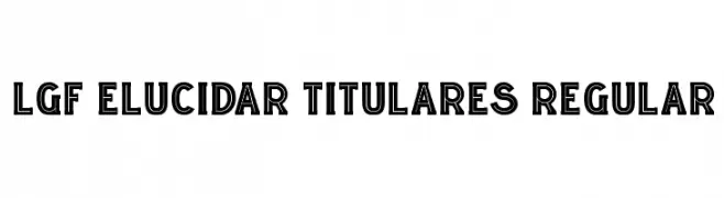
A bold, outlined font with a modern, industrial style.
![LGF ELUCIDAR TITULARES Regular تنزيل الخطوط]() تنزيل 298 التنزيلات@WebFont
تنزيل 298 التنزيلات@WebFont -
-
![Trinkets4 تنزيل الخطوط]() تنزيل 298 التنزيلات@WebFont
تنزيل 298 التنزيلات@WebFont -
( Fonts by dartcanada.tripod.com - Darren Rigby )
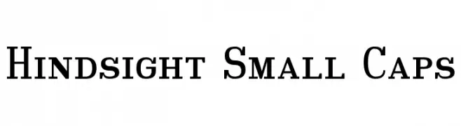
A classic serif typeface with bold uppercase and small caps lowercase letters, offering medium contrast and a formal appearance.
![Hindsight Small Caps تنزيل الخطوط]() تنزيل 298 التنزيلات@WebFont
تنزيل 298 التنزيلات@WebFont -
( Fonts by Edric Studio - Personal-use only. For commercial use please contact owner. )
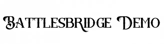
An ornate and decorative font with elaborate swirls and flourishes.
![Battlesbridge Demo تنزيل الخطوط]() تنزيل 298 التنزيلات@WebFont
تنزيل 298 التنزيلات@WebFont -
( Fonts by www.gliphmaker.com. Personal-use only. For commercial use please contact owner. )
A modern, geometric font with sharp angles and a dynamic style.
![Geisha تنزيل الخطوط]() تنزيل 298 التنزيلات@WebFont
تنزيل 298 التنزيلات@WebFont -
( Fonts by Jacob Fisher - www.pizzadude.dk )
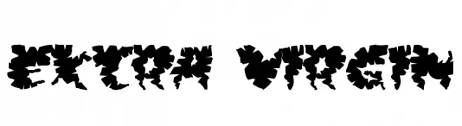
A bold, decorative font with jagged, leaf-like edges for an organic look.
![Extra virgin تنزيل الخطوط]() تنزيل 298 التنزيلات@WebFont
تنزيل 298 التنزيلات@WebFont
![Turbulence [R.I.P Ikarus] تنزيل الخطوط](https://d144mzi0q5mijx.cloudfront.net/img/T/U/Turbulence-RIP-Ikarus.webp)

ما هي أبرز الخطوط الآن؟
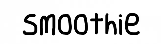
تحظى Smoothie, Wobbly BRK, BoulderRough, Turbulence [R.I.P Ikarus] and LGF ELUCIDAR TITULARES Regular بشعبية لخطوطها النظيفة وتطبيقاتها الواسعة — من الهوية البصرية إلى الصفحات المقصودة والملصقات.
أي الخطوط تُستخدم كثيرًا في الشعارات؟
تُعد السان سيريف الهندسية (مثل Poppins وعائلات على نمط Gotham) خيارًا شائعًا لعلامات نظيفة قابلة للتوسع. ولإضفاء طابع ودي، تبقى السكريبت واليدوية خيارًا كلاسيكيًا. اجمع عنوانًا بارزًا مع خط نصي محايد لتحقيق التوازن والتميّز.
كم مرة يتم تحديث قائمة أعلى الخطوط؟
نحدّثها بانتظام استنادًا إلى التنزيلات والنشاط الفعلي. عُد إليها كثيرًا لاكتشاف النجوم الصاعدة مبكرًا.
💡 نصيحة: أضف هذه الصفحة إلى العلامات — تتغير الاتجاهات بسرعة وقد تُلهم خطوط اليوم الرائجة إعادة العلامة غدًا.