مرحبًا بك في قسم أعلى الخطوط — حيث تلتقي الشعبية بالجودة. هذه هي الخطوط الأكثر تنزيلًا واستخدامًا هذا العام من قبل مجتمعنا. إذا كنت بحاجة إلى اختيار موثوق للشعارات أو الويب أو وسائل التواصل، فابدأ من هنا.
يتميز كل خط رائج بتوازن جيد وقابلية قراءة وتعدد استخدامات. ستجد سان سيريف حديثة، وسكريبتات أنيقة، وسيريف كلاسيكية، وخطوط عرض minimal مختارة بعناية.
-
( Copyright 2018 The Sometype Mono Project Authors (https://github.com/googlefonts/sometype-mono) )
A modern, monospaced typeface with uniform character width and high legibility.
 تنزيل 317 التنزيلات@WebFont
 -
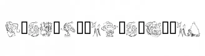
( Fonts by Kat`s Fun Fonts - Personal-use only. For commercial use please contact owner. )
A decorative font with Christmas-themed illustrations replacing standard characters.
![KR Christmas Color Me تنزيل الخطوط]() تنزيل 317 التنزيلات@WebFont
تنزيل 317 التنزيلات@WebFont -
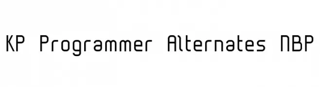
![KP Programmer Alternates NBP تنزيل الخطوط]() تنزيل 317 التنزيلات@WebFont
تنزيل 317 التنزيلات@WebFont -
( Fonts by www.typodermicfonts.com - Ray Larabie )
A bold, graffiti-inspired font with a playful, three-dimensional style.
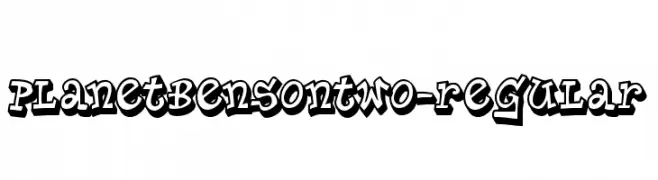
![PlanetBensonTwo-Regular تنزيل الخطوط]() تنزيل 317 التنزيلات@WebFont
تنزيل 317 التنزيلات@WebFont -
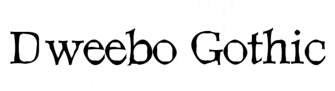
![Dweebo Gothic تنزيل الخطوط]() تنزيل 317 التنزيلات@WebFont
تنزيل 317 التنزيلات@WebFont -
-
( Fonts by Kong Font - https://fontkong.com/ - Personal-use only. For commercial use please contact owner. )
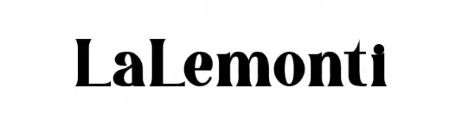
A bold, high-contrast serif font with dramatic strokes and elegant serifs.
![La Lemonti تنزيل الخطوط]() تنزيل 317 التنزيلات@WebFont
تنزيل 317 التنزيلات@WebFont -
( Fonts by a Max Infeld - XEROGRAPHER FONTS - xerographer.blogspot.com . Personal-use only. For commercial use please contact owner. )
A playful, bold font with irregular, hand-drawn letterforms.
![AlwaysNever تنزيل الخطوط]() تنزيل 317 التنزيلات@WebFont
تنزيل 317 التنزيلات@WebFont -
( Fonts by Din Studio - Donis Miftahudin - Personal-use only. For commercial use please contact owner. )
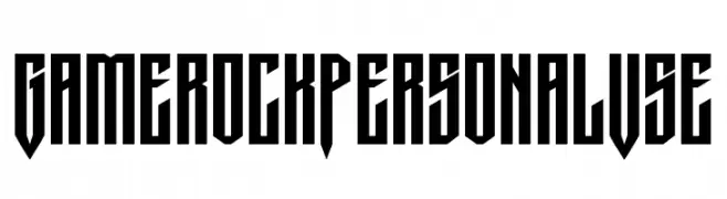
A bold, geometric font with sharp angles and a modern, edgy style.
![Gamerock Personal Use تنزيل الخطوط]() تنزيل 317 التنزيلات@WebFont
تنزيل 317 التنزيلات@WebFont -
( Lauren Harrison - gumroad.com/lrnrh )
A bold, angular font with electrifying motifs and a modern, edgy style.
![Electro تنزيل الخطوط]() تنزيل 317 التنزيلات@WebFont
تنزيل 317 التنزيلات@WebFont -
( Woodcutter - woodcutter Manero - www.woodcutter.es )
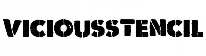
A bold, distressed stencil font with an industrial and gritty aesthetic.
![Vicious Stencil تنزيل الخطوط]() تنزيل 317 التنزيلات@WebFont
تنزيل 317 التنزيلات@WebFont


ما هي أبرز الخطوط الآن؟
تحظى Sometype Mono Regular, KR Christmas Color Me, KP Programmer Alternates NBP, PlanetBensonTwo-Regular and Dweebo Gothic بشعبية لخطوطها النظيفة وتطبيقاتها الواسعة — من الهوية البصرية إلى الصفحات المقصودة والملصقات.
أي الخطوط تُستخدم كثيرًا في الشعارات؟
تُعد السان سيريف الهندسية (مثل Poppins وعائلات على نمط Gotham) خيارًا شائعًا لعلامات نظيفة قابلة للتوسع. ولإضفاء طابع ودي، تبقى السكريبت واليدوية خيارًا كلاسيكيًا. اجمع عنوانًا بارزًا مع خط نصي محايد لتحقيق التوازن والتميّز.
كم مرة يتم تحديث قائمة أعلى الخطوط؟
نحدّثها بانتظام استنادًا إلى التنزيلات والنشاط الفعلي. عُد إليها كثيرًا لاكتشاف النجوم الصاعدة مبكرًا.
💡 نصيحة: أضف هذه الصفحة إلى العلامات — تتغير الاتجاهات بسرعة وقد تُلهم خطوط اليوم الرائجة إعادة العلامة غدًا.