مرحبًا بك في قسم أعلى الخطوط — حيث تلتقي الشعبية بالجودة. هذه هي الخطوط الأكثر تنزيلًا واستخدامًا هذا العام من قبل مجتمعنا. إذا كنت بحاجة إلى اختيار موثوق للشعارات أو الويب أو وسائل التواصل، فابدأ من هنا.
يتميز كل خط رائج بتوازن جيد وقابلية قراءة وتعدد استخدامات. ستجد سان سيريف حديثة، وسكريبتات أنيقة، وسيريف كلاسيكية، وخطوط عرض minimal مختارة بعناية.
-
( Fonts by Graphix Line Studio - Personal-use only. For commercial use please contact owner. )
A playful and elegant handwritten script font with bold, flowing strokes.
 تنزيل 39 التنزيلات@WebFont
 -
( Fonts by Iconian Fonts - Daniel Zadorozny - Personal-use only. For commercial use please contact owner. )
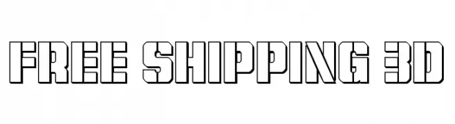
A bold, 3D block-style font with a modern, industrial look.
![Free Shipping 3D تنزيل الخطوط]() تنزيل 39 التنزيلات@WebFont
تنزيل 39 التنزيلات@WebFont -
( Fonts by Roams Type Co - Personal-use only. For commercial use please contact owner. )
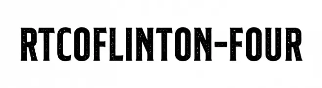
A bold, textured font with a vintage, distressed look.
![RTCOFlinton-Four تنزيل الخطوط]() تنزيل 39 التنزيلات@WebFont
تنزيل 39 التنزيلات@WebFont -
( Fonts by Vunira Design - Personal-use only. For commercial use please contact owner. )
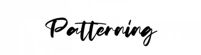
A bold, expressive handwritten font with fluid strokes and a casual style.
![Patterning تنزيل الخطوط]() تنزيل 39 التنزيلات@WebFont
تنزيل 39 التنزيلات@WebFont -
( Fonts by Inermedia Studio - Personal-use only. For commercial use please contact owner. )
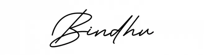
A sophisticated, elegant handwritten script with fluid, connected strokes.
![Bindhu تنزيل الخطوط]() تنزيل 39 التنزيلات@WebFont
تنزيل 39 التنزيلات@WebFont -
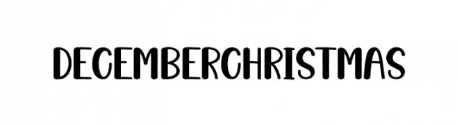
( Personal-use only. For commercial use please contact owner. )
Playful, rounded sans-serif with a hand-drawn look.
![December Christmas تنزيل الخطوط]() تنزيل 39 التنزيلات@WebFont
تنزيل 39 التنزيلات@WebFont -
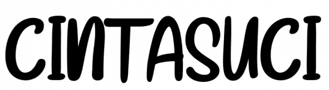
( Fonts by StringLabs - stringlabscreative.com - Personal-use only. For commercial use please contact owner. )
A bold, handwritten font with a playful and friendly style.
![CINTA SUCI تنزيل الخطوط]() تنزيل 39 التنزيلات@WebFont
تنزيل 39 التنزيلات@WebFont -
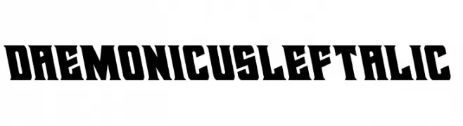
( Fonts by Iconian Fonts - Daniel Zadorozny - Personal-use only. For commercial use please contact owner. )
A bold, angular font with a leftward slant and exaggerated serifs.
![Daemonicus Leftalic تنزيل الخطوط]() تنزيل 39 التنزيلات@WebFont
تنزيل 39 التنزيلات@WebFont -
( Fonts by NanaNissa - Personal-use only. For commercial use please contact owner. )
A modern, elegant script font with flowing, cursive letters and graceful flourishes.
![Bullvetti تنزيل الخطوط]() تنزيل 39 التنزيلات@WebFont
تنزيل 39 التنزيلات@WebFont -
( Fonts by Rudi Winarko - Personal-use only. For commercial use please contact owner. )
A futuristic, geometric font with sharp angles and clean lines.
![SATLYTERegular تنزيل الخطوط]() تنزيل 39 التنزيلات@WebFont
تنزيل 39 التنزيلات@WebFont -
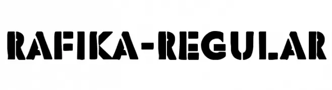
( Fonts by Typodermic Fonts - Raymond Larabie - Personal-use only. For commercial use please contact owner. )
A bold, stencil-style font with geometric cutouts and a modern, industrial look.
![Rafika-Regular تنزيل الخطوط]() تنزيل 39 التنزيلات@WebFont
تنزيل 39 التنزيلات@WebFont -
( Fonts by Beautypes )
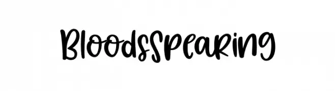
Casual handwritten script with rounded, playful forms.
![BloodsSpearing تنزيل الخطوط]() تنزيل 39 التنزيلات@WebFont
تنزيل 39 التنزيلات@WebFont -
( Personal-use only. For commercial use please contact owner. )
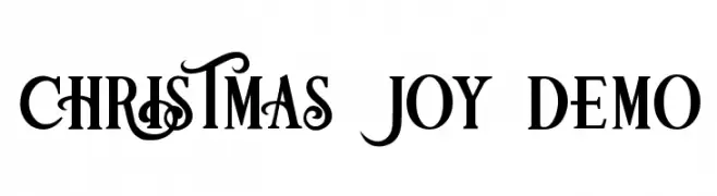
Decorative serif font with festive swashes and high contrast.
![Christmas Joy Demo تنزيل الخطوط]() تنزيل 39 التنزيلات@WebFont
تنزيل 39 التنزيلات@WebFont -
( Fonts by Shelley Evans - Personal-use only. For commercial use please contact owner. )
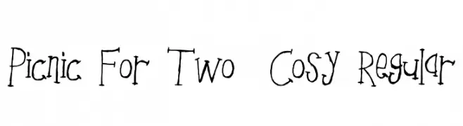
A whimsical, hand-drawn font with irregular, playful strokes.
![Picnic For Two _ Cosy Regular تنزيل الخطوط]() تنزيل 39 التنزيلات@WebFont
تنزيل 39 التنزيلات@WebFont -
( Fonts by Trequartista Studio - Personal-use only. For commercial use please contact owner. )
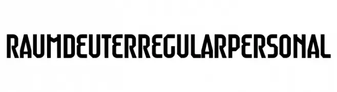
A bold, geometric font with sharp angles and a modern, industrial feel.
![Raumdeuter Regular Personal تنزيل الخطوط]() تنزيل 39 التنزيلات@WebFont
تنزيل 39 التنزيلات@WebFont -
( Fonts by Inermedia Studio - Personal-use only. For commercial use please contact owner. )
A playful, casual handwritten font with fluid strokes and a modern feel.
![Scriptones تنزيل الخطوط]() تنزيل 39 التنزيلات@WebFont
تنزيل 39 التنزيلات@WebFont -
( Fonts by Joseph Dawson - Personal-use only. For commercial use please contact owner. )
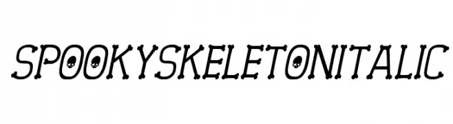
A spooky, italicized font with skeletal elements and skull motifs.
![Spooky Skeleton Italic تنزيل الخطوط]() تنزيل 39 التنزيلات@WebFont
تنزيل 39 التنزيلات@WebFont -
( Fonts by Perspectype Studio - Personal-use only. For commercial use please contact owner. )
A dynamic and expressive script font with fluid strokes and artistic flair.
![Hageton تنزيل الخطوط]() تنزيل 39 التنزيلات@WebFont
تنزيل 39 التنزيلات@WebFont -
( Fonts by Rudi Winarko - Personal-use only. For commercial use please contact owner. )
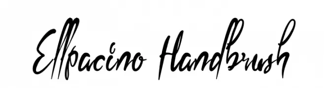
A bold, hand-drawn font with dynamic, sweeping strokes.
![Ellpacino Handbrush تنزيل الخطوط]() تنزيل 39 التنزيلات@WebFont
تنزيل 39 التنزيلات@WebFont -
( Fonts by Woodcutter Manero - www.woodcutter.es - Personal-use only. For commercial use please contact owner. )
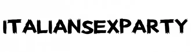
Bold, brush-stroke font with energetic, hand-drawn style.
![Italian Sex Party تنزيل الخطوط]() تنزيل 39 التنزيلات@WebFont
تنزيل 39 التنزيلات@WebFont -
( Fonts by Letterena Studios - letterena.com - Personal-use only. For commercial use please contact owner. )
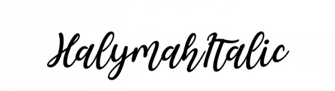
A lively, cursive font with bold, interconnected strokes and a dynamic slant.
![Halymah Italic تنزيل الخطوط]() تنزيل 39 التنزيلات@WebFont
تنزيل 39 التنزيلات@WebFont -
( Fonts by Four Lines - zain Fahroni - Personal-use only. For commercial use please contact owner. )
A bold, playful script font with a handwritten feel.
![Chicharito تنزيل الخطوط]() تنزيل 39 التنزيلات@WebFont
تنزيل 39 التنزيلات@WebFont -
( Fonts by YonType Studio - Muhammad Yoni - Personal-use only. For commercial use please contact owner. )
An elegant script font with flowing, interconnected letters and decorative swashes.
![Bullgari تنزيل الخطوط]() تنزيل 39 التنزيلات@WebFont
تنزيل 39 التنزيلات@WebFont -
( Fonts by Macagonzz )
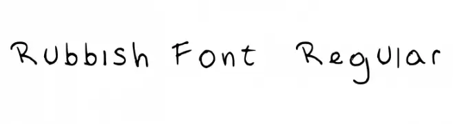
Casual handwritten font with playful, uneven strokes.
![Rubbish Font 2 Regular تنزيل الخطوط]() تنزيل 39 التنزيلات@WebFont
تنزيل 39 التنزيلات@WebFont -
( Fonts by Joseph Dawson - Personal-use only. For commercial use please contact owner. )
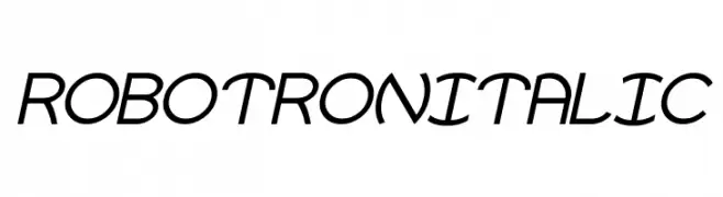
A futuristic, italicized font with sleek, angular letters.
![Robotron Italic تنزيل الخطوط]() تنزيل 39 التنزيلات@WebFont
تنزيل 39 التنزيلات@WebFont -
( Fonts by weknow - Wino S Kadir - Personal-use only. For commercial use please contact owner. )
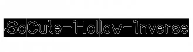
A playful, hollow font with rounded, smooth characters and a modern geometric influence.
![So Cute-Hollow-Inverse تنزيل الخطوط]() تنزيل 39 التنزيلات@WebFont
تنزيل 39 التنزيلات@WebFont -
( Fonts by Woodcutter )
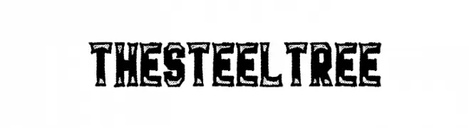
Distressed, bold display font with an industrial, textured look.
![The Steel Tree تنزيل الخطوط]() تنزيل 39 التنزيلات@WebFont
تنزيل 39 التنزيلات@WebFont -
( Fonts by Vladimir Nikolic - www.creativefabrica.com/designer/vladimirnikolic/ - Personal-use only. For commercial use please contact owner. )
A bold, outlined font with characters enclosed in rounded capsules, offering a playful and retro-modern style.
![Quinteto Negative Light Regular تنزيل الخطوط]() تنزيل 39 التنزيلات@WebFont
تنزيل 39 التنزيلات@WebFont -
( Fonts by ReyreyBlue - Reyrey Blue - Personal-use only. For commercial use please contact owner. )
A dynamic, flowing script font with elegant cursive letterforms.
![The Chemical تنزيل الخطوط]() تنزيل 39 التنزيلات@WebFont
تنزيل 39 التنزيلات@WebFont -
( Fonts by Iconian Fonts )
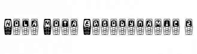
A bold, geometric font with a futuristic, digital aesthetic.
![Hola Mota Ergodynamic 2 تنزيل الخطوط]() تنزيل 39 التنزيلات@WebFont
تنزيل 39 التنزيلات@WebFont -
( Fonts by Power Type™ Foundry )
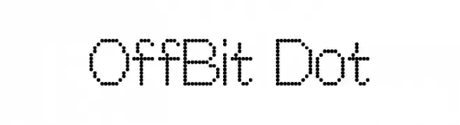
A dot matrix style font with a modern, digital appearance.
![OffBit Dot تنزيل الخطوط]() تنزيل 39 التنزيلات@WebFont
تنزيل 39 التنزيلات@WebFont -
( Fonts by Don Marciano - Personal-use only. For commercial use please contact owner. )
A futuristic, geometric font with rounded edges and consistent stroke width.
![Moon Hand تنزيل الخطوط]() تنزيل 39 التنزيلات@WebFont
تنزيل 39 التنزيلات@WebFont -
( Fonts by Perspectype Studio - Personal-use only. For commercial use please contact owner. )
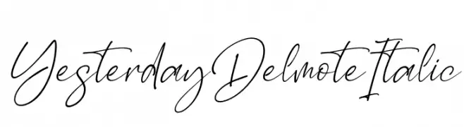
An elegant, flowing script font with smooth, cursive letterforms.
![Yesterday Delmote Italic تنزيل الخطوط]() تنزيل 39 التنزيلات@WebFont
تنزيل 39 التنزيلات@WebFont -
( Fonts by Aluyeah Studio - Personal-use only. For commercial use please contact owner. )
A modern, geometric sans-serif font with clean lines and uniform strokes.
![Murberry تنزيل الخطوط]() تنزيل 39 التنزيلات@WebFont
تنزيل 39 التنزيلات@WebFont -
( Fonts by Iconian Fonts - Daniel Zadorozny - Personal-use only. For commercial use please contact owner. )
A whimsical and decorative font with intricate curls and swirls.
![The Shire Expanded تنزيل الخطوط]() تنزيل 39 التنزيلات@WebFont
تنزيل 39 التنزيلات@WebFont


ما هي أبرز الخطوط الآن؟
تحظى Wishyou, Free Shipping 3D, RTCOFlinton-Four, Patterning and Bindhu بشعبية لخطوطها النظيفة وتطبيقاتها الواسعة — من الهوية البصرية إلى الصفحات المقصودة والملصقات.
أي الخطوط تُستخدم كثيرًا في الشعارات؟
تُعد السان سيريف الهندسية (مثل Poppins وعائلات على نمط Gotham) خيارًا شائعًا لعلامات نظيفة قابلة للتوسع. ولإضفاء طابع ودي، تبقى السكريبت واليدوية خيارًا كلاسيكيًا. اجمع عنوانًا بارزًا مع خط نصي محايد لتحقيق التوازن والتميّز.
كم مرة يتم تحديث قائمة أعلى الخطوط؟
نحدّثها بانتظام استنادًا إلى التنزيلات والنشاط الفعلي. عُد إليها كثيرًا لاكتشاف النجوم الصاعدة مبكرًا.
💡 نصيحة: أضف هذه الصفحة إلى العلامات — تتغير الاتجاهات بسرعة وقد تُلهم خطوط اليوم الرائجة إعادة العلامة غدًا.