مرحبًا بك في قسم أعلى الخطوط — حيث تلتقي الشعبية بالجودة. هذه هي الخطوط الأكثر تنزيلًا واستخدامًا هذا العام من قبل مجتمعنا. إذا كنت بحاجة إلى اختيار موثوق للشعارات أو الويب أو وسائل التواصل، فابدأ من هنا.
يتميز كل خط رائج بتوازن جيد وقابلية قراءة وتعدد استخدامات. ستجد سان سيريف حديثة، وسكريبتات أنيقة، وسيريف كلاسيكية، وخطوط عرض minimal مختارة بعناية.
-
( Fonts by Indriyanti - Personal-use only. For commercial use please contact owner. )
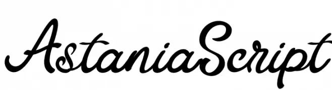
A lively and elegant script font with fluid, cursive strokes.
 تنزيل 43 التنزيلات@WebFont
 -
( Fonts by Teguh Pranata - Personal-use only. For commercial use please contact owner. )
A bold, blocky font with strong, impactful characters.
![Bosih تنزيل الخطوط]() تنزيل 43 التنزيلات@WebFont
تنزيل 43 التنزيلات@WebFont -
( Fonts by fortunes co - Ramandhani Nugraha - Personal-use only. For commercial use please contact owner. )
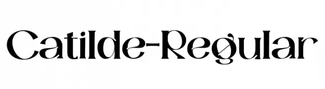
A high-contrast serif font with a blend of modern and classic elements.
![Catilde-Regular تنزيل الخطوط]() تنزيل 43 التنزيلات@WebFont
تنزيل 43 التنزيلات@WebFont -
( Fonts by Daniel Zadorozny - www.iconian.com - Personal-use only. For commercial use please contact owner. )
A bold, angular font with a geometric and dynamic style.
![Arctic Guardian Leftalic تنزيل الخطوط]() تنزيل 43 التنزيلات@WebFont
تنزيل 43 التنزيلات@WebFont -
( Fonts by Digital Typeface Studio - Eva Barabasne Olasz - Personal-use only. For commercial use please contact owner. )
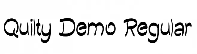
A playful, hand-drawn font with irregular strokes and a whimsical style.
![Quilty Demo Regular تنزيل الخطوط]() تنزيل 43 التنزيلات@WebFont
تنزيل 43 التنزيلات@WebFont -
( Fonts by Vladimir Nikolic - www.creativefabrica.com/designer/vladimirnikolic/ - Personal-use only. For commercial use please contact owner. )
A geometric, decorative font with intricate line patterns and bold outlines.
![Construction Regular تنزيل الخطوط]() تنزيل 43 التنزيلات@WebFont
تنزيل 43 التنزيلات@WebFont -
( Fonts by Colllab Studio - Personal-use only. For commercial use please contact owner. )
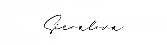
An elegant, flowing script font with a handwritten style.
![Sieralova تنزيل الخطوط]() تنزيل 43 التنزيلات@WebFont
تنزيل 43 التنزيلات@WebFont -
( Fonts by Letterena Studios - letterena.com - Personal-use only. For commercial use please contact owner. )
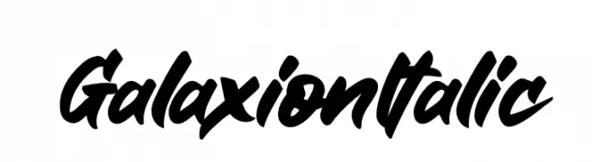
A bold, dynamic script font with a strong italic slant and fluid, connected characters.
![Galaxion Italic تنزيل الخطوط]() تنزيل 43 التنزيلات@WebFont
تنزيل 43 التنزيلات@WebFont -
( Fonts by Teguh Pranata - Personal-use only. For commercial use please contact owner. )
A bold, dynamic font with horizontal lines creating a sense of speed and movement.
![SpeedMonstersDemo تنزيل الخطوط]() تنزيل 43 التنزيلات@WebFont
تنزيل 43 التنزيلات@WebFont -
( Fonts by UI Creative - Personal-use only. For commercial use please contact owner. )
A dynamic, handwritten-style font with elegant, flowing strokes.
![Raymond Caroline تنزيل الخطوط]() تنزيل 43 التنزيلات@WebFont
تنزيل 43 التنزيلات@WebFont -
( Fonts by Alpaprana Studio - Personal-use only. For commercial use please contact owner. )
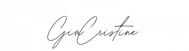
A flowing, elegant script font with a modern handwritten style.
![Gia Cristine تنزيل الخطوط]() تنزيل 43 التنزيلات@WebFont
تنزيل 43 التنزيلات@WebFont -
( Fonts by Typodermic Fonts - Raymond Larabie - Personal-use only. For commercial use please contact owner. )
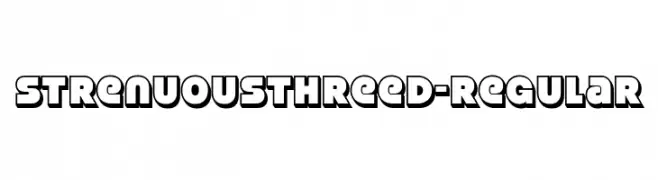
A bold, three-dimensional font with a playful yet assertive style.
![StrenuousThreeD-Regular تنزيل الخطوط]() تنزيل 43 التنزيلات@WebFont
تنزيل 43 التنزيلات@WebFont -
( Fonts by Irfan Hidayat - Personal-use only. For commercial use please contact owner. )
A bold, geometric font with high contrast and a modern, stencil-like design.
![RuttelsDemo-Regular تنزيل الخطوط]() تنزيل 43 التنزيلات@WebFont
تنزيل 43 التنزيلات@WebFont -
( Fonts by dcoxy - Greg Medina - Personal-use only. For commercial use please contact owner. )
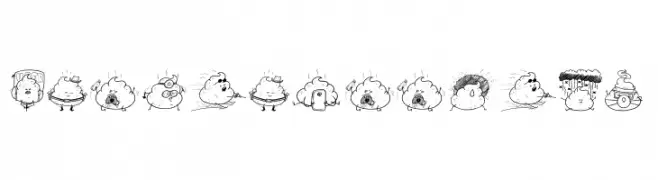
Hand-drawn, humorous cartoon icons with a poop theme.
![Iconic Poopies تنزيل الخطوط]() تنزيل 43 التنزيلات@WebFont
تنزيل 43 التنزيلات@WebFont -
( Fonts by weknow - Wino S Kadir - Personal-use only. For commercial use please contact owner. )
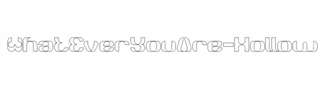
A futuristic, hollow, geometric font with a modern aesthetic.
![What Ever You Are-Hollow تنزيل الخطوط]() تنزيل 43 التنزيلات@WebFont
تنزيل 43 التنزيلات@WebFont -
( Fonts by Edric Studio - Personal-use only. For commercial use please contact owner. )
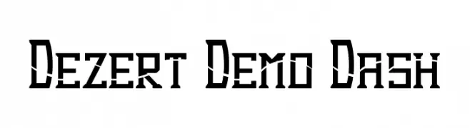
A bold, geometric font with sharp angles and high contrast, ideal for modern and industrial themes.
![Dezert Demo Dash تنزيل الخطوط]() تنزيل 43 التنزيلات@WebFont
تنزيل 43 التنزيلات@WebFont -
( Fonts by Vunira Design - Personal-use only. For commercial use please contact owner. )
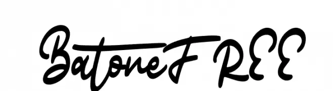
A bold, fluid script font with interconnected letters and expressive strokes.
![BatoneFREE تنزيل الخطوط]() تنزيل 43 التنزيلات@WebFont
تنزيل 43 التنزيلات@WebFont -
( Fonts by Iconian Fonts - Daniel Zadorozny - Personal-use only. For commercial use please contact owner. )
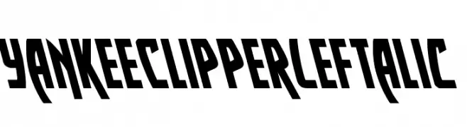
A bold, left-slanted font with angular and dynamic characters.
![Yankee Clipper Leftalic تنزيل الخطوط]() تنزيل 43 التنزيلات@WebFont
تنزيل 43 التنزيلات@WebFont -
( Fonts by Fontysia - Fontysia - Personal-use only. For commercial use please contact owner. )
A casual, handwritten font with fluid, slightly irregular strokes.
![Calmly تنزيل الخطوط]() تنزيل 43 التنزيلات@WebFont
تنزيل 43 التنزيلات@WebFont -
( Fonts by Iconian Fonts - Daniel Zadorozny - Personal-use only. For commercial use please contact owner. )
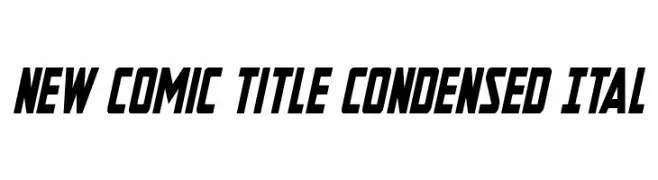
A bold, condensed, and italic font with a dynamic and modern style.
![New Comic Title Condensed Ital تنزيل الخطوط]() تنزيل 43 التنزيلات@WebFont
تنزيل 43 التنزيلات@WebFont -
( Fonts by Letterena Studios - letterena.com - Personal-use only. For commercial use please contact owner. )
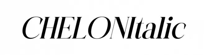
An elegant serif font with high contrast and a refined italic style.
![CHELON Italic تنزيل الخطوط]() تنزيل 43 التنزيلات@WebFont
تنزيل 43 التنزيلات@WebFont -
( Fonts by Letterena Studios - letterena.com - Personal-use only. For commercial use please contact owner. )
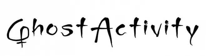
A spooky, hand-drawn font with an eerie, ghostly appearance.
![Ghost Activity تنزيل الخطوط]() تنزيل 43 التنزيلات@WebFont
تنزيل 43 التنزيلات@WebFont -
( Fonts by Alessandro Lamirata - Personal-use only. For commercial use please contact owner. )
A decorative and playful font with intricate patterns and artistic flair.
![Golf Tools Medium تنزيل الخطوط]() تنزيل 43 التنزيلات@WebFont
تنزيل 43 التنزيلات@WebFont -
( Fonts by Typodermic Fonts - Raymond Larabie - Personal-use only. For commercial use please contact owner. )
A sleek, futuristic font with geometric and minimalistic design.
![Univox-Regular تنزيل الخطوط]() تنزيل 43 التنزيلات@WebFont
تنزيل 43 التنزيلات@WebFont -
( Fonts by Woodcutter )
A distressed, vintage-style font with a tall, narrow design.
![Summer Film Festival تنزيل الخطوط]() تنزيل 43 التنزيلات@WebFont
تنزيل 43 التنزيلات@WebFont -
( Fonts by AukimVisuel - Audry Kitoko Makelele - Personal-use only. For commercial use please contact owner. )
A bold, stencil-style font with expanded, geometric characters.
![Lakisa Stencil Expanded تنزيل الخطوط]() تنزيل 43 التنزيلات@WebFont
تنزيل 43 التنزيلات@WebFont -
( Fonts by Edric Studio - Personal-use only. For commercial use please contact owner. )
A bold, italic font with angular, geometric characters and a modern, dynamic style.
![Dezert Demo Italic تنزيل الخطوط]() تنزيل 43 التنزيلات@WebFont
تنزيل 43 التنزيلات@WebFont -
( Fonts by Iconian Fonts - Daniel Zadorozny - Personal-use only. For commercial use please contact owner. )
A bold, italicized font with a gradient effect and striped pattern, ideal for dynamic designs.
![New Comic Title Gradient Ital تنزيل الخطوط]() تنزيل 43 التنزيلات@WebFont
تنزيل 43 التنزيلات@WebFont -
( Fonts by StringLabs - stringlabscreative.com - Personal-use only. For commercial use please contact owner. )
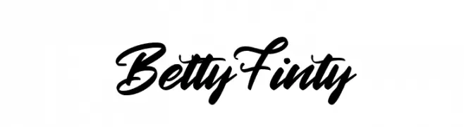
A bold, fluid script font with a dynamic, handwritten style.
![Betty Finty تنزيل الخطوط]() تنزيل 43 التنزيلات@WebFont
تنزيل 43 التنزيلات@WebFont -
( Personal-use only. For commercial use please contact owner. )
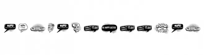
Comic-style display font with speech bubbles and bold, playful letters.
![EASTER BUBBLES تنزيل الخطوط]() تنزيل 43 التنزيلات@WebFont
تنزيل 43 التنزيلات@WebFont -
( Fonts by Vunira Design - Personal-use only. For commercial use please contact owner. )
A bold, cursive script font with elegant, flowing strokes.
![JalieFREE تنزيل الخطوط]() تنزيل 43 التنزيلات@WebFont
تنزيل 43 التنزيلات@WebFont -
( Fonts by LetterStock - Guguh Gumantoro - Personal-use only. For commercial use please contact owner. )
A bold, brush-style font with a distressed texture and dynamic, energetic appearance.
![Bulkies Regular تنزيل الخطوط]() تنزيل 43 التنزيلات@WebFont
تنزيل 43 التنزيلات@WebFont -
( Fonts by Typodermic Fonts - Raymond Larabie - Personal-use only. For commercial use please contact owner. )
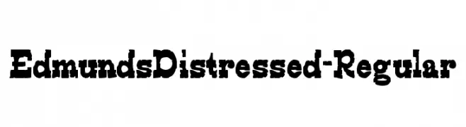
A bold, distressed font with a vintage, rugged appearance.
![EdmundsDistressed-Regular تنزيل الخطوط]() تنزيل 43 التنزيلات@WebFont
تنزيل 43 التنزيلات@WebFont -
( Fonts by Colllab Studio - Personal-use only. For commercial use please contact owner. )
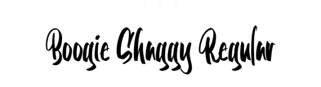
A bold, expressive handwritten font with dynamic strokes and playful curves.
![Boogie Shaggy Regular تنزيل الخطوط]() تنزيل 43 التنزيلات@WebFont
تنزيل 43 التنزيلات@WebFont -
( Fonts by Teguh Pranata - Personal-use only. For commercial use please contact owner. )
A bold, rounded font with a modern and playful style.
![Stines تنزيل الخطوط]() تنزيل 43 التنزيلات@WebFont
تنزيل 43 التنزيلات@WebFont


ما هي أبرز الخطوط الآن؟
تحظى AstaniaScript, Bosih, Catilde-Regular, Arctic Guardian Leftalic and Quilty Demo Regular بشعبية لخطوطها النظيفة وتطبيقاتها الواسعة — من الهوية البصرية إلى الصفحات المقصودة والملصقات.
أي الخطوط تُستخدم كثيرًا في الشعارات؟
تُعد السان سيريف الهندسية (مثل Poppins وعائلات على نمط Gotham) خيارًا شائعًا لعلامات نظيفة قابلة للتوسع. ولإضفاء طابع ودي، تبقى السكريبت واليدوية خيارًا كلاسيكيًا. اجمع عنوانًا بارزًا مع خط نصي محايد لتحقيق التوازن والتميّز.
كم مرة يتم تحديث قائمة أعلى الخطوط؟
نحدّثها بانتظام استنادًا إلى التنزيلات والنشاط الفعلي. عُد إليها كثيرًا لاكتشاف النجوم الصاعدة مبكرًا.
💡 نصيحة: أضف هذه الصفحة إلى العلامات — تتغير الاتجاهات بسرعة وقد تُلهم خطوط اليوم الرائجة إعادة العلامة غدًا.