مرحبًا بك في قسم أعلى الخطوط — حيث تلتقي الشعبية بالجودة. هذه هي الخطوط الأكثر تنزيلًا واستخدامًا هذا العام من قبل مجتمعنا. إذا كنت بحاجة إلى اختيار موثوق للشعارات أو الويب أو وسائل التواصل، فابدأ من هنا.
يتميز كل خط رائج بتوازن جيد وقابلية قراءة وتعدد استخدامات. ستجد سان سيريف حديثة، وسكريبتات أنيقة، وسيريف كلاسيكية، وخطوط عرض minimal مختارة بعناية.
-
( Fonts by www.tylerfinck.com - Personal-use only. For commercial use please contact owner. )
A clean, modern sans-serif font with low contrast and geometric shapes.
 تنزيل 351 التنزيلات@WebFont
 -
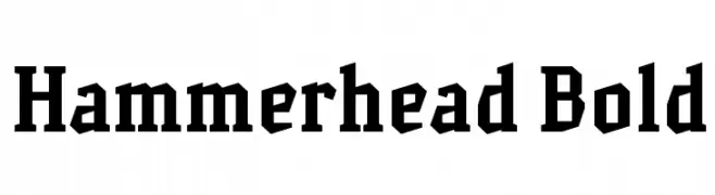
( Iconian Fonts - Daniel Zadorozny - www.iconian.com )
A bold, italicized font with a futuristic, angular design.
![Starduster Super-Italic تنزيل الخطوط]() تنزيل 351 التنزيلات@WebFont
تنزيل 351 التنزيلات@WebFont -
![Hammerhead Bold تنزيل الخطوط]() تنزيل 351 التنزيلات@WebFont
تنزيل 351 التنزيلات@WebFont -
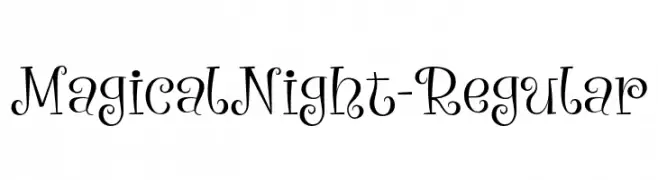
( Fonts by Font Bundles )
A whimsical, curly font with enchanting swirls and loops.
![MagicalNight-Regular تنزيل الخطوط]() تنزيل 351 التنزيلات@WebFont
تنزيل 351 التنزيلات@WebFont -
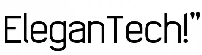
( Fonts by Yun Gonzalez - g3drakoheart-arts.deviantart.com - Personal-use only. For commercial use please contact owner. )
A sleek, modern font with clean lines and geometric shapes.
![EleganTech!]() تنزيل 351 التنزيلات@WebFont
تنزيل 351 التنزيلات@WebFont -
-
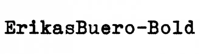
( Fonts by Peter Wiegel - www.peter-wiegel.de - Personal-use only. For commercial use please contact owner. )
A bold, textured font with a vintage, typewriter-like appearance.
![ErikasBuero-Bold تنزيل الخطوط]() تنزيل 351 التنزيلات@WebFont
تنزيل 351 التنزيلات@WebFont -
( Alexander Pravdin )
A bold, condensed sans-serif typeface with a modern and clean design.
![SONGERCondensed تنزيل الخطوط]() تنزيل 351 التنزيلات@WebFont
تنزيل 351 التنزيلات@WebFont -
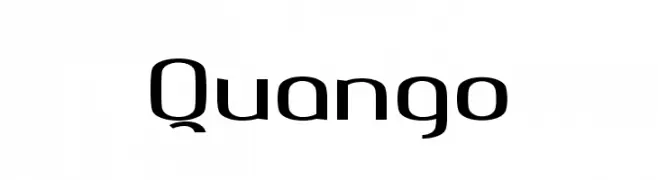
( NimaVisual - Nima Visual - nimavisual.tumblr.com/ )
A modern, geometric font with clean lines and a balanced structure.
![Quango تنزيل الخطوط]() تنزيل 351 التنزيلات@WebFont
تنزيل 351 التنزيلات@WebFont -
( Noto is a trademark of Google Inc. Noto fonts are open source. All Noto fonts are published under the SIL Open Font License, Version 1.1 )
A classic serif font with high contrast and refined details.
![Noto Serif Khmer Regular تنزيل الخطوط]() تنزيل 351 التنزيلات@WebFont
تنزيل 351 التنزيلات@WebFont -
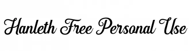
( Fonts by Andhi Yulianto - Personal-use only. For commercial use please contact owner. )
A stylish and elegant script font with flowing, connected letterforms.
![Hanleth Free Personal Use تنزيل الخطوط]() تنزيل 351 التنزيلات@WebFont
تنزيل 351 التنزيلات@WebFont


ما هي أبرز الخطوط الآن؟
تحظى Sono Light, Starduster Super-Italic, Hammerhead Bold, MagicalNight-Regular and EleganTech!" بشعبية لخطوطها النظيفة وتطبيقاتها الواسعة — من الهوية البصرية إلى الصفحات المقصودة والملصقات.
أي الخطوط تُستخدم كثيرًا في الشعارات؟
تُعد السان سيريف الهندسية (مثل Poppins وعائلات على نمط Gotham) خيارًا شائعًا لعلامات نظيفة قابلة للتوسع. ولإضفاء طابع ودي، تبقى السكريبت واليدوية خيارًا كلاسيكيًا. اجمع عنوانًا بارزًا مع خط نصي محايد لتحقيق التوازن والتميّز.
كم مرة يتم تحديث قائمة أعلى الخطوط؟
نحدّثها بانتظام استنادًا إلى التنزيلات والنشاط الفعلي. عُد إليها كثيرًا لاكتشاف النجوم الصاعدة مبكرًا.
💡 نصيحة: أضف هذه الصفحة إلى العلامات — تتغير الاتجاهات بسرعة وقد تُلهم خطوط اليوم الرائجة إعادة العلامة غدًا.