مرحبًا بك في قسم أعلى الخطوط — حيث تلتقي الشعبية بالجودة. هذه هي الخطوط الأكثر تنزيلًا واستخدامًا هذا العام من قبل مجتمعنا. إذا كنت بحاجة إلى اختيار موثوق للشعارات أو الويب أو وسائل التواصل، فابدأ من هنا.
يتميز كل خط رائج بتوازن جيد وقابلية قراءة وتعدد استخدامات. ستجد سان سيريف حديثة، وسكريبتات أنيقة، وسيريف كلاسيكية، وخطوط عرض minimal مختارة بعناية.
-
( Fonts by www.asleycruz.com - Asley Cruz - Personal-use only. For commercial use please contact owner. )
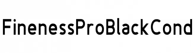
A bold, modern sans-serif font with a slightly condensed width and clean lines.
 تنزيل 359 التنزيلات@WebFont
 -
( Fonts by Fredrick Brennan )
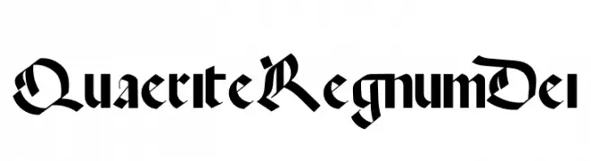
A classic blackletter font with intricate, angular letterforms and a gothic aesthetic.
![Quaerite Regnum Dei تنزيل الخطوط]() تنزيل 359 التنزيلات@WebFont
تنزيل 359 التنزيلات@WebFont -
( Fonts by Alit Suarnegara )
A bold, expressive handwritten font with fluid, connected strokes.
![Asfrogas تنزيل الخطوط]() تنزيل 359 التنزيلات@WebFont
تنزيل 359 التنزيلات@WebFont -
( Fonts by Taylor Baybutt - ikon3.com - Free for personal use only )
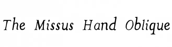
A playful, hand-drawn oblique font with dynamic strokes and a whimsical style.
![The Missus Hand Oblique تنزيل الخطوط]() تنزيل 359 التنزيلات@WebFont
تنزيل 359 التنزيلات@WebFont -
![Asteria تنزيل الخطوط]() تنزيل 359 التنزيلات@WebFont
تنزيل 359 التنزيلات@WebFont -
-
( Fonts by Levi Halmos )
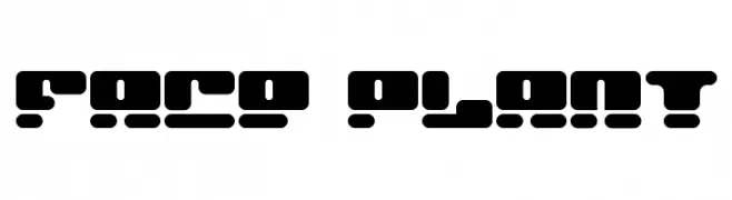
A bold, geometric font with a futuristic, digital aesthetic.
![Face plant تنزيل الخطوط]() تنزيل 359 التنزيلات@WebFont
تنزيل 359 التنزيلات@WebFont -
( Noto is a trademark of Google Inc. Noto fonts are open source. All Noto fonts are published under the SIL Open Font License, Version 1.1 )
A bold, sans-serif font with clean lines and excellent readability.
![Noto Sans Bengali UI Bold تنزيل الخطوط]() تنزيل 359 التنزيلات@WebFont
تنزيل 359 التنزيلات@WebFont -
( Fonts by www.haroldsfonts.com )
A heart-themed decorative font with glyphs made from clustered heart shapes.
![Heartland Hearts تنزيل الخطوط]() تنزيل 359 التنزيلات@WebFont
تنزيل 359 التنزيلات@WebFont -
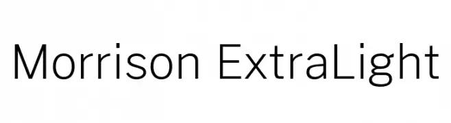
( Fonts by Pablo Impallari, Rodrigo Fuenzalida (Modified by Dan O. Williams) - Personal-use only. For commercial use please contact owner. )
A modern, extra light sans-serif font with clean lines and low contrast.
![Morrison ExtraLight تنزيل الخطوط]() تنزيل 359 التنزيلات@WebFont
تنزيل 359 التنزيلات@WebFont -
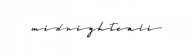
( Fonts by a Zaffar Ansari - Zansari . Personal-use only. For commercial use please contact owner. )
A flowing, cursive font with elegant, elongated letterforms and a handwritten appearance.
![Midnightcali تنزيل الخطوط]() تنزيل 359 التنزيلات@WebFont
تنزيل 359 التنزيلات@WebFont


ما هي أبرز الخطوط الآن؟
تحظى Fineness Pro Black Cond, Quaerite Regnum Dei, Asfrogas, The Missus Hand Oblique and Asteria بشعبية لخطوطها النظيفة وتطبيقاتها الواسعة — من الهوية البصرية إلى الصفحات المقصودة والملصقات.
أي الخطوط تُستخدم كثيرًا في الشعارات؟
تُعد السان سيريف الهندسية (مثل Poppins وعائلات على نمط Gotham) خيارًا شائعًا لعلامات نظيفة قابلة للتوسع. ولإضفاء طابع ودي، تبقى السكريبت واليدوية خيارًا كلاسيكيًا. اجمع عنوانًا بارزًا مع خط نصي محايد لتحقيق التوازن والتميّز.
كم مرة يتم تحديث قائمة أعلى الخطوط؟
نحدّثها بانتظام استنادًا إلى التنزيلات والنشاط الفعلي. عُد إليها كثيرًا لاكتشاف النجوم الصاعدة مبكرًا.
💡 نصيحة: أضف هذه الصفحة إلى العلامات — تتغير الاتجاهات بسرعة وقد تُلهم خطوط اليوم الرائجة إعادة العلامة غدًا.