مرحبًا بك في قسم أعلى الخطوط — حيث تلتقي الشعبية بالجودة. هذه هي الخطوط الأكثر تنزيلًا واستخدامًا هذا العام من قبل مجتمعنا. إذا كنت بحاجة إلى اختيار موثوق للشعارات أو الويب أو وسائل التواصل، فابدأ من هنا.
يتميز كل خط رائج بتوازن جيد وقابلية قراءة وتعدد استخدامات. ستجد سان سيريف حديثة، وسكريبتات أنيقة، وسيريف كلاسيكية، وخطوط عرض minimal مختارة بعناية.
-
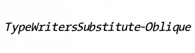
( Fonts by Manfred Klein. Free for private and charity use. Free for commercial with donation to organizations )
A modern oblique typewriter-style font with clean lines and excellent readability.
 تنزيل 363 التنزيلات@WebFont
 -
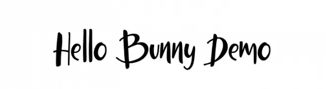
( Fonts by Ardyana Types )
A playful handwritten font with dynamic strokes and a lively style.
![Hello Bunny Demo تنزيل الخطوط]() تنزيل 363 التنزيلات@WebFont
تنزيل 363 التنزيلات@WebFont -
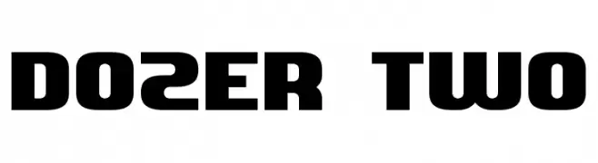
( Aaron Amar - www.behance.net/aaronamar )
A bold, geometric typeface with a modern, industrial feel.
![Dozer Two تنزيل الخطوط]() تنزيل 363 التنزيلات@WebFont
تنزيل 363 التنزيلات@WebFont -
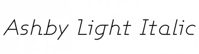
( Fonts by Apostrophic Lab )
A sleek, light, and italicized font with a modern and elegant style.
![Ashby Light Italic تنزيل الخطوط]() تنزيل 363 التنزيلات@WebFont
تنزيل 363 التنزيلات@WebFont -
( Fonts by www.peter-wiegel.de. Personal-use only. For commercial use please contact owner. )
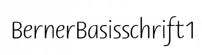
A clean, rounded font with consistent line weight and friendly appearance.
![BernerBasisschrift1 تنزيل الخطوط]() تنزيل 363 التنزيلات@WebFont
تنزيل 363 التنزيلات@WebFont -
-
( Fonts by Apostrophic Lab )
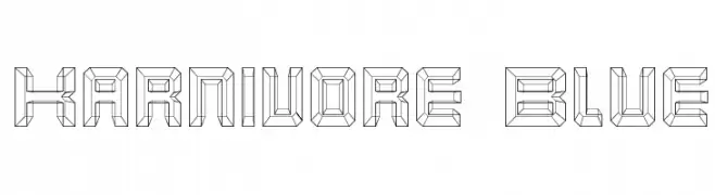
A bold, geometric font with a three-dimensional, angular design.
![Karnivore Blue تنزيل الخطوط]() تنزيل 363 التنزيلات@WebFont
تنزيل 363 التنزيلات@WebFont -
![Hindolam Regular تنزيل الخطوط]() تنزيل 363 التنزيلات@WebFont
تنزيل 363 التنزيلات@WebFont -
( Fonts by www.typodermicfonts.com - Ray Larabie )
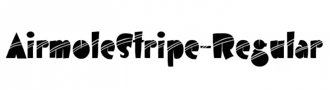
A bold, striped, and geometric font with a playful and modern style.
![AirmoleStripe-Regular تنزيل الخطوط]() تنزيل 363 التنزيلات@WebFont
تنزيل 363 التنزيلات@WebFont -
( Fonts by Misti`s Fonts - mistifonts.com - Personal-use only. For commercial use please contact owner. )
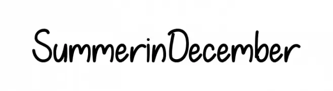
A playful, handwritten font with a casual and friendly style.
![SummerinDecember تنزيل الخطوط]() تنزيل 363 التنزيلات@WebFont
تنزيل 363 التنزيلات@WebFont -
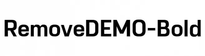
( Fonts by Eko Bimantara - Personal-use only. For commercial use please contact owner. )
A bold, modern sans-serif font with clean lines and strong presence.
![RemoveDEMO-Bold تنزيل الخطوط]() تنزيل 363 التنزيلات@WebFont
تنزيل 363 التنزيلات@WebFont
ما هي أبرز الخطوط الآن؟
تحظى TypeWritersSubstitute-Oblique, Hello Bunny Demo, Dozer Two, Ashby Light Italic and BernerBasisschrift1 بشعبية لخطوطها النظيفة وتطبيقاتها الواسعة — من الهوية البصرية إلى الصفحات المقصودة والملصقات.
أي الخطوط تُستخدم كثيرًا في الشعارات؟
تُعد السان سيريف الهندسية (مثل Poppins وعائلات على نمط Gotham) خيارًا شائعًا لعلامات نظيفة قابلة للتوسع. ولإضفاء طابع ودي، تبقى السكريبت واليدوية خيارًا كلاسيكيًا. اجمع عنوانًا بارزًا مع خط نصي محايد لتحقيق التوازن والتميّز.
كم مرة يتم تحديث قائمة أعلى الخطوط؟
نحدّثها بانتظام استنادًا إلى التنزيلات والنشاط الفعلي. عُد إليها كثيرًا لاكتشاف النجوم الصاعدة مبكرًا.
💡 نصيحة: أضف هذه الصفحة إلى العلامات — تتغير الاتجاهات بسرعة وقد تُلهم خطوط اليوم الرائجة إعادة العلامة غدًا.