مرحبًا بك في قسم أعلى الخطوط — حيث تلتقي الشعبية بالجودة. هذه هي الخطوط الأكثر تنزيلًا واستخدامًا هذا العام من قبل مجتمعنا. إذا كنت بحاجة إلى اختيار موثوق للشعارات أو الويب أو وسائل التواصل، فابدأ من هنا.
يتميز كل خط رائج بتوازن جيد وقابلية قراءة وتعدد استخدامات. ستجد سان سيريف حديثة، وسكريبتات أنيقة، وسيريف كلاسيكية، وخطوط عرض minimal مختارة بعناية.
-
( Fonts by a Typeface Leone - www.tipografialeone.net. Personal-use only. For commercial use please contact owner. )
A modern, geometric sans-serif font with a clean and minimalistic style.
 تنزيل 369 التنزيلات@WebFont
 -
( Fonts by Google )
A bold, condensed, and italic sans-serif typeface with high contrast and tight spacing.
![Noto Sans Condensed Black Italic تنزيل الخطوط]() تنزيل 369 التنزيلات@WebFont
تنزيل 369 التنزيلات@WebFont -
( Fonts by Brittney Murphy Design )
A bold, playful font with rounded, bubbly characters and a hand-drawn feel.
![AwesomePossumDemo-Shine تنزيل الخطوط]() تنزيل 369 التنزيلات@WebFont
تنزيل 369 التنزيلات@WebFont -
( Vladimir Nikolic - www.coroflot.com/vladimirnikolic )
A bold, geometric font with a blocky, digital appearance.
![Players Regular تنزيل الخطوط]() تنزيل 369 التنزيلات@WebFont
تنزيل 369 التنزيلات@WebFont -
( Fonts by Noah Type )
A bold, playful font with rounded, bubbly characters.
![Get Donuts Demo تنزيل الخطوط]() تنزيل 369 التنزيلات@WebFont
تنزيل 369 التنزيلات@WebFont -
-
( Fonts by Ikrar Bey Khubaib )
A bold, expressive script font with a dynamic, handwritten style.
![Haritta تنزيل الخطوط]() تنزيل 369 التنزيلات@WebFont
تنزيل 369 التنزيلات@WebFont -
( Roger White - web.archive.org/web/20120416090521/www.rogersfonts.org.uk/ )
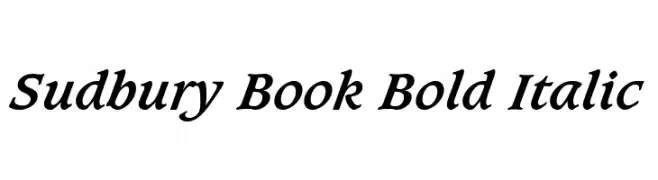
A bold, italic serif font with a classic and elegant style.
![Sudbury Book Bold Italic تنزيل الخطوط]() تنزيل 369 التنزيلات@WebFont
تنزيل 369 التنزيلات@WebFont -
( K-Type - www.k-type.com )
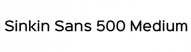
A clean, modern sans-serif font with medium weight and balanced proportions.
![Sinkin Sans 500 Medium تنزيل الخطوط]() تنزيل 369 التنزيلات@WebFont
تنزيل 369 التنزيلات@WebFont -
( Fonts by Daniel Zadorozny - www.iconian.com - Free for personal use )
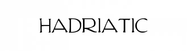
A modern serif font with elegant curves and clean lines.
![Hadriatic تنزيل الخطوط]() تنزيل 369 التنزيلات@WebFont
تنزيل 369 التنزيلات@WebFont -
( Fonts by Apostrophic Lab )
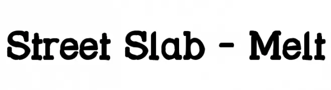
A bold, playful slab serif font with rounded edges and uniform weight.
![Street Slab - Melt تنزيل الخطوط]() تنزيل 369 التنزيلات@WebFont
تنزيل 369 التنزيلات@WebFont


ما هي أبرز الخطوط الآن؟
تحظى Leo Arrow Sans Serif, Noto Sans Condensed Black Italic, AwesomePossumDemo-Shine, Players Regular and Get Donuts Demo بشعبية لخطوطها النظيفة وتطبيقاتها الواسعة — من الهوية البصرية إلى الصفحات المقصودة والملصقات.
أي الخطوط تُستخدم كثيرًا في الشعارات؟
تُعد السان سيريف الهندسية (مثل Poppins وعائلات على نمط Gotham) خيارًا شائعًا لعلامات نظيفة قابلة للتوسع. ولإضفاء طابع ودي، تبقى السكريبت واليدوية خيارًا كلاسيكيًا. اجمع عنوانًا بارزًا مع خط نصي محايد لتحقيق التوازن والتميّز.
كم مرة يتم تحديث قائمة أعلى الخطوط؟
نحدّثها بانتظام استنادًا إلى التنزيلات والنشاط الفعلي. عُد إليها كثيرًا لاكتشاف النجوم الصاعدة مبكرًا.
💡 نصيحة: أضف هذه الصفحة إلى العلامات — تتغير الاتجاهات بسرعة وقد تُلهم خطوط اليوم الرائجة إعادة العلامة غدًا.