مرحبًا بك في قسم أعلى الخطوط — حيث تلتقي الشعبية بالجودة. هذه هي الخطوط الأكثر تنزيلًا واستخدامًا هذا العام من قبل مجتمعنا. إذا كنت بحاجة إلى اختيار موثوق للشعارات أو الويب أو وسائل التواصل، فابدأ من هنا.
يتميز كل خط رائج بتوازن جيد وقابلية قراءة وتعدد استخدامات. ستجد سان سيريف حديثة، وسكريبتات أنيقة، وسيريف كلاسيكية، وخطوط عرض minimal مختارة بعناية.
-
( Fonts by Vernon Adams - Personal-use only. For commercial use please contact owner. )
A modern sans-serif font with clean lines and balanced spacing.
 تنزيل 379 التنزيلات@WebFont
 -
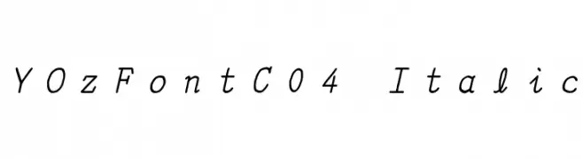
![YOzFontC04 Italic تنزيل الخطوط]() تنزيل 379 التنزيلات@WebFont
تنزيل 379 التنزيلات@WebFont -
( Darrell Flood )
A modern, tall, and narrow sans-serif font with consistent stroke width.
![Baby Blues تنزيل الخطوط]() تنزيل 379 التنزيلات@WebFont
تنزيل 379 التنزيلات@WebFont -
( Fonts by Castcraft Software - opti.netii.net - check the website before use )
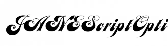
An elegant and decorative script font with ornate flourishes.
![JANEScriptOpti تنزيل الخطوط]() تنزيل 379 التنزيلات@WebFont
تنزيل 379 التنزيلات@WebFont -
( Copyright 2012 The Encode Project Authors (impallari@gmail.com), with Reserved Font Name "Encode Sansâ€. )
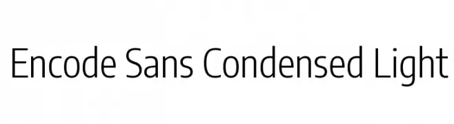
A modern, condensed sans-serif font with a light weight and clean design.
![Encode Sans Condensed Light تنزيل الخطوط]() تنزيل 379 التنزيلات@WebFont
تنزيل 379 التنزيلات@WebFont -
-
( Fonts by Kong Font - https://fontkong.com/ - Personal-use only. For commercial use please contact owner. )
A playful and elegant script font with smooth, rounded letterforms.
![Rosanna تنزيل الخطوط]() تنزيل 379 التنزيلات@WebFont
تنزيل 379 التنزيلات@WebFont -
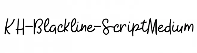
( Kristy Hatswell - www.webcodesigns.com/ )
A playful, handwritten script font with a casual and fluid style.
![KH-Blackline-Script Medium تنزيل الخطوط]() تنزيل 379 التنزيلات@WebFont
تنزيل 379 التنزيلات@WebFont -
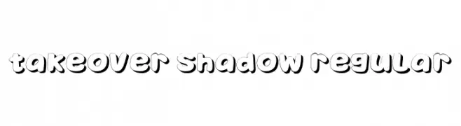
( Fonts by Vladimir Nikolic )
A bold, playful font with a shadow effect for a 3D look.
![Takeover Shadow Regular تنزيل الخطوط]() تنزيل 379 التنزيلات@WebFont
تنزيل 379 التنزيلات@WebFont -
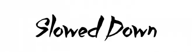
( Fonts by Jonathan S. Harris - www.tattoowoo.com. Personal-use only. For commercial use please contact owner. )
A bold, brush-style font with dynamic strokes and an artistic flair.
![Slowed Down تنزيل الخطوط]() تنزيل 379 التنزيلات@WebFont
تنزيل 379 التنزيلات@WebFont -
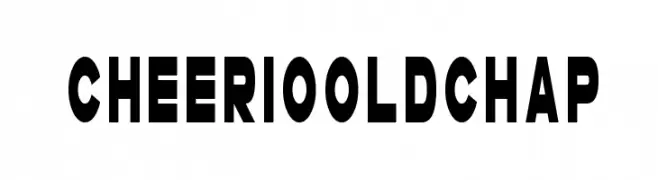
( Fonts by Darrell Flood )
A bold, geometric font with uniform stroke width and strong presence.
![Cheerio Old Chap تنزيل الخطوط]() تنزيل 379 التنزيلات@WebFont
تنزيل 379 التنزيلات@WebFont


ما هي أبرز الخطوط الآن؟
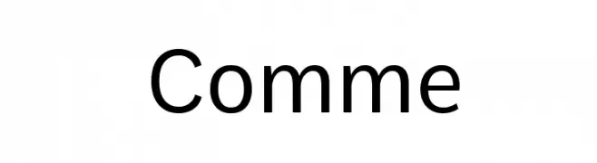
تحظى Comme, YOzFontC04 Italic, Baby Blues, JANEScriptOpti and Encode Sans Condensed Light بشعبية لخطوطها النظيفة وتطبيقاتها الواسعة — من الهوية البصرية إلى الصفحات المقصودة والملصقات.
أي الخطوط تُستخدم كثيرًا في الشعارات؟
تُعد السان سيريف الهندسية (مثل Poppins وعائلات على نمط Gotham) خيارًا شائعًا لعلامات نظيفة قابلة للتوسع. ولإضفاء طابع ودي، تبقى السكريبت واليدوية خيارًا كلاسيكيًا. اجمع عنوانًا بارزًا مع خط نصي محايد لتحقيق التوازن والتميّز.
كم مرة يتم تحديث قائمة أعلى الخطوط؟
نحدّثها بانتظام استنادًا إلى التنزيلات والنشاط الفعلي. عُد إليها كثيرًا لاكتشاف النجوم الصاعدة مبكرًا.
💡 نصيحة: أضف هذه الصفحة إلى العلامات — تتغير الاتجاهات بسرعة وقد تُلهم خطوط اليوم الرائجة إعادة العلامة غدًا.