مرحبًا بك في قسم أعلى الخطوط — حيث تلتقي الشعبية بالجودة. هذه هي الخطوط الأكثر تنزيلًا واستخدامًا هذا العام من قبل مجتمعنا. إذا كنت بحاجة إلى اختيار موثوق للشعارات أو الويب أو وسائل التواصل، فابدأ من هنا.
يتميز كل خط رائج بتوازن جيد وقابلية قراءة وتعدد استخدامات. ستجد سان سيريف حديثة، وسكريبتات أنيقة، وسيريف كلاسيكية، وخطوط عرض minimal مختارة بعناية.
-
( Fonts by Nick Curtis - www.nicksfonts.com )
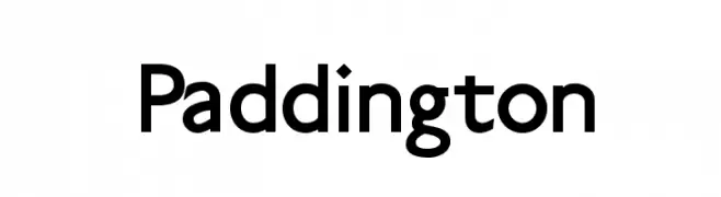
A bold serif font with dramatic, angular serifs and a vintage-modern appeal.
 تنزيل 4599 التنزيلات
 -
![Paddington تنزيل الخطوط]() تنزيل 4597 التنزيلات@WebFont
تنزيل 4597 التنزيلات@WebFont -
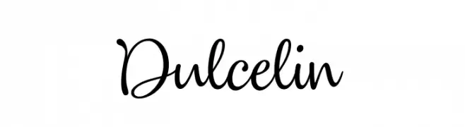
( Fonts by youssef-habchi.com - Personal-use only. For commercial use please contact owner. )
A playful and elegant script font with smooth, flowing lines and connected letters.
![Dulcelin تنزيل الخطوط]() تنزيل 4596 التنزيلات@WebFont
تنزيل 4596 التنزيلات@WebFont -
( Copyright (c) 2011 Alejandro Paul (sudtipos@sudtipos.com) )
An elegant script font with flowing, interconnected letters and a refined appearance.
![Mr De Haviland Regular تنزيل الخطوط]() تنزيل 4596 التنزيلات@WebFont
تنزيل 4596 التنزيلات@WebFont -
( Fonts by Anthem Type - Joey Nelson )
A bold, rounded font with a playful and approachable style.
![Nicotine تنزيل الخطوط]() تنزيل 4594 التنزيلات@WebFont
تنزيل 4594 التنزيلات@WebFont -
-
( Fonts by Fonts by Rasmus Andersson / Changes by Cristiano Sobral with parts from Marc Monis - Personal-use only. For commercial use please contact owner. )
A bold, modern sans-serif font with thick, uniform strokes for high legibility.
![LinikSans-Black تنزيل الخطوط]() تنزيل 4593 التنزيلات@WebFont
تنزيل 4593 التنزيلات@WebFont -
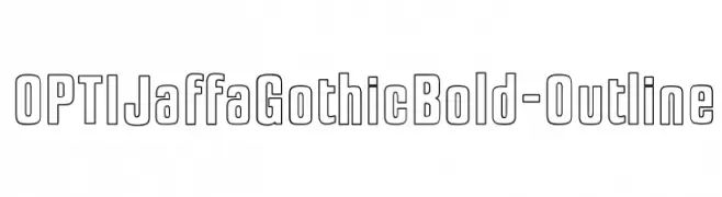
( Fonts by Castcraft Software - opti.netii.net - check the website before use )
A bold, outlined font with geometric precision and modern appeal.
![OPTIJaffaGothicBold-Outline تنزيل الخطوط]() تنزيل 4592 التنزيلات@WebFont
تنزيل 4592 التنزيلات@WebFont -
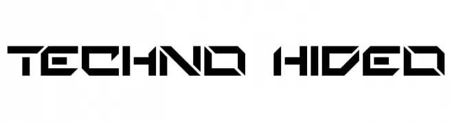
( Fonts by Paul Reid - tracertong.co.uk )
A bold, futuristic font with sharp angles and geometric shapes.
![Techno Hideo تنزيل الخطوط]() تنزيل 4592 التنزيلات@WebFont
تنزيل 4592 التنزيلات@WebFont -
( Fonts by www.freakyfonts.de )
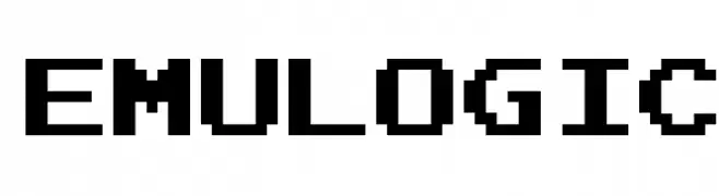
A pixelated, retro-style font with a blocky, monospaced design.
![Emulogic تنزيل الخطوط]() تنزيل 4591 التنزيلات@WebFont
تنزيل 4591 التنزيلات@WebFont -
( Fonts by Lecter Johnson - doubletwostudios.tumblr.com )
A bold, geometric font with a strong, industrial style.
![XXII DONT-MESS-WITH-VIKINGS-HARDCORE تنزيل الخطوط]() تنزيل 4590 التنزيلات@WebFont
تنزيل 4590 التنزيلات@WebFont


ما هي أبرز الخطوط الآن؟
تحظى Indubitably, Paddington, Dulcelin, Mr De Haviland Regular and Nicotine بشعبية لخطوطها النظيفة وتطبيقاتها الواسعة — من الهوية البصرية إلى الصفحات المقصودة والملصقات.
أي الخطوط تُستخدم كثيرًا في الشعارات؟
تُعد السان سيريف الهندسية (مثل Poppins وعائلات على نمط Gotham) خيارًا شائعًا لعلامات نظيفة قابلة للتوسع. ولإضفاء طابع ودي، تبقى السكريبت واليدوية خيارًا كلاسيكيًا. اجمع عنوانًا بارزًا مع خط نصي محايد لتحقيق التوازن والتميّز.
كم مرة يتم تحديث قائمة أعلى الخطوط؟
نحدّثها بانتظام استنادًا إلى التنزيلات والنشاط الفعلي. عُد إليها كثيرًا لاكتشاف النجوم الصاعدة مبكرًا.
💡 نصيحة: أضف هذه الصفحة إلى العلامات — تتغير الاتجاهات بسرعة وقد تُلهم خطوط اليوم الرائجة إعادة العلامة غدًا.