مرحبًا بك في قسم أعلى الخطوط — حيث تلتقي الشعبية بالجودة. هذه هي الخطوط الأكثر تنزيلًا واستخدامًا هذا العام من قبل مجتمعنا. إذا كنت بحاجة إلى اختيار موثوق للشعارات أو الويب أو وسائل التواصل، فابدأ من هنا.
يتميز كل خط رائج بتوازن جيد وقابلية قراءة وتعدد استخدامات. ستجد سان سيريف حديثة، وسكريبتات أنيقة، وسيريف كلاسيكية، وخطوط عرض minimal مختارة بعناية.
-
( Free for Personal Use. To use commercially please visit the www.bvfonts.com )
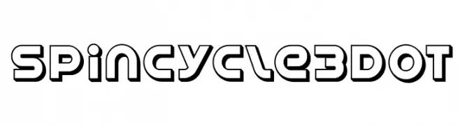
A bold, modern font with a three-dimensional outline style and geometric shapes.
 تنزيل 400 التنزيلات@WebFont
 -
( Fonts by 38.lineart - Muhammad Ridha Agusni - Personal-use only. For commercial use please contact owner. )
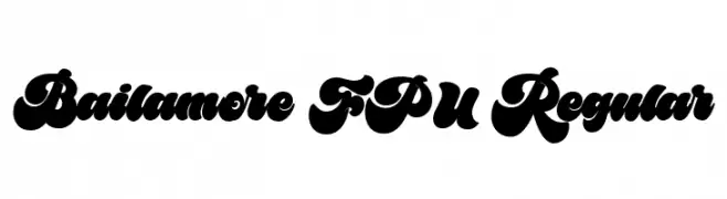
A bold, playful font with thick, rounded strokes and a whimsical style.
![Bailamore FPU Regular تنزيل الخطوط]() تنزيل 400 التنزيلات@WebFont
تنزيل 400 التنزيلات@WebFont -
( Fonts by Iconian Fonts )
A bold, expanded font with a vintage horror vibe, perfect for eye-catching designs.
![Ghoulish Intent Expanded تنزيل الخطوط]() تنزيل 400 التنزيلات@WebFont
تنزيل 400 التنزيلات@WebFont -
( Fonts by a Neale Davidson - www.pixelsagas.com. Personal-use only. For commercial use please contact owner. )
A bold, italicized font with sharp, angular characters and a dynamic style.
![Bidan Bold Italic تنزيل الخطوط]() تنزيل 400 التنزيلات@WebFont
تنزيل 400 التنزيلات@WebFont -
( Fonts by Style-7 - www.styleseven.com - Personal-use only. For commercial use please contact owner. )
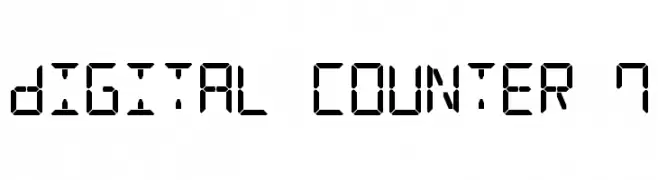
A digital, seven-segment display style font with a geometric and technical look.
![Digital Counter 7 تنزيل الخطوط]() تنزيل 400 التنزيلات@WebFont
تنزيل 400 التنزيلات@WebFont -
-
( Copyright (c) 2011, Hjort Nidudsson (http://caudex.sf.net) )
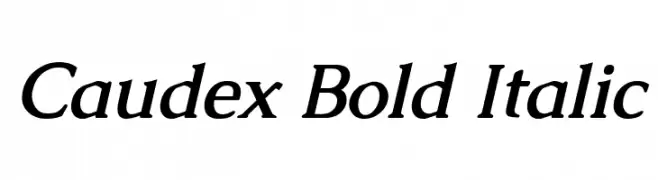
A bold, italic serif font with a classic and elegant style.
![Caudex Bold Italic تنزيل الخطوط]() تنزيل 400 التنزيلات@WebFont
تنزيل 400 التنزيلات@WebFont -
( Fonts by Mans Greback - www.mansgreback.com - Personal-use only. For commercial use please contact owner. )
A playful, handwritten font with bold, lively strokes and a whimsical charm.
![Smile Kids تنزيل الخطوط]() تنزيل 400 التنزيلات@WebFont
تنزيل 400 التنزيلات@WebFont -
![LitosScript-SemiBold تنزيل الخطوط]() تنزيل 400 التنزيلات@WebFont
تنزيل 400 التنزيلات@WebFont -
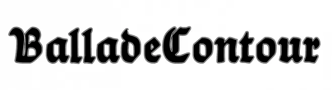
( Fonts by Dieter Steffmann )
A bold, blackletter font with a contour effect, offering a dramatic, Gothic style.
![BalladeContour تنزيل الخطوط]() تنزيل 400 التنزيلات@WebFont
تنزيل 400 التنزيلات@WebFont -
![Coptic Normal تنزيل الخطوط]() تنزيل 400 التنزيلات@WebFont
تنزيل 400 التنزيلات@WebFont


ما هي أبرز الخطوط الآن؟
تحظى SpinCycle3DOT, Bailamore FPU Regular, Ghoulish Intent Expanded, Bidan Bold Italic and Digital Counter 7 بشعبية لخطوطها النظيفة وتطبيقاتها الواسعة — من الهوية البصرية إلى الصفحات المقصودة والملصقات.
أي الخطوط تُستخدم كثيرًا في الشعارات؟
تُعد السان سيريف الهندسية (مثل Poppins وعائلات على نمط Gotham) خيارًا شائعًا لعلامات نظيفة قابلة للتوسع. ولإضفاء طابع ودي، تبقى السكريبت واليدوية خيارًا كلاسيكيًا. اجمع عنوانًا بارزًا مع خط نصي محايد لتحقيق التوازن والتميّز.
كم مرة يتم تحديث قائمة أعلى الخطوط؟
نحدّثها بانتظام استنادًا إلى التنزيلات والنشاط الفعلي. عُد إليها كثيرًا لاكتشاف النجوم الصاعدة مبكرًا.
💡 نصيحة: أضف هذه الصفحة إلى العلامات — تتغير الاتجاهات بسرعة وقد تُلهم خطوط اليوم الرائجة إعادة العلامة غدًا.