مرحبًا بك في قسم أعلى الخطوط — حيث تلتقي الشعبية بالجودة. هذه هي الخطوط الأكثر تنزيلًا واستخدامًا هذا العام من قبل مجتمعنا. إذا كنت بحاجة إلى اختيار موثوق للشعارات أو الويب أو وسائل التواصل، فابدأ من هنا.
يتميز كل خط رائج بتوازن جيد وقابلية قراءة وتعدد استخدامات. ستجد سان سيريف حديثة، وسكريبتات أنيقة، وسيريف كلاسيكية، وخطوط عرض minimal مختارة بعناية.
-
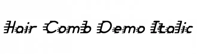
( Fonts by Noah Type )
A bold, italic font with dynamic horizontal lines for a sense of movement.
 تنزيل 408 التنزيلات@WebFont
 -
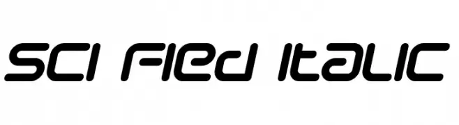
( Fonts by dustBUST - Andreas Nylin )
A futuristic, italicized font with rounded edges and a sci-fi aesthetic.
![Sci Fied Italic تنزيل الخطوط]() تنزيل 408 التنزيلات@WebFont
تنزيل 408 التنزيلات@WebFont -
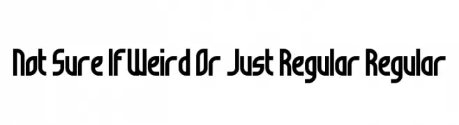
( Fonts by Andrew McCluskey - nalgames.com )
A bold, geometric font with a modern and structured design.
![Not Sure If Weird Or Just Regular Regular تنزيل الخطوط]() تنزيل 408 التنزيلات@WebFont
تنزيل 408 التنزيلات@WebFont -
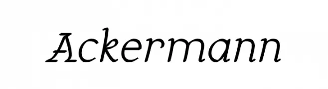
( Personal-use only. For commercial use please contact owner. )
An elegant script font with a slight slant and moderate stroke contrast.
![Ackermann تنزيل الخطوط]() تنزيل 408 التنزيلات@WebFont
تنزيل 408 التنزيلات@WebFont -
( Fonts by ReyreyBlue - Reyrey Blue - Personal-use only. For commercial use please contact owner. )
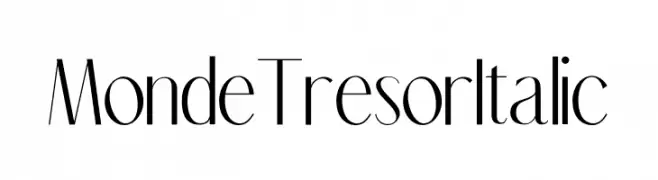
A modern, elegant font with high contrast and a slight italic slant.
![Mon de Tresor Italic تنزيل الخطوط]() تنزيل 408 التنزيلات@WebFont
تنزيل 408 التنزيلات@WebFont -
-
( Fonts by Tursun Sultan - Personal-use only. For commercial use please contact owner. )
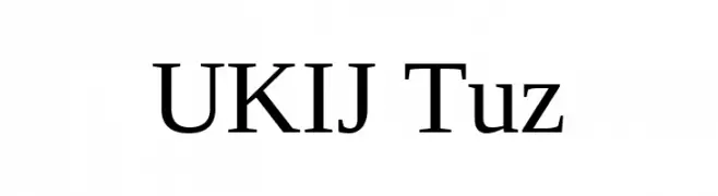
A classic serif font with elegant strokes and balanced proportions.
![UKIJ Tuz تنزيل الخطوط]() تنزيل 408 التنزيلات@WebFont
تنزيل 408 التنزيلات@WebFont -
( Fonts by or from www.graffitifonts.net )
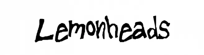
A playful, hand-drawn font with irregular, artistic strokes.
![Lemonheads تنزيل الخطوط]() تنزيل 408 التنزيلات@WebFont
تنزيل 408 التنزيلات@WebFont -
( Fonts by Mas Yudi )
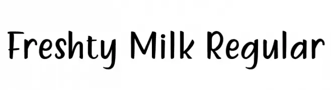
A playful and casual handwritten font with smooth curves and a friendly feel.
![Freshty Milk Regular تنزيل الخطوط]() تنزيل 408 التنزيلات@WebFont
تنزيل 408 التنزيلات@WebFont -
![Fun Euro Original Condensed No. 1 [Demo] تنزيل الخطوط]() تنزيل 408 التنزيلات@WebFont
تنزيل 408 التنزيلات@WebFont -
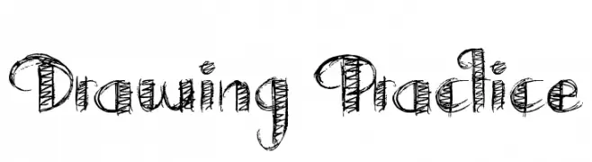
( Fonts by Jonathan S. Harris - www.tattoowoo.com. Personal-use only. For commercial use please contact owner. )
A hand-drawn, sketch-style font with playful curves and textured strokes.
![Drawing Practice تنزيل الخطوط]() تنزيل 408 التنزيلات@WebFont
تنزيل 408 التنزيلات@WebFont
![Fun Euro Original Condensed No. 1 [Demo] تنزيل الخطوط](https://d144mzi0q5mijx.cloudfront.net/img/F/U/Fun-Euro-Original-Condensed-No-1-Demo.webp)
ما هي أبرز الخطوط الآن؟
تحظى Hair Comb Demo Italic, Sci Fied Italic, Not Sure If Weird Or Just Regular Regular, Ackermann and Mon de Tresor Italic بشعبية لخطوطها النظيفة وتطبيقاتها الواسعة — من الهوية البصرية إلى الصفحات المقصودة والملصقات.
أي الخطوط تُستخدم كثيرًا في الشعارات؟
تُعد السان سيريف الهندسية (مثل Poppins وعائلات على نمط Gotham) خيارًا شائعًا لعلامات نظيفة قابلة للتوسع. ولإضفاء طابع ودي، تبقى السكريبت واليدوية خيارًا كلاسيكيًا. اجمع عنوانًا بارزًا مع خط نصي محايد لتحقيق التوازن والتميّز.
كم مرة يتم تحديث قائمة أعلى الخطوط؟
نحدّثها بانتظام استنادًا إلى التنزيلات والنشاط الفعلي. عُد إليها كثيرًا لاكتشاف النجوم الصاعدة مبكرًا.
💡 نصيحة: أضف هذه الصفحة إلى العلامات — تتغير الاتجاهات بسرعة وقد تُلهم خطوط اليوم الرائجة إعادة العلامة غدًا.