مرحبًا بك في قسم أعلى الخطوط — حيث تلتقي الشعبية بالجودة. هذه هي الخطوط الأكثر تنزيلًا واستخدامًا هذا العام من قبل مجتمعنا. إذا كنت بحاجة إلى اختيار موثوق للشعارات أو الويب أو وسائل التواصل، فابدأ من هنا.
يتميز كل خط رائج بتوازن جيد وقابلية قراءة وتعدد استخدامات. ستجد سان سيريف حديثة، وسكريبتات أنيقة، وسيريف كلاسيكية، وخطوط عرض minimal مختارة بعناية.
-
( Fonts by www.blambot.com )
A bold, industrial font with a futuristic, geometric design.
 تنزيل 417 التنزيلات@WebFont
 -
( Fonts by Burhan Afif - hanscostudio.com - Personal-use only. For commercial use please contact owner. )
A futuristic, geometric font with clean lines and a tech-inspired aesthetic.
![Nucleo تنزيل الخطوط]() تنزيل 417 التنزيلات@WebFont
تنزيل 417 التنزيلات@WebFont -
( Fonts by or from www.graffitifonts.net )
A casual, handwritten font with an authentic, personal touch.
![Shopping List تنزيل الخطوط]() تنزيل 417 التنزيلات@WebFont
تنزيل 417 التنزيلات@WebFont -
( Copyright (c) 2011-2012, Ana Sanfelippo (anasanfe@gmail.com), with Reserved Font Name 'Almendra' )
A classic, calligraphic font with elegant, flowing letterforms.
![Almendra Italic تنزيل الخطوط]() تنزيل 417 التنزيلات@WebFont
تنزيل 417 التنزيلات@WebFont -
![Uqammaq Heavy تنزيل الخطوط]() تنزيل 417 التنزيلات@WebFont
تنزيل 417 التنزيلات@WebFont -
-
( Fonts by Adult Ramblings - Anastacia E. Zittel - Personal-use only. For commercial use please contact owner. )
Whimsical display font using doll silhouettes as characters.
![AEZ toy dolls تنزيل الخطوط]() تنزيل 417 التنزيلات@WebFont
تنزيل 417 التنزيلات@WebFont -
( recklessweeknights.tumblr.com )
A playful, hand-drawn font with whimsical, irregular strokes.
![penis تنزيل الخطوط]() تنزيل 417 التنزيلات@WebFont
تنزيل 417 التنزيلات@WebFont -
( www.woodcutter.es )
A bold, rounded font with a playful and dynamic style.
![Conquest تنزيل الخطوط]() تنزيل 417 التنزيلات@WebFont
تنزيل 417 التنزيلات@WebFont -
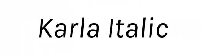
( Copyright (c) 2011-2012, Jonathan Pinhorn (jonpinhorn.typedesign@gmail.com), with Reserved Font Names 'Karla' )
A modern, italic sans-serif font with clean lines and balanced proportions.
![Karla Italic تنزيل الخطوط]() تنزيل 417 التنزيلات@WebFont
تنزيل 417 التنزيلات@WebFont -
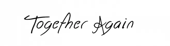
( Font by Jonathan Harris - www.tattoowoo.com )
A dynamic handwritten font with fluid, cursive letterforms and artistic flair.
![Together Again تنزيل الخطوط]() تنزيل 417 التنزيلات@WebFont
تنزيل 417 التنزيلات@WebFont


ما هي أبرز الخطوط الآن؟
تحظى MechEffects2 BB, Nucleo, Shopping List, Almendra Italic and Uqammaq Heavy بشعبية لخطوطها النظيفة وتطبيقاتها الواسعة — من الهوية البصرية إلى الصفحات المقصودة والملصقات.
أي الخطوط تُستخدم كثيرًا في الشعارات؟
تُعد السان سيريف الهندسية (مثل Poppins وعائلات على نمط Gotham) خيارًا شائعًا لعلامات نظيفة قابلة للتوسع. ولإضفاء طابع ودي، تبقى السكريبت واليدوية خيارًا كلاسيكيًا. اجمع عنوانًا بارزًا مع خط نصي محايد لتحقيق التوازن والتميّز.
كم مرة يتم تحديث قائمة أعلى الخطوط؟
نحدّثها بانتظام استنادًا إلى التنزيلات والنشاط الفعلي. عُد إليها كثيرًا لاكتشاف النجوم الصاعدة مبكرًا.
💡 نصيحة: أضف هذه الصفحة إلى العلامات — تتغير الاتجاهات بسرعة وقد تُلهم خطوط اليوم الرائجة إعادة العلامة غدًا.