مرحبًا بك في قسم أعلى الخطوط — حيث تلتقي الشعبية بالجودة. هذه هي الخطوط الأكثر تنزيلًا واستخدامًا هذا العام من قبل مجتمعنا. إذا كنت بحاجة إلى اختيار موثوق للشعارات أو الويب أو وسائل التواصل، فابدأ من هنا.
يتميز كل خط رائج بتوازن جيد وقابلية قراءة وتعدد استخدامات. ستجد سان سيريف حديثة، وسكريبتات أنيقة، وسيريف كلاسيكية، وخطوط عرض minimal مختارة بعناية.
-
( Fonts by headfirst - Morice Kastoun - Personal-use only. For commercial use please contact owner. )
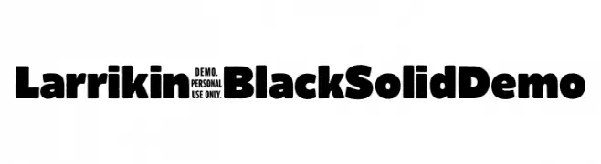
A bold, playful font with thick, rounded strokes and high contrast.
 تنزيل 423 التنزيلات@WebFont
 -
( Fonts by Fernando Carvente - serifdechocolate.wordpress.com )
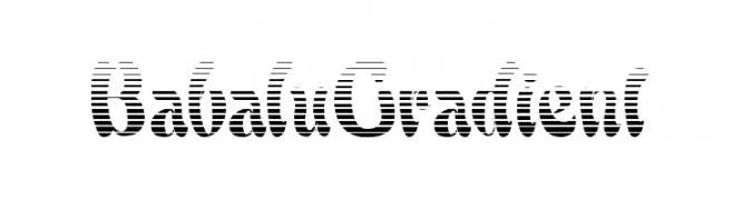
A bold, decorative font with a striped gradient effect.
![BabaluGradient تنزيل الخطوط]() تنزيل 423 التنزيلات@WebFont
تنزيل 423 التنزيلات@WebFont -
( Fonts by www.alphabetype.it )
A bold, playful, and quirky decorative font with high contrast and artistic flair.
![Singapore تنزيل الخطوط]() تنزيل 423 التنزيلات@WebFont
تنزيل 423 التنزيلات@WebFont -
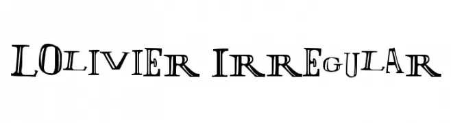
![LOlivier Irregular تنزيل الخطوط]() تنزيل 423 التنزيلات@WebFont
تنزيل 423 التنزيلات@WebFont -
( Fonts by joorgemoron - Personal-use only. For commercial use please contact owner. )
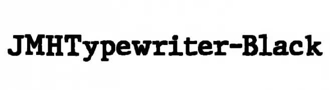
A bold, vintage typewriter-style font with slab serifs and strong, uniform strokes.
![JMHTypewriter-Black تنزيل الخطوط]() تنزيل 423 التنزيلات@WebFont
تنزيل 423 التنزيلات@WebFont -
-
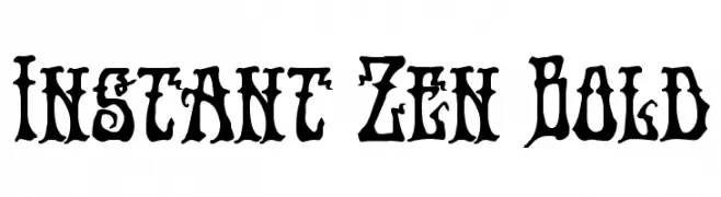
( Fonts by Iconian Fonts )
A bold, gothic-inspired font with intricate, decorative details.
![Instant Zen Bold تنزيل الخطوط]() تنزيل 423 التنزيلات@WebFont
تنزيل 423 التنزيلات@WebFont -
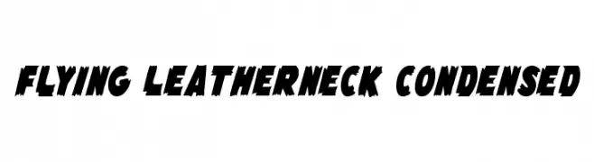
( Fonts by Daniel Zadorozny - www.iconian.com - Free for personal use )
A bold, jagged, and condensed font with an energetic and aggressive style.
![Flying Leatherneck Condensed تنزيل الخطوط]() تنزيل 423 التنزيلات@WebFont
تنزيل 423 التنزيلات@WebFont -
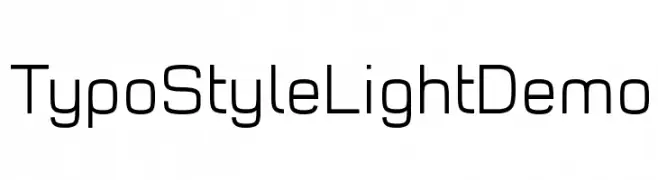
( Fonts by www.studiotypo.com - Personal-use only. For commercial use please contact owner. )
A modern, geometric sans-serif font with uniform stroke widths and rounded edges.
![Typo Style Light Demo تنزيل الخطوط]() تنزيل 423 التنزيلات@WebFont
تنزيل 423 التنزيلات@WebFont -
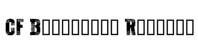
( Fonts by Steve Cloutier - www.cloutierfontes.ca )
A bold, distressed font with a textured, vintage appearance.
![CF Bucherons Regular تنزيل الخطوط]() تنزيل 423 التنزيلات@WebFont
تنزيل 423 التنزيلات@WebFont -
( Fonts by Cat.B - Agathe M.Joyce - Personal-use only. For commercial use please contact owner. )
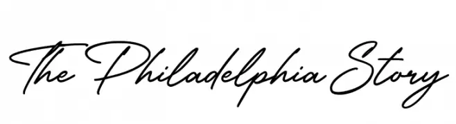
A sophisticated and fluid script font with seamless cursive connections.
![The Philadelphia Story تنزيل الخطوط]() تنزيل 423 التنزيلات@WebFont
تنزيل 423 التنزيلات@WebFont

ما هي أبرز الخطوط الآن؟
تحظى Larrikin-BlackSolidDemo, BabaluGradient, Singapore, LOlivier Irregular and JMHTypewriter-Black بشعبية لخطوطها النظيفة وتطبيقاتها الواسعة — من الهوية البصرية إلى الصفحات المقصودة والملصقات.
أي الخطوط تُستخدم كثيرًا في الشعارات؟
تُعد السان سيريف الهندسية (مثل Poppins وعائلات على نمط Gotham) خيارًا شائعًا لعلامات نظيفة قابلة للتوسع. ولإضفاء طابع ودي، تبقى السكريبت واليدوية خيارًا كلاسيكيًا. اجمع عنوانًا بارزًا مع خط نصي محايد لتحقيق التوازن والتميّز.
كم مرة يتم تحديث قائمة أعلى الخطوط؟
نحدّثها بانتظام استنادًا إلى التنزيلات والنشاط الفعلي. عُد إليها كثيرًا لاكتشاف النجوم الصاعدة مبكرًا.
💡 نصيحة: أضف هذه الصفحة إلى العلامات — تتغير الاتجاهات بسرعة وقد تُلهم خطوط اليوم الرائجة إعادة العلامة غدًا.