مرحبًا بك في قسم أعلى الخطوط — حيث تلتقي الشعبية بالجودة. هذه هي الخطوط الأكثر تنزيلًا واستخدامًا هذا العام من قبل مجتمعنا. إذا كنت بحاجة إلى اختيار موثوق للشعارات أو الويب أو وسائل التواصل، فابدأ من هنا.
يتميز كل خط رائج بتوازن جيد وقابلية قراءة وتعدد استخدامات. ستجد سان سيريف حديثة، وسكريبتات أنيقة، وسيريف كلاسيكية، وخطوط عرض minimal مختارة بعناية.
-
( Copyright (c) 2011, Dan Sayers (i@iotic.com) )
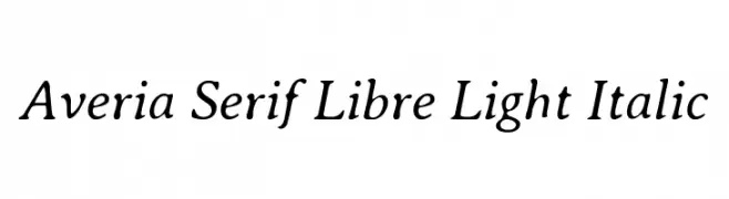
A light, elegant serif font with a graceful italic slant.
 تنزيل 434 التنزيلات@WebFont
 -
( Fonts by Typhoon Type - Suthi Srisopha - www.typhoontype.net - Personal-use only. For commercial use please contact owner. )
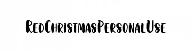
A playful, festive handwritten font with bold, rounded characters.
![RedChristmasPersonalUse تنزيل الخطوط]() تنزيل 434 التنزيلات@WebFont
تنزيل 434 التنزيلات@WebFont -
![Nestor تنزيل الخطوط]() تنزيل 434 التنزيلات
تنزيل 434 التنزيلات -
( Fonts by www.aka-acid.com )
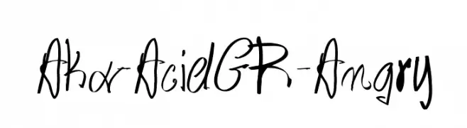
A bold, expressive handwritten font with dynamic strokes.
![Aka-AcidGR-Angry تنزيل الخطوط]() تنزيل 434 التنزيلات@WebFont
تنزيل 434 التنزيلات@WebFont -
( Fonts by Spork Thug Typography - Josh Wilhelm - www.lifewithouttaffy.com/taffy/blog )
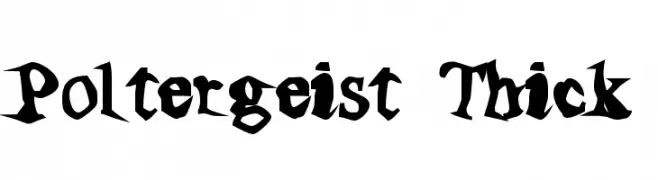
A bold, jagged font with a hand-drawn, chaotic style.
![Poltergeist Thick تنزيل الخطوط]() تنزيل 434 التنزيلات@WebFont
تنزيل 434 التنزيلات@WebFont -
-
( Fonts by Tursun Sultan - Personal-use only. For commercial use please contact owner. )
A classic serif font with a modern touch, offering elegance and readability.
![UKIJ Tuz Qara تنزيل الخطوط]() تنزيل 434 التنزيلات@WebFont
تنزيل 434 التنزيلات@WebFont -
( Fonts by Daniel Zadorozny - www.iconian.com - Free for personal use )
A bold, italicized blackletter font with a medieval aesthetic.
![Uberhölme Italic تنزيل الخطوط]() تنزيل 434 التنزيلات@WebFont
تنزيل 434 التنزيلات@WebFont -
( Fonts by Khurasan )
A playful, bold font with rounded, thick strokes and a friendly appearance.
![Chocopy تنزيل الخطوط]() تنزيل 434 التنزيلات@WebFont
تنزيل 434 التنزيلات@WebFont -
( Fonts by Graham Meade - GemFonts )
A modern-vintage serif font with sharp serifs and elegant curves.
![MilleniGem تنزيل الخطوط]() تنزيل 434 التنزيلات@WebFont
تنزيل 434 التنزيلات@WebFont -
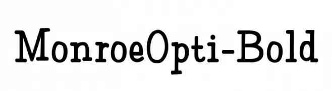
( Fonts by Castcraft Software - opti.netii.net - check the website before use )
A bold slab serif font with thick strokes and rounded edges, perfect for impactful designs.
![MonroeOpti-Bold تنزيل الخطوط]() تنزيل 434 التنزيلات@WebFont
تنزيل 434 التنزيلات@WebFont

ما هي أبرز الخطوط الآن؟
تحظى Averia Serif Libre Light Italic, RedChristmasPersonalUse, Nestor, Aka-AcidGR-Angry and Poltergeist Thick بشعبية لخطوطها النظيفة وتطبيقاتها الواسعة — من الهوية البصرية إلى الصفحات المقصودة والملصقات.
أي الخطوط تُستخدم كثيرًا في الشعارات؟
تُعد السان سيريف الهندسية (مثل Poppins وعائلات على نمط Gotham) خيارًا شائعًا لعلامات نظيفة قابلة للتوسع. ولإضفاء طابع ودي، تبقى السكريبت واليدوية خيارًا كلاسيكيًا. اجمع عنوانًا بارزًا مع خط نصي محايد لتحقيق التوازن والتميّز.
كم مرة يتم تحديث قائمة أعلى الخطوط؟
نحدّثها بانتظام استنادًا إلى التنزيلات والنشاط الفعلي. عُد إليها كثيرًا لاكتشاف النجوم الصاعدة مبكرًا.
💡 نصيحة: أضف هذه الصفحة إلى العلامات — تتغير الاتجاهات بسرعة وقد تُلهم خطوط اليوم الرائجة إعادة العلامة غدًا.