مرحبًا بك في قسم أعلى الخطوط — حيث تلتقي الشعبية بالجودة. هذه هي الخطوط الأكثر تنزيلًا واستخدامًا هذا العام من قبل مجتمعنا. إذا كنت بحاجة إلى اختيار موثوق للشعارات أو الويب أو وسائل التواصل، فابدأ من هنا.
يتميز كل خط رائج بتوازن جيد وقابلية قراءة وتعدد استخدامات. ستجد سان سيريف حديثة، وسكريبتات أنيقة، وسيريف كلاسيكية، وخطوط عرض minimal مختارة بعناية.
-
( Fonts by Motokiwo - Anton Cahyono - Personal-use only. For commercial use please contact owner. )
A modern, sleek font with tall, narrow characters and high contrast strokes.
 تنزيل 70 التنزيلات@WebFont
 -
( Fonts by Typodermic Fonts )
An elegant serif italic font with smooth curves and a classic yet modern style.
![KingsbridgeEl-Italic تنزيل الخطوط]() تنزيل 70 التنزيلات@WebFont
تنزيل 70 التنزيلات@WebFont -
( Fonts by Zanatlija - Personal-use only. For commercial use please contact owner. )
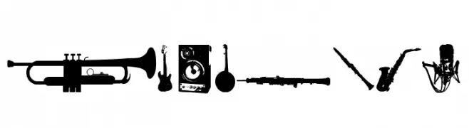
A decorative set of music-themed icons representing various instruments and elements.
![music tfb تنزيل الخطوط]() تنزيل 70 التنزيلات@WebFont
تنزيل 70 التنزيلات@WebFont -
( Fonts by 7NTypes - Situjuh Nazara - Personal-use only. For commercial use please contact owner. )
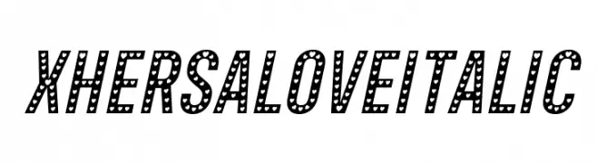
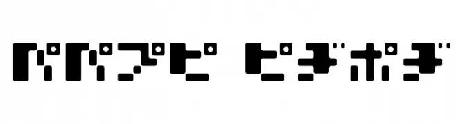
A bold, italicized font with decorative dotted patterns.
![Xhers Alove Italic تنزيل الخطوط]() تنزيل 70 التنزيلات@WebFont
تنزيل 70 التنزيلات@WebFont -
( Fonts by Airotype Studio - Personal-use only. For commercial use please contact owner. )
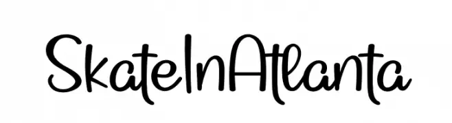
A playful, handwritten font with a casual and friendly style.
![Skate In Atlanta تنزيل الخطوط]() تنزيل 70 التنزيلات@WebFont
تنزيل 70 التنزيلات@WebFont -
( Fonts by Garisman Studio - Risman Ginarwan - Personal-use only. For commercial use please contact owner. )
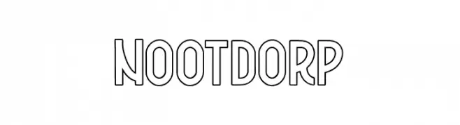
A bold, outlined font with a modern, playful style and consistent geometric design.
![Nootdorp تنزيل الخطوط]() تنزيل 70 التنزيلات@WebFont
تنزيل 70 التنزيلات@WebFont -
![Pointer SuperExtended تنزيل الخطوط]() تنزيل 70 التنزيلات@WebFont
تنزيل 70 التنزيلات@WebFont -
( Hanny Sandoval - www.behance.net/hannysandoval )
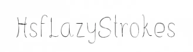
A whimsical, sketch-like handwritten font with dynamic strokes.
![HsfLazyStrokes تنزيل الخطوط]() تنزيل 70 التنزيلات@WebFont
تنزيل 70 التنزيلات@WebFont -
( Fonts by Raymond Larabie - Personal-use only. For commercial use please contact owner. )
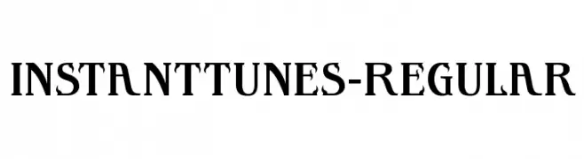
A modern decorative font with dynamic, flowing letterforms and bold numerals.
![InstantTunes-Regular تنزيل الخطوط]() تنزيل 70 التنزيلات@WebFont
تنزيل 70 التنزيلات@WebFont -
( Fonts by Vladimir Nikolic - www.creativefabrica.com/designer/vladimirnikolic/ - Personal-use only. For commercial use please contact owner. )
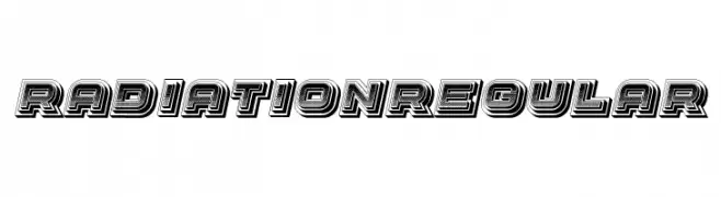
A bold, layered font with a retro 3D effect and geometric structure.
![Radiation Regular تنزيل الخطوط]() تنزيل 70 التنزيلات@WebFont
تنزيل 70 التنزيلات@WebFont -
( Fonts by Patria Ari Typestudio - Patria Ari - Personal-use only. For commercial use please contact owner. )
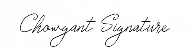
An elegant, cursive font with fluid, connected letters and varying line thickness.
![Chowgant Signature تنزيل الخطوط]() تنزيل 70 التنزيلات@WebFont
تنزيل 70 التنزيلات@WebFont -
( Fonts by Mozatype - Personal-use only. For commercial use please contact owner. )
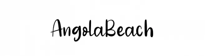
A playful, casual handwritten font with smooth, flowing curves.
![Angola Beach تنزيل الخطوط]() تنزيل 70 التنزيلات@WebFont
تنزيل 70 التنزيلات@WebFont -
( Fonts by Raymond Larabie - Personal-use only. For commercial use please contact owner. )
A modern, tech-inspired font with segmented lines and geometric shapes.
![VanchromeDown-Regular تنزيل الخطوط]() تنزيل 70 التنزيلات@WebFont
تنزيل 70 التنزيلات@WebFont -
![Vimal Bold Italic تنزيل الخطوط]() تنزيل 70 التنزيلات
تنزيل 70 التنزيلات -
( Fonts by weknow - Wino S Kadir - Personal-use only. For commercial use please contact owner. )
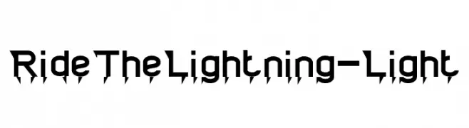
A bold, lightning-inspired font with sharp, angular edges for a dynamic look.
![Ride The Lightning-Light تنزيل الخطوط]() تنزيل 70 التنزيلات@WebFont
تنزيل 70 التنزيلات@WebFont -
( Fonts by FHFont - Ferry Hadriyan - Personal-use only. For commercial use please contact owner. )
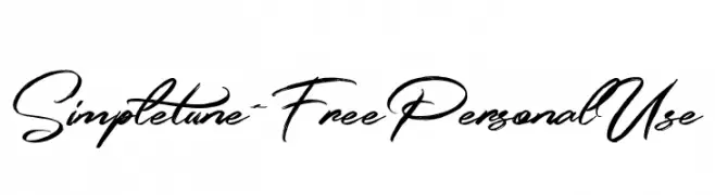
A dynamic and elegant script font with fluid, cursive letterforms.
![Simpletune-FreePersonalUse تنزيل الخطوط]() تنزيل 70 التنزيلات@WebFont
تنزيل 70 التنزيلات@WebFont -
( Fonts by Daniel Zadorozny - www.iconian.com - Personal-use only. For commercial use please contact owner. )
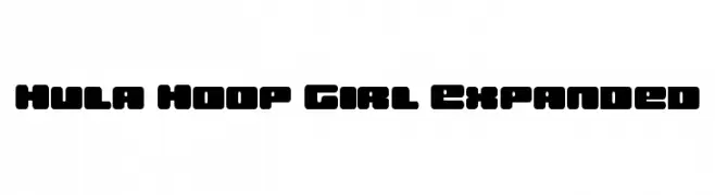
A bold, rounded font with a playful and energetic style.
![Hula Hoop Girl Expanded تنزيل الخطوط]() تنزيل 70 التنزيلات@WebFont
تنزيل 70 التنزيلات@WebFont -
( Fonts by Kat`s Fun Fonts - Personal-use only. For commercial use please contact owner. )
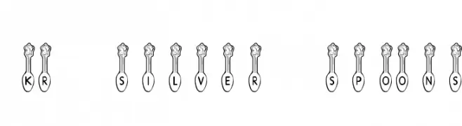
A decorative font with characters encased in ornate spoon designs.
![KR Silver Spoons تنزيل الخطوط]() تنزيل 70 التنزيلات@WebFont
تنزيل 70 التنزيلات@WebFont -
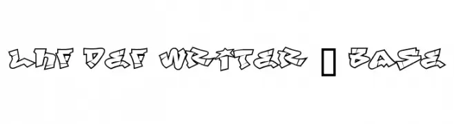
![LHF Def Writer | BASE تنزيل الخطوط]() تنزيل 70 التنزيلات
تنزيل 70 التنزيلات -
( Fonts by Vunira Design - Personal-use only. For commercial use please contact owner. )
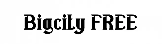
A bold, angular serif font with a modern vintage flair.
![Bigcity FREE تنزيل الخطوط]() تنزيل 70 التنزيلات@WebFont
تنزيل 70 التنزيلات@WebFont -
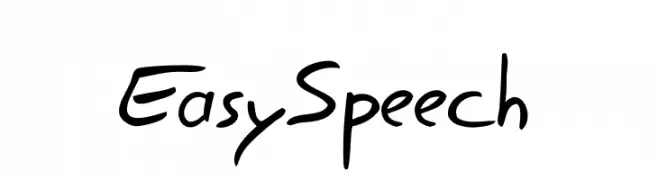
( Jean-Jacques Morello - about.me/xoth )
A lively and energetic handwritten font with fluid strokes.
![EasySpeech تنزيل الخطوط]() تنزيل 70 التنزيلات@WebFont
تنزيل 70 التنزيلات@WebFont -
( Fonts by Dikas Studio - Andika Setiawan - Personal-use only. For commercial use please contact owner. )
A lively, expressive handwritten font with fluid, dynamic strokes.
![Wildy Sign Personal Use تنزيل الخطوط]() تنزيل 70 التنزيلات@WebFont
تنزيل 70 التنزيلات@WebFont -
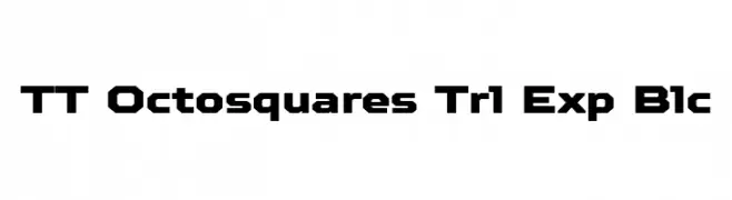
( Fonts by TypeType Foundry )
A bold, geometric font with blocky, angular letterforms and a modern aesthetic.
![TT Octosquares Trl Exp Blc تنزيل الخطوط]() تنزيل 70 التنزيلات@WebFont
تنزيل 70 التنزيلات@WebFont -
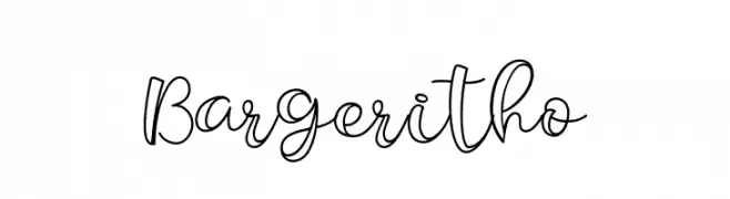
( Fonts by Kotak Kuning Studio - kotakkuning.com - Personal-use only. For commercial use please contact owner. )
A modern, cursive font with elegant, flowing characters.
![Bargeritho تنزيل الخطوط]() تنزيل 70 التنزيلات@WebFont
تنزيل 70 التنزيلات@WebFont -
( Fonts by Jen Jones - Personal-use only. For commercial use please contact owner. )
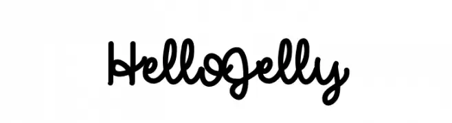
A playful, casual handwritten font with smooth, flowing curves.
![HelloJelly تنزيل الخطوط]() تنزيل 70 التنزيلات@WebFont
تنزيل 70 التنزيلات@WebFont -
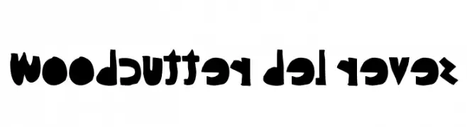
( Fonts by www.woodcutter.es - woodcutter Manero - Personal-use only. For commercial use please contact owner. )
A playful, bold font with reversed characters and a handcrafted feel.
![woodcutter del reves تنزيل الخطوط]() تنزيل 70 التنزيلات@WebFont
تنزيل 70 التنزيلات@WebFont -
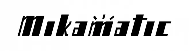
( Marco Antonio Sanz Molleda - nagarerumonogatari.blogspot.jp/ )
A bold, angular font with a futuristic and dynamic style.
![Mikamatic تنزيل الخطوط]() تنزيل 70 التنزيلات@WebFont
تنزيل 70 التنزيلات@WebFont -
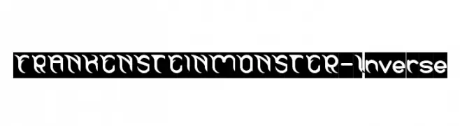
( weknow - Wino S Kadir - www.creativefabrica.com/designer/weknow/ )
A bold, decorative font with a gothic, monstrous style.
![FRANKENSTEIN MONSTER-Inverse تنزيل الخطوط]() تنزيل 70 التنزيلات@WebFont
تنزيل 70 التنزيلات@WebFont -
( Flop Design - www.flopdesign.com/ )
A bold, geometric font with a playful and modern style.
![MOOMILK KANA تنزيل الخطوط]() تنزيل 70 التنزيلات@WebFont
تنزيل 70 التنزيلات@WebFont -
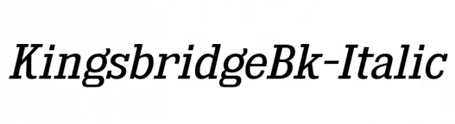
( Fonts by Typodermic Fonts )
Elegant serif font with italic style and moderate contrast.
![KingsbridgeBk-Italic تنزيل الخطوط]() تنزيل 70 التنزيلات@WebFont
تنزيل 70 التنزيلات@WebFont -
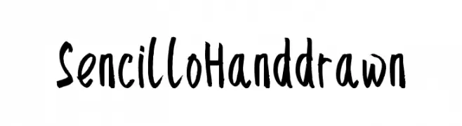
( Atjcloth Studio - Hanif Syahputra - creativemarket.com/Atjcloth?u=Atjcloth )
A playful, hand-drawn font with irregular strokes and a casual vibe.
![SencilloHanddrawn تنزيل الخطوط]() تنزيل 70 التنزيلات@WebFont
تنزيل 70 التنزيلات@WebFont -
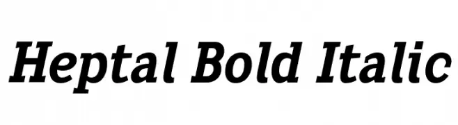
( deFharo - Fernando Haro - defharo.com )
A bold, italicized font with strong strokes and a dynamic slant.
![Heptal Bold Italic تنزيل الخطوط]() تنزيل 70 التنزيلات@WebFont
تنزيل 70 التنزيلات@WebFont -
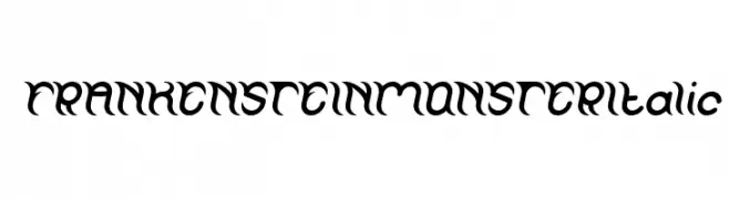
( weknow - Wino S Kadir - www.creativefabrica.com/designer/weknow/ )
A bold, gothic-inspired font with sharp edges and flowing curves.
![FRANKENSTEIN MONSTER Italic تنزيل الخطوط]() تنزيل 70 التنزيلات@WebFont
تنزيل 70 التنزيلات@WebFont -
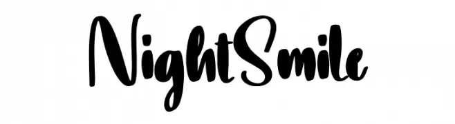
( Fonts by Scratchones )
Bold, playful handwritten script with brush-like strokes.
![Night Smile تنزيل الخطوط]() تنزيل 70 التنزيلات@WebFont
تنزيل 70 التنزيلات@WebFont -
( Noto is a trademark of Google Inc. Noto fonts are open source. All Noto fonts are published under the SIL Open Font License, Version 1.1 )
A clean, extra condensed, and light font ideal for modern designs.
![Noto Sans Sinhala ExtraCondensed Light تنزيل الخطوط]() تنزيل 70 التنزيلات@WebFont
تنزيل 70 التنزيلات@WebFont


ما هي أبرز الخطوط الآن؟
تحظى Modric, KingsbridgeEl-Italic, music tfb, Xhers Alove Italic and Skate In Atlanta بشعبية لخطوطها النظيفة وتطبيقاتها الواسعة — من الهوية البصرية إلى الصفحات المقصودة والملصقات.
أي الخطوط تُستخدم كثيرًا في الشعارات؟
تُعد السان سيريف الهندسية (مثل Poppins وعائلات على نمط Gotham) خيارًا شائعًا لعلامات نظيفة قابلة للتوسع. ولإضفاء طابع ودي، تبقى السكريبت واليدوية خيارًا كلاسيكيًا. اجمع عنوانًا بارزًا مع خط نصي محايد لتحقيق التوازن والتميّز.
كم مرة يتم تحديث قائمة أعلى الخطوط؟
نحدّثها بانتظام استنادًا إلى التنزيلات والنشاط الفعلي. عُد إليها كثيرًا لاكتشاف النجوم الصاعدة مبكرًا.
💡 نصيحة: أضف هذه الصفحة إلى العلامات — تتغير الاتجاهات بسرعة وقد تُلهم خطوط اليوم الرائجة إعادة العلامة غدًا.