مرحبًا بك في قسم أعلى الخطوط — حيث تلتقي الشعبية بالجودة. هذه هي الخطوط الأكثر تنزيلًا واستخدامًا هذا العام من قبل مجتمعنا. إذا كنت بحاجة إلى اختيار موثوق للشعارات أو الويب أو وسائل التواصل، فابدأ من هنا.
يتميز كل خط رائج بتوازن جيد وقابلية قراءة وتعدد استخدامات. ستجد سان سيريف حديثة، وسكريبتات أنيقة، وسيريف كلاسيكية، وخطوط عرض minimal مختارة بعناية.
-
 تنزيل 462 التنزيلات@WebFont
 -
( Fonts by www.peter-wiegel.de. Personal-use only. For commercial use please contact owner. )
A modern, geometric font with high contrast and stylish design.
![Quimbie تنزيل الخطوط]() تنزيل 462 التنزيلات@WebFont
تنزيل 462 التنزيلات@WebFont -
( Fonts by GUST e-foundry )
A modern sans-serif italic font with clean lines and a dynamic style.
![TeXGyreHeros-Italic تنزيل الخطوط]() تنزيل 462 التنزيلات@WebFont
تنزيل 462 التنزيلات@WebFont -
( Fonts by Adien Gunarta - fontasticindonesia.blogspot.com )
A playful, hand-drawn font with tall, narrow letters and a dynamic tilt.
![Don Aquarel تنزيل الخطوط]() تنزيل 461 التنزيلات@WebFont
تنزيل 461 التنزيلات@WebFont -
![Mucho Fresco تنزيل الخطوط]() تنزيل 461 التنزيلات@WebFont
تنزيل 461 التنزيلات@WebFont -
-
( Fonts by Manfred Klein. Free for private and charity use. Free for commercial with donation to organizations )
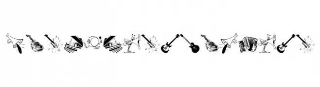
Illustrative font with each character as a unique musical instrument drawing.
![MusicInstruments تنزيل الخطوط]() تنزيل 461 التنزيلات@WebFont
تنزيل 461 التنزيلات@WebFont -
( Haris Purnama - creativemarket.com/RitsType )
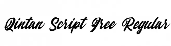
A dynamic script font with fluid, interconnected strokes and elegant style.
![Qintan Script Free Regular تنزيل الخطوط]() تنزيل 461 التنزيلات@WebFont
تنزيل 461 التنزيلات@WebFont -
( Fonts by maja.mint - creativemarket.com/maja.mint - Personal-use only. For commercial use please contact owner. )
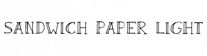
A sophisticated serif font with elegant, thin strokes and slight serifs.
![Sandwich Paper Light تنزيل الخطوط]() تنزيل 461 التنزيلات@WebFont
تنزيل 461 التنزيلات@WebFont -
( Fonts by Royaltype )
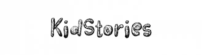
A playful, hand-drawn font with a textured, wood-like appearance.
![KidStories تنزيل الخطوط]() تنزيل 461 التنزيلات@WebFont
تنزيل 461 التنزيلات@WebFont -
( Fonts by Vernon Adams - Personal-use only. For commercial use please contact owner. )
A modern, clean sans-serif font with excellent readability.
![Comme Medium تنزيل الخطوط]() تنزيل 461 التنزيلات@WebFont
تنزيل 461 التنزيلات@WebFont


ما هي أبرز الخطوط الآن؟
تحظى NCAA ACC, Quimbie, TeXGyreHeros-Italic, Don Aquarel and Mucho Fresco بشعبية لخطوطها النظيفة وتطبيقاتها الواسعة — من الهوية البصرية إلى الصفحات المقصودة والملصقات.
أي الخطوط تُستخدم كثيرًا في الشعارات؟
تُعد السان سيريف الهندسية (مثل Poppins وعائلات على نمط Gotham) خيارًا شائعًا لعلامات نظيفة قابلة للتوسع. ولإضفاء طابع ودي، تبقى السكريبت واليدوية خيارًا كلاسيكيًا. اجمع عنوانًا بارزًا مع خط نصي محايد لتحقيق التوازن والتميّز.
كم مرة يتم تحديث قائمة أعلى الخطوط؟
نحدّثها بانتظام استنادًا إلى التنزيلات والنشاط الفعلي. عُد إليها كثيرًا لاكتشاف النجوم الصاعدة مبكرًا.
💡 نصيحة: أضف هذه الصفحة إلى العلامات — تتغير الاتجاهات بسرعة وقد تُلهم خطوط اليوم الرائجة إعادة العلامة غدًا.