مرحبًا بك في قسم أعلى الخطوط — حيث تلتقي الشعبية بالجودة. هذه هي الخطوط الأكثر تنزيلًا واستخدامًا هذا العام من قبل مجتمعنا. إذا كنت بحاجة إلى اختيار موثوق للشعارات أو الويب أو وسائل التواصل، فابدأ من هنا.
يتميز كل خط رائج بتوازن جيد وقابلية قراءة وتعدد استخدامات. ستجد سان سيريف حديثة، وسكريبتات أنيقة، وسيريف كلاسيكية، وخطوط عرض minimal مختارة بعناية.
-
( Ideas and Apps - Angel García Rubio - www.ideasandapps.com )
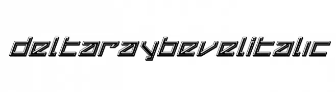
A bold, angular font with a rugged, industrial style.
 تنزيل 75 التنزيلات@WebFont
 -
![Delta Ray Bevel Italic تنزيل الخطوط]() تنزيل 75 التنزيلات@WebFont
تنزيل 75 التنزيلات@WebFont -
( Iconian Fonts - Daniel Zadorozny - www.iconian.com )
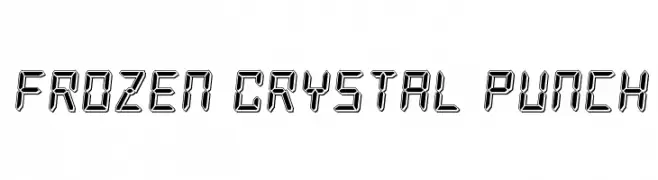
A futuristic, digital-style font with a three-dimensional, crystal-like appearance.
![Frozen Crystal Punch تنزيل الخطوط]() تنزيل 75 التنزيلات@WebFont
تنزيل 75 التنزيلات@WebFont -
( Fonts by Zanatlija - Personal-use only. For commercial use please contact owner. )
An ornate, decorative font with intricate floral patterns in each letter.
![Initials TFB تنزيل الخطوط]() تنزيل 75 التنزيلات@WebFont
تنزيل 75 التنزيلات@WebFont -
( Fonts by Daniel Zadorozny - www.iconian.com )
A bold, geometric font with a 3D halftone effect, perfect for futuristic designs.
![OmegaForce Halftone 3D Regular تنزيل الخطوط]() تنزيل 75 التنزيلات@WebFont
تنزيل 75 التنزيلات@WebFont -
( Fonts by Kat`s Fun Fonts - Personal-use only. For commercial use please contact owner. )
A playful, golf-themed font with bold, rounded letters and integrated flag motifs.
![KR Hole In One! تنزيل الخطوط]() تنزيل 75 التنزيلات@WebFont
تنزيل 75 التنزيلات@WebFont -
( Fonts by Kong Font - fontkong.com - Personal-use only. For commercial use please contact owner. )
A lively and expressive script font with fluid, dynamic strokes.
![Boostone تنزيل الخطوط]() تنزيل 75 التنزيلات@WebFont
تنزيل 75 التنزيلات@WebFont -
( Fonts by DmLetter31 - Dimas Prasetyo - Personal-use only. For commercial use please contact owner. )
A playful, bold font with a hand-drawn, whimsical style.
![Sugar Dream تنزيل الخطوط]() تنزيل 75 التنزيلات@WebFont
تنزيل 75 التنزيلات@WebFont -
( Ekloff Design - ekloff.com )
A modular, grid-based font with a digital, pixelated style.
![Remodula Regular تنزيل الخطوط]() تنزيل 75 التنزيلات@WebFont
تنزيل 75 التنزيلات@WebFont -
( Fonts by Iconian Fonts )
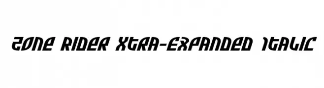
Bold, italic, and expanded with a modern, dynamic style.
![Zone Rider Xtra-Expanded Italic تنزيل الخطوط]() تنزيل 75 التنزيلات@WebFont
تنزيل 75 التنزيلات@WebFont -
( Fonts by ingoFonts - Ingo Zimmermann - Personal-use only. For commercial use please contact owner. )
A sleek, modern, light italic font with low contrast and condensed spacing.
![AbsolutRed-LightItalic تنزيل الخطوط]() تنزيل 75 التنزيلات@WebFont
تنزيل 75 التنزيلات@WebFont -
![Byzantine Exasperation Regular تنزيل الخطوط]() تنزيل 75 التنزيلات@WebFont
تنزيل 75 التنزيلات@WebFont -
( Fonts by Woodcutter Manero - www.woodcutter.es - Personal-use only. For commercial use please contact owner. )
A bold, distressed font with chaotic, paint-splattered textures.
![Chaos in Wisconsin تنزيل الخطوط]() تنزيل 75 التنزيلات@WebFont
تنزيل 75 التنزيلات@WebFont -
( Fonts by Daniel Zadorozny - www.iconian.com - Free for personal use )
A bold, futuristic font with sharp, angular edges and a geometric style.
![VX Rocket Laser Italic تنزيل الخطوط]() تنزيل 75 التنزيلات@WebFont
تنزيل 75 التنزيلات@WebFont -
( Fonts by Leonard Posavec - leosupply.co - Personal-use only. For commercial use please contact owner. )
A bold, graffiti-inspired font with a dynamic and edgy style.
![FastOstrich تنزيل الخطوط]() تنزيل 75 التنزيلات@WebFont
تنزيل 75 التنزيلات@WebFont -
( Ariel Gonzalez - aritogonzalez.blogspot.com.ar/ )
A bold, geometric font with a modern, futuristic style and decorative elements.
![BlackMary تنزيل الخطوط]() تنزيل 75 التنزيلات@WebFont
تنزيل 75 التنزيلات@WebFont -
( Noto is a trademark of Google Inc. Noto fonts are open source. All Noto fonts are published under the SIL Open Font License, Version 1.1 )
Invalid font composed of placeholder symbols.
![Noto Serif Hebrew ExtraCondensed Thin تنزيل الخطوط]() تنزيل 75 التنزيلات@WebFont
تنزيل 75 التنزيلات@WebFont -
( Fonts by AlifRyanZulfikar - Personal-use only. For commercial use please contact owner. )
A playful and whimsical script font with a handwritten style.
![Love Sunday - Personal Use تنزيل الخطوط]() تنزيل 75 التنزيلات@WebFont
تنزيل 75 التنزيلات@WebFont -
( Fonts by LyonsType - Daniel Lyons - Personal-use only. For commercial use please contact owner. )
A bold, italicized font with a modern and dynamic style.
![LTReponseBoldItalic تنزيل الخطوط]() تنزيل 75 التنزيلات@WebFont
تنزيل 75 التنزيلات@WebFont -
( Iconian Fonts - Daniel Zadorozny - www.iconian.com )
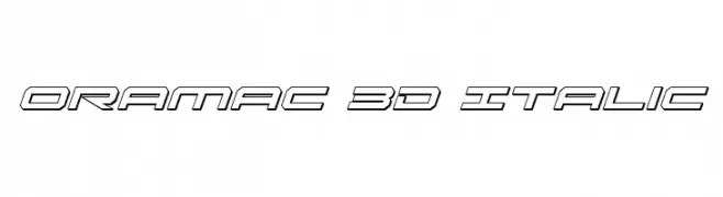
A futuristic 3D italic font with outlined, angular characters.
![Oramac 3D Italic تنزيل الخطوط]() تنزيل 75 التنزيلات@WebFont
تنزيل 75 التنزيلات@WebFont -
( Fonts by Brixdee - jack-oatley.com - Personal-use only. For commercial use please contact owner. )
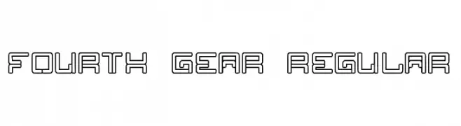
A futuristic, geometric font with a hollow, outlined design.
![Fourth Gear Regular تنزيل الخطوط]() تنزيل 75 التنزيلات@WebFont
تنزيل 75 التنزيلات@WebFont -
( Fonts by Riyadh Rahman - Personal-use only. For commercial use please contact owner. )
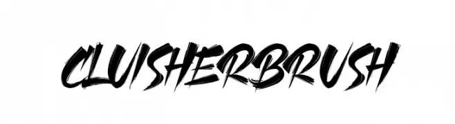
A bold, dynamic brush-style font with expressive strokes.
![CLUISHER BRUSH تنزيل الخطوط]() تنزيل 75 التنزيلات@WebFont
تنزيل 75 التنزيلات@WebFont -
( Fonts by nariswari_creative - Taufik Dwi Purnomo - Personal-use only. For commercial use please contact owner. )
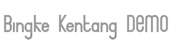
A modern, textured font with diagonal line patterns and geometric structure.
![Bingke Kentang DEMO تنزيل الخطوط]() تنزيل 75 التنزيلات@WebFont
تنزيل 75 التنزيلات@WebFont -
( Fonts by Tegaki Script - Personal-use only. For commercial use please contact owner. )
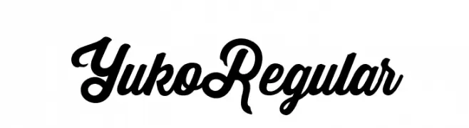
A bold, flowing script font with elegant, cursive letterforms.
![Yuko Regular تنزيل الخطوط]() تنزيل 75 التنزيلات@WebFont
تنزيل 75 التنزيلات@WebFont -
( weknow - Wino S Kadir - www.creativefabrica.com/designer/weknow/ )
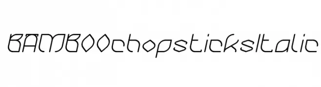
A modern, italic font with geometric and organic elements.
![BAMBOO chopsticks Italic تنزيل الخطوط]() تنزيل 75 التنزيلات@WebFont
تنزيل 75 التنزيلات@WebFont -
( Blue Jay Font Studio - katzfonts.50megs.com/bj1.html )
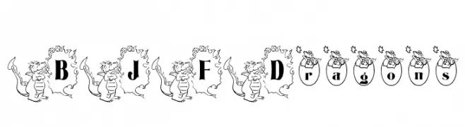
A playful, dragon-themed decorative font perfect for fantasy projects.
![BJF Dragons تنزيل الخطوط]() تنزيل 75 التنزيلات@WebFont
تنزيل 75 التنزيلات@WebFont -
( Fonts by Edric Studio - Personal-use only. For commercial use please contact owner. )
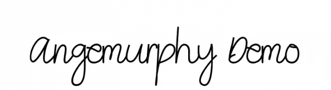
A lively, flowing script font with elegant, connected strokes.
![Angemurphy Demo تنزيل الخطوط]() تنزيل 75 التنزيلات@WebFont
تنزيل 75 التنزيلات@WebFont -
( Fonts by Booga Letter - Fajar Wicaksono - Personal-use only. For commercial use please contact owner. )
A bold, hand-drawn font with a playful and whimsical style.
![Fun Party تنزيل الخطوط]() تنزيل 75 التنزيلات@WebFont
تنزيل 75 التنزيلات@WebFont -
( Fonts by www.junkohanhero.com - Personal-use only. For commercial use please contact owner. )
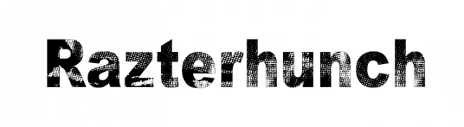
A bold, distressed font with a textured, industrial look.
![Razterhunch تنزيل الخطوط]() تنزيل 75 التنزيلات@WebFont
تنزيل 75 التنزيلات@WebFont -
( Fonts by Ikrar Bey Khubaib )
![Graby تنزيل الخطوط]() تنزيل 75 التنزيلات@WebFont
تنزيل 75 التنزيلات@WebFont -
( Fonts by Edric Studio - Personal-use only. For commercial use please contact owner. )
A bold, modern font with geometric, rounded characters.
![BigBOBY Demo تنزيل الخطوط]() تنزيل 75 التنزيلات@WebFont
تنزيل 75 التنزيلات@WebFont -
( Fonts by Riyadh Rahman - Personal-use only. For commercial use please contact owner. )
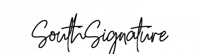
A fluid and elegant handwritten font with smooth, flowing lines.
![South Signature تنزيل الخطوط]() تنزيل 75 التنزيلات@WebFont
تنزيل 75 التنزيلات@WebFont -
( Iconian Fonts - Daniel Zadorozny - www.iconian.com )
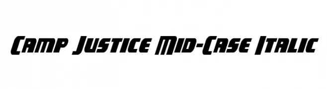
A bold, italic, and dynamic font with a modern geometric style.
![Camp Justice Mid-Case Italic تنزيل الخطوط]() تنزيل 75 التنزيلات@WebFont
تنزيل 75 التنزيلات@WebFont -
( Thumaszz - Thomas Versteeg - OreadGames.com )
A pixelated, retro-style font with a digital, arcade-like appearance.
![MiniPower تنزيل الخطوط]() تنزيل 75 التنزيلات@WebFont
تنزيل 75 التنزيلات@WebFont -
( Fonts by Paul Vincent - Personal-use only. For commercial use please contact owner. )
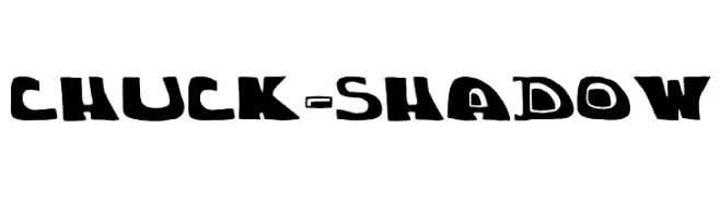
A bold, playful font with a shadow effect, ideal for dynamic and fun designs.
![chuck-shadow تنزيل الخطوط]() تنزيل 75 التنزيلات@WebFont
تنزيل 75 التنزيلات@WebFont


ما هي أبرز الخطوط الآن؟
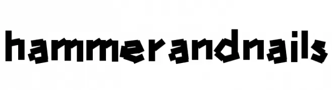
تحظى hammerandnails, Delta Ray Bevel Italic, Frozen Crystal Punch, Initials TFB and OmegaForce Halftone 3D Regular بشعبية لخطوطها النظيفة وتطبيقاتها الواسعة — من الهوية البصرية إلى الصفحات المقصودة والملصقات.
أي الخطوط تُستخدم كثيرًا في الشعارات؟
تُعد السان سيريف الهندسية (مثل Poppins وعائلات على نمط Gotham) خيارًا شائعًا لعلامات نظيفة قابلة للتوسع. ولإضفاء طابع ودي، تبقى السكريبت واليدوية خيارًا كلاسيكيًا. اجمع عنوانًا بارزًا مع خط نصي محايد لتحقيق التوازن والتميّز.
كم مرة يتم تحديث قائمة أعلى الخطوط؟
نحدّثها بانتظام استنادًا إلى التنزيلات والنشاط الفعلي. عُد إليها كثيرًا لاكتشاف النجوم الصاعدة مبكرًا.
💡 نصيحة: أضف هذه الصفحة إلى العلامات — تتغير الاتجاهات بسرعة وقد تُلهم خطوط اليوم الرائجة إعادة العلامة غدًا.