مرحبًا بك في قسم أعلى الخطوط — حيث تلتقي الشعبية بالجودة. هذه هي الخطوط الأكثر تنزيلًا واستخدامًا هذا العام من قبل مجتمعنا. إذا كنت بحاجة إلى اختيار موثوق للشعارات أو الويب أو وسائل التواصل، فابدأ من هنا.
يتميز كل خط رائج بتوازن جيد وقابلية قراءة وتعدد استخدامات. ستجد سان سيريف حديثة، وسكريبتات أنيقة، وسيريف كلاسيكية، وخطوط عرض minimal مختارة بعناية.
-
 تنزيل 479 التنزيلات@WebFont
 -
( Fonts by Jacob Fisher - www.pizzadude.dk )
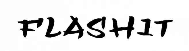
A bold, brush-style script font with dynamic and expressive strokes.
![Flashit تنزيل الخطوط]() تنزيل 479 التنزيلات@WebFont
تنزيل 479 التنزيلات@WebFont -
( Fonts by FONTS BY LYAJKA - Personal-use only. For commercial use please contact owner. )
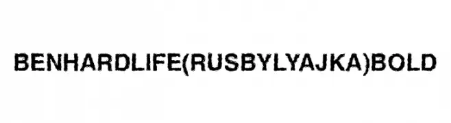
A rugged, distressed font with a bold, textured appearance.
![Ben Hard Life(RUS BY LYAJKA) Bold تنزيل الخطوط]() تنزيل 479 التنزيلات@WebFont
تنزيل 479 التنزيلات@WebFont -
( Copyright (c) 2011 by Brian J. Bonislawsky DBA Astigmatic (AOETI) )
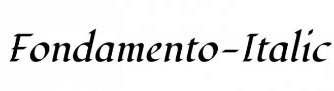
An elegant and flowing italic font with moderate contrast and graceful curves.
![Fondamento-Italic تنزيل الخطوط]() تنزيل 479 التنزيلات@WebFont
تنزيل 479 التنزيلات@WebFont -
( Fonts by Luedecke Design Font Co. - ldfonts.weebly.com )
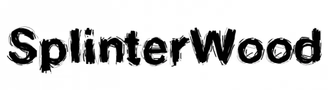
A rugged, textured font with a splintered wood appearance.
![SplinterWood تنزيل الخطوط]() تنزيل 479 التنزيلات@WebFont
تنزيل 479 التنزيلات@WebFont -
-
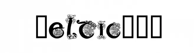
![Celtic101 تنزيل الخطوط]() تنزيل 479 التنزيلات@WebFont
تنزيل 479 التنزيلات@WebFont -
( Fonts by Daniel Zadorozny - www.iconian.com - Personal-use only. For commercial use please contact owner. )
A bold, geometric font with angular lines and an industrial feel.
![Drive Corps Spaced تنزيل الخطوط]() تنزيل 478 التنزيلات@WebFont
تنزيل 478 التنزيلات@WebFont -
( Fonts by Mr Letters - https://www.creativefabrica.com/designer/mrletters/ - Personal-use only. For commercial use please contact owner. )
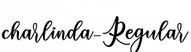
An elegant, flowing script font with graceful loops and swirls.
![charlinda-Regular تنزيل الخطوط]() تنزيل 478 التنزيلات@WebFont
تنزيل 478 التنزيلات@WebFont -
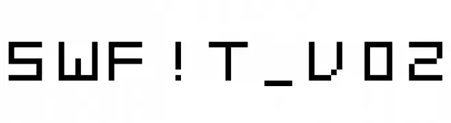
![SWF!T_v02 تنزيل الخطوط]() تنزيل 478 التنزيلات@WebFont
تنزيل 478 التنزيلات@WebFont -
( Personal-use only. For commercial use please contact owner. )
A bold, modern font with geometric shapes and uniform strokes.
![Mothanna Bold تنزيل الخطوط]() تنزيل 478 التنزيلات@WebFont
تنزيل 478 التنزيلات@WebFont


ما هي أبرز الخطوط الآن؟
تحظى Speculum, Flashit, Ben Hard Life(RUS BY LYAJKA) Bold, Fondamento-Italic and SplinterWood بشعبية لخطوطها النظيفة وتطبيقاتها الواسعة — من الهوية البصرية إلى الصفحات المقصودة والملصقات.
أي الخطوط تُستخدم كثيرًا في الشعارات؟
تُعد السان سيريف الهندسية (مثل Poppins وعائلات على نمط Gotham) خيارًا شائعًا لعلامات نظيفة قابلة للتوسع. ولإضفاء طابع ودي، تبقى السكريبت واليدوية خيارًا كلاسيكيًا. اجمع عنوانًا بارزًا مع خط نصي محايد لتحقيق التوازن والتميّز.
كم مرة يتم تحديث قائمة أعلى الخطوط؟
نحدّثها بانتظام استنادًا إلى التنزيلات والنشاط الفعلي. عُد إليها كثيرًا لاكتشاف النجوم الصاعدة مبكرًا.
💡 نصيحة: أضف هذه الصفحة إلى العلامات — تتغير الاتجاهات بسرعة وقد تُلهم خطوط اليوم الرائجة إعادة العلامة غدًا.