مرحبًا بك في قسم أعلى الخطوط — حيث تلتقي الشعبية بالجودة. هذه هي الخطوط الأكثر تنزيلًا واستخدامًا هذا العام من قبل مجتمعنا. إذا كنت بحاجة إلى اختيار موثوق للشعارات أو الويب أو وسائل التواصل، فابدأ من هنا.
يتميز كل خط رائج بتوازن جيد وقابلية قراءة وتعدد استخدامات. ستجد سان سيريف حديثة، وسكريبتات أنيقة، وسيريف كلاسيكية، وخطوط عرض minimal مختارة بعناية.
-
( Fonts by Vanessa Bays - bythebutterfly.com )
A playful, casual handwritten font with smooth curves and a relaxed style.
 تنزيل 494 التنزيلات@WebFont
 -
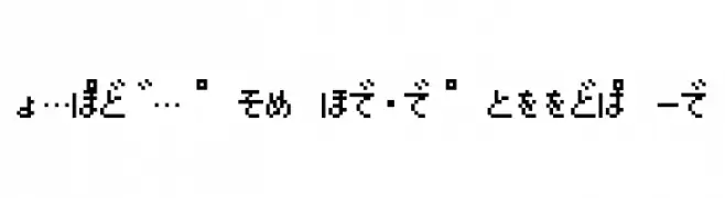
![Pokemon GB Japan HRRegular تنزيل الخطوط]() تنزيل 494 التنزيلات@WebFont
تنزيل 494 التنزيلات@WebFont -
( Fonts by www.theboutons.com - Gary David Bouton )
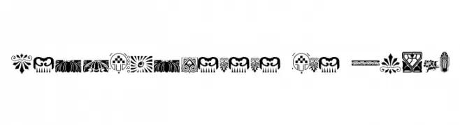
Intricate decorative elements inspired by Nouveau, Rococo, and Deco styles.
![Nouveau Rococo Deco Dings I تنزيل الخطوط]() تنزيل 494 التنزيلات@WebFont
تنزيل 494 التنزيلات@WebFont -
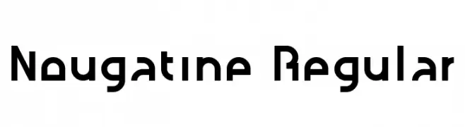
![Nougatine Regular تنزيل الخطوط]() تنزيل 494 التنزيلات@WebFont
تنزيل 494 التنزيلات@WebFont -
( Fonts by Christopher Hansen )
A bold, playful font with irregular, jagged characters and a hand-drawn feel.
![Deanna تنزيل الخطوط]() تنزيل 494 التنزيلات@WebFont
تنزيل 494 التنزيلات@WebFont -
-
( Fonts by Typhoon Type - Suthi Srisopha - www.typhoontype.net - Personal-use only. For commercial use please contact owner. )
A playful, handwritten font with smooth, flowing lines and decorative elements.
![Sweet Hipster تنزيل الخطوط]() تنزيل 494 التنزيلات@WebFont
تنزيل 494 التنزيلات@WebFont -
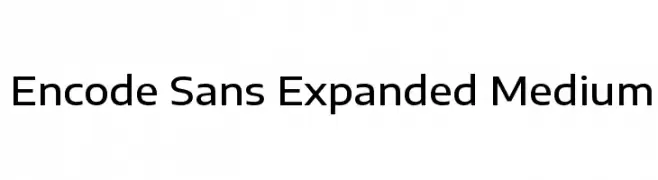
( Copyright 2012 The Encode Project Authors (impallari@gmail.com), with Reserved Font Name "Encode Sansâ€. )
A modern, expanded sans-serif font with a clean and balanced design.
![Encode Sans Expanded Medium تنزيل الخطوط]() تنزيل 494 التنزيلات@WebFont
تنزيل 494 التنزيلات@WebFont -
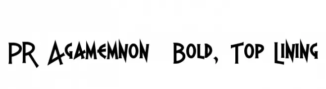
( Fonts by Peter Rempel - www.prfonts.com )
A bold, angular font with sharp lines and a geometric style.
![PR Agamemnon Bold, Top Lining تنزيل الخطوط]() تنزيل 494 التنزيلات@WebFont
تنزيل 494 التنزيلات@WebFont -
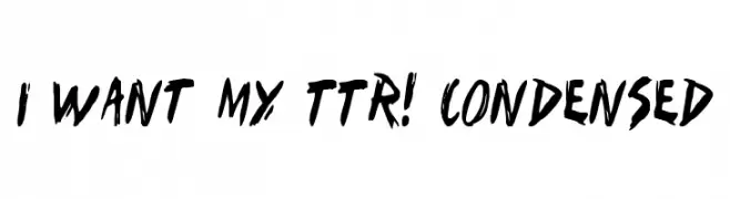
( Fonts by Daniel Zadorozny - www.iconian.com - Free for personal use )
A bold, hand-painted style font with dynamic, irregular strokes and a condensed form.
![I Want My TTR! Condensed تنزيل الخطوط]() تنزيل 493 التنزيلات@WebFont
تنزيل 493 التنزيلات@WebFont -
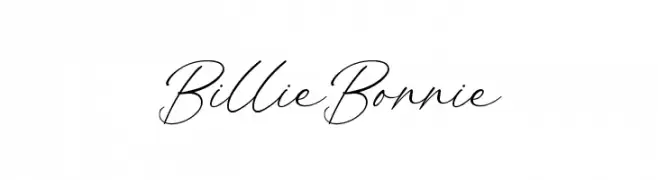
( Fonts by Kong Font - https://fontkong.com/ - Personal-use only. For commercial use please contact owner. )
A modern, elegant script font with flowing, interconnected strokes.
![Billie Bonnie تنزيل الخطوط]() تنزيل 493 التنزيلات@WebFont
تنزيل 493 التنزيلات@WebFont


ما هي أبرز الخطوط الآن؟
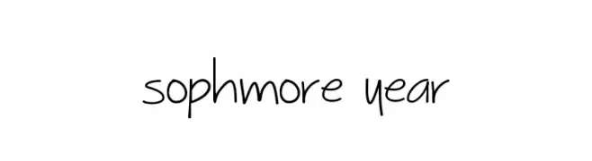
تحظى Sophmore Year, Pokemon GB Japan HRRegular, Nouveau Rococo Deco Dings I, Nougatine Regular and Deanna بشعبية لخطوطها النظيفة وتطبيقاتها الواسعة — من الهوية البصرية إلى الصفحات المقصودة والملصقات.
أي الخطوط تُستخدم كثيرًا في الشعارات؟
تُعد السان سيريف الهندسية (مثل Poppins وعائلات على نمط Gotham) خيارًا شائعًا لعلامات نظيفة قابلة للتوسع. ولإضفاء طابع ودي، تبقى السكريبت واليدوية خيارًا كلاسيكيًا. اجمع عنوانًا بارزًا مع خط نصي محايد لتحقيق التوازن والتميّز.
كم مرة يتم تحديث قائمة أعلى الخطوط؟
نحدّثها بانتظام استنادًا إلى التنزيلات والنشاط الفعلي. عُد إليها كثيرًا لاكتشاف النجوم الصاعدة مبكرًا.
💡 نصيحة: أضف هذه الصفحة إلى العلامات — تتغير الاتجاهات بسرعة وقد تُلهم خطوط اليوم الرائجة إعادة العلامة غدًا.