مرحبًا بك في قسم أعلى الخطوط — حيث تلتقي الشعبية بالجودة. هذه هي الخطوط الأكثر تنزيلًا واستخدامًا هذا العام من قبل مجتمعنا. إذا كنت بحاجة إلى اختيار موثوق للشعارات أو الويب أو وسائل التواصل، فابدأ من هنا.
يتميز كل خط رائج بتوازن جيد وقابلية قراءة وتعدد استخدامات. ستجد سان سيريف حديثة، وسكريبتات أنيقة، وسيريف كلاسيكية، وخطوط عرض minimal مختارة بعناية.
-
( Fonts by Wahyu Eka Prasetya - wepfont.com - Personal-use only. For commercial use please contact owner. )
A bold, brush-style font with dynamic, hand-painted characteristics.
 تنزيل 82 التنزيلات@WebFont
 -
( imagex - www.imagex-fonts.com )
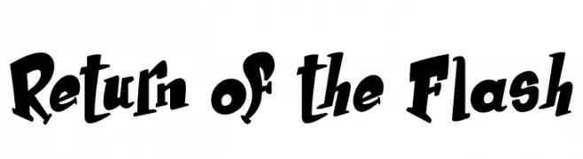
A bold, playful font with dynamic curves and unique character shapes.
![Return of the Flash تنزيل الخطوط]() تنزيل 82 التنزيلات@WebFont
تنزيل 82 التنزيلات@WebFont -
( LJ Design Studios - www.ljdesignstudios.com )
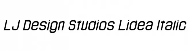
A modern, italicized font with a sleek and futuristic design.
![LJ Design Studios Lidea Italic تنزيل الخطوط]() تنزيل 82 التنزيلات@WebFont
تنزيل 82 التنزيلات@WebFont -
( MaximDude's Fonts - maximdude.deviantart.com )
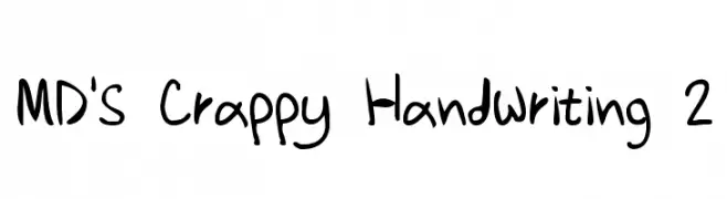
A playful, handwritten-style font with irregular, whimsical strokes.
![MD's Crappy Handwriting 2 تنزيل الخطوط]() تنزيل 82 التنزيلات@WebFont
تنزيل 82 التنزيلات@WebFont -
( Fonts by Press Gang Studios - Personal-use only. For commercial use please contact owner. )
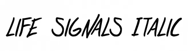
A dynamic, italicized handwritten font with medium contrast and a casual style.
![life signals Italic تنزيل الخطوط]() تنزيل 82 التنزيلات@WebFont
تنزيل 82 التنزيلات@WebFont -
![Pointer ExtraExtended Oblique تنزيل الخطوط]() تنزيل 82 التنزيلات@WebFont
تنزيل 82 التنزيلات@WebFont -
( Iconian Fonts - Daniel Zadorozny - www.iconian.com )
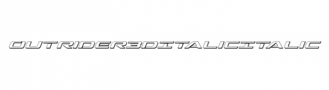
A dynamic, 3D italic font with a futuristic and bold design.
![Outrider 3D Italic Italic تنزيل الخطوط]() تنزيل 82 التنزيلات@WebFont
تنزيل 82 التنزيلات@WebFont -
( Public domain / GNU GPL - jlhfonts.blogspot.com/ )
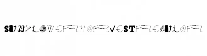
A decorative and eclectic font with playful, artistic character designs.
![Sunflower Harvest Regular تنزيل الخطوط]() تنزيل 82 التنزيلات@WebFont
تنزيل 82 التنزيلات@WebFont -
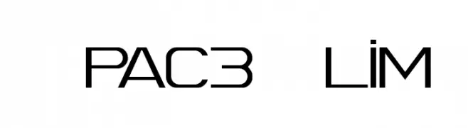
![Spac3 Slim تنزيل الخطوط]() تنزيل 82 التنزيلات@WebFont
تنزيل 82 التنزيلات@WebFont -
( Fonts by www.chequered.ink - Chequered Ink - Personal-use only. For commercial use please contact owner. )
A bold, modern sans-serif font with a geometric structure.
![Oganesson تنزيل الخطوط]() تنزيل 82 التنزيلات@WebFont
تنزيل 82 التنزيلات@WebFont -
( Fonts by Televo - Personal-use only. For commercial use please contact owner. )
A sleek, modern italic font with a geometric and dynamic style.
![KHMenu Italic تنزيل الخطوط]() تنزيل 82 التنزيلات@WebFont
تنزيل 82 التنزيلات@WebFont -
( Hamelton Media - James Hamelton Jr - www.hameltonmedia.com )
A bold, brush-style handwritten font with a lively and informal appearance.
![Fombre تنزيل الخطوط]() تنزيل 82 التنزيلات@WebFont
تنزيل 82 التنزيلات@WebFont -
( Fonts by skomii - Personal-use only. For commercial use please contact owner. )
A playful, hand-drawn font with bold, irregular strokes.
![Erasaur تنزيل الخطوط]() تنزيل 82 التنزيلات@WebFont
تنزيل 82 التنزيلات@WebFont -
( imagex - www.imagex-fonts.com )
A bold, playful font with a three-dimensional shadow effect.
![Royal Delight Shad تنزيل الخطوط]() تنزيل 82 التنزيلات@WebFont
تنزيل 82 التنزيلات@WebFont -
( Noto is a trademark of Google Inc. Noto fonts are open source. All Noto fonts are published under the SIL Open Font License, Version 1.1 )
A bold, condensed font with a modern and robust style.
![Noto Sans Tamil Condensed Black تنزيل الخطوط]() تنزيل 82 التنزيلات@WebFont
تنزيل 82 التنزيلات@WebFont -
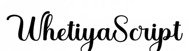
( Fonts by StringLabs - stringlabscreative.com - Personal-use only. For commercial use please contact owner. )
A flowing, cursive font with elegant loops and a handwritten style.
![WhetiyaScript تنزيل الخطوط]() تنزيل 82 التنزيلات@WebFont
تنزيل 82 التنزيلات@WebFont -
( Fonts by Iconian Fonts - Daniel Zadorozny - Personal-use only. For commercial use please contact owner. )
A bold, expanded, and italicized font with a modern and dynamic style.
![Watchtower Expanded Italic تنزيل الخطوط]() تنزيل 82 التنزيلات@WebFont
تنزيل 82 التنزيلات@WebFont -
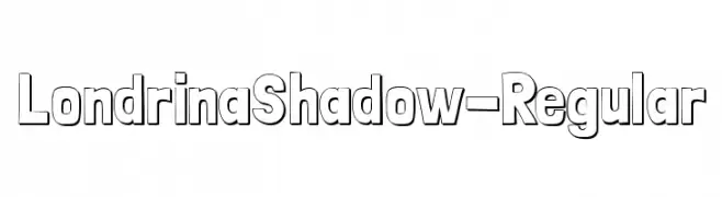
( Marcelo Magalhães Pereira - www.marcelomagalhaes.net )
A bold, playful font with a distinctive shadow effect.
![LondrinaShadow-Regular تنزيل الخطوط]() تنزيل 82 التنزيلات@WebFont
تنزيل 82 التنزيلات@WebFont -
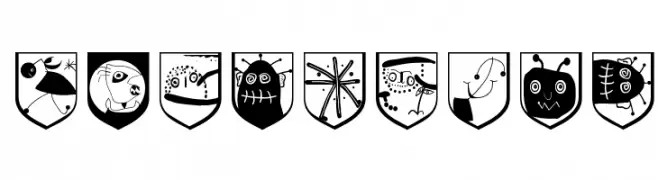
( Fonts by Manfred Klein. Free for private and charity use. Free for commercial with donation to organizations )
A playful, illustrative display font with shield-shaped, cartoon-like glyphs.
![TodayArms تنزيل الخطوط]() تنزيل 82 التنزيلات@WebFont
تنزيل 82 التنزيلات@WebFont -
( Fonts by Billy Argel Fonts - www.billyargel.com - Personal-use only. For commercial use please contact owner. )
A bold, decorative font with a playful, dripping style ideal for festive designs.
![PARTYBOYPERSONALUSE-XBdXCn تنزيل الخطوط]() تنزيل 82 التنزيلات@WebFont
تنزيل 82 التنزيلات@WebFont -
( Fonts by Ibra Creative Studio )
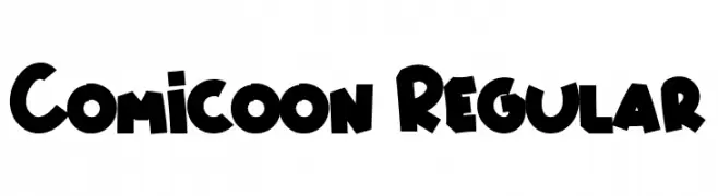
A playful, bold font with a cartoonish style and rounded edges.
![Comicoon Regular تنزيل الخطوط]() تنزيل 82 التنزيلات@WebFont
تنزيل 82 التنزيلات@WebFont -
( Fonts by Jehoo Creative - Anwar Patihan - Personal-use only. For commercial use please contact owner. )
A dynamic, high-contrast script font with elegant loops and swashes.
![Citul تنزيل الخطوط]() تنزيل 82 التنزيلات@WebFont
تنزيل 82 التنزيلات@WebFont -
( Fonts by Daniel Zadorozny - www.iconian.com - Personal-use only. For commercial use please contact owner. )
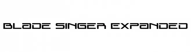
A futuristic, geometric font with sharp angles and clean lines.
![Blade Singer Expanded تنزيل الخطوط]() تنزيل 82 التنزيلات@WebFont
تنزيل 82 التنزيلات@WebFont -
( Fonts by www.junkohanhero.com - Personal-use only. For commercial use please contact owner. )
A thin, hand-drawn font with an organic and whimsical style.
![Thin king تنزيل الخطوط]() تنزيل 82 التنزيلات@WebFont
تنزيل 82 التنزيلات@WebFont -
( Fonts by Woodcutter - woodcutter Manero - Personal-use only. For commercial use please contact owner. )
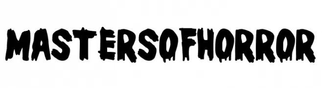
A bold, jagged font ideal for horror-themed designs.
![Masters of Horror تنزيل الخطوط]() تنزيل 82 التنزيلات@WebFont
تنزيل 82 التنزيلات@WebFont -
( Fonts by Zetafonts - Personal-use only. For commercial use please contact owner. )
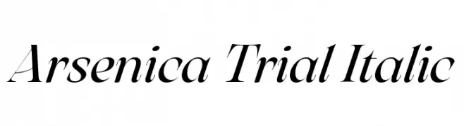
An elegant italic serif font with high contrast and flowing curves.
![Arsenica Trial Italic تنزيل الخطوط]() تنزيل 82 التنزيلات@WebFont
تنزيل 82 التنزيلات@WebFont -
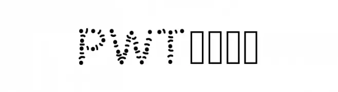
( www.peax-webdesign.com )
A modern, decorative font with characters formed by evenly spaced dots.
![PWTribe تنزيل الخطوط]() تنزيل 82 التنزيلات@WebFont
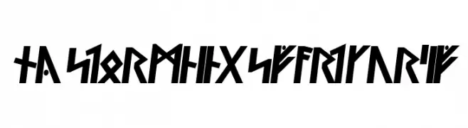
تنزيل 82 التنزيلات@WebFont -
![Ny Stormning Svart Kursiv تنزيل الخطوط]() تنزيل 82 التنزيلات@WebFont
تنزيل 82 التنزيلات@WebFont -
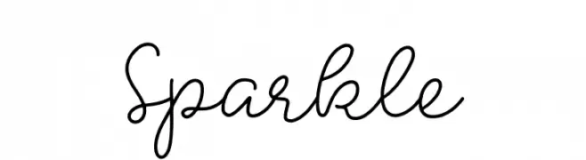
( Fonts by peterdraw - Ahmad Syarif Afandi - Personal-use only. For commercial use please contact owner. )
A playful and elegant script font with smooth, flowing lines and a handwritten charm.
![Sparkle تنزيل الخطوط]() تنزيل 82 التنزيلات@WebFont
تنزيل 82 التنزيلات@WebFont -
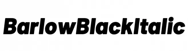
( Fonts by Tribby )
A bold, italicized font with a modern and dynamic style.
![Barlow Black Italic تنزيل الخطوط]() تنزيل 82 التنزيلات@WebFont
تنزيل 82 التنزيلات@WebFont -
( Cioroianu Stefan Cristian )
A flowing, cursive font with elegant, interconnected characters.
![Cioroianu font تنزيل الخطوط]() تنزيل 82 التنزيلات@WebFont
تنزيل 82 التنزيلات@WebFont -
( imagex - www.imagex-fonts.com )
A playful, hand-drawn font with bold outlines and a whimsical style.
![Scoubidou Rap تنزيل الخطوط]() تنزيل 82 التنزيلات@WebFont
تنزيل 82 التنزيلات@WebFont -
( Fonts by Wahyu Eka Prasetya - wepfont.com - Personal-use only. For commercial use please contact owner. )
A bold, hand-drawn font with a dynamic and expressive style.
![Fagers تنزيل الخطوط]() تنزيل 82 التنزيلات@WebFont
تنزيل 82 التنزيلات@WebFont -
![TheInequalityGrapher تنزيل الخطوط]() تنزيل 82 التنزيلات@WebFont
تنزيل 82 التنزيلات@WebFont -
![Pointer UltraCondensed Oblique تنزيل الخطوط]() تنزيل 82 التنزيلات@WebFont
تنزيل 82 التنزيلات@WebFont


ما هي أبرز الخطوط الآن؟
تحظى Gerbang, Return of the Flash, LJ Design Studios Lidea Italic, MD's Crappy Handwriting 2 and life signals Italic بشعبية لخطوطها النظيفة وتطبيقاتها الواسعة — من الهوية البصرية إلى الصفحات المقصودة والملصقات.
أي الخطوط تُستخدم كثيرًا في الشعارات؟
تُعد السان سيريف الهندسية (مثل Poppins وعائلات على نمط Gotham) خيارًا شائعًا لعلامات نظيفة قابلة للتوسع. ولإضفاء طابع ودي، تبقى السكريبت واليدوية خيارًا كلاسيكيًا. اجمع عنوانًا بارزًا مع خط نصي محايد لتحقيق التوازن والتميّز.
كم مرة يتم تحديث قائمة أعلى الخطوط؟
نحدّثها بانتظام استنادًا إلى التنزيلات والنشاط الفعلي. عُد إليها كثيرًا لاكتشاف النجوم الصاعدة مبكرًا.
💡 نصيحة: أضف هذه الصفحة إلى العلامات — تتغير الاتجاهات بسرعة وقد تُلهم خطوط اليوم الرائجة إعادة العلامة غدًا.