مرحبًا بك في قسم أعلى الخطوط — حيث تلتقي الشعبية بالجودة. هذه هي الخطوط الأكثر تنزيلًا واستخدامًا هذا العام من قبل مجتمعنا. إذا كنت بحاجة إلى اختيار موثوق للشعارات أو الويب أو وسائل التواصل، فابدأ من هنا.
يتميز كل خط رائج بتوازن جيد وقابلية قراءة وتعدد استخدامات. ستجد سان سيريف حديثة، وسكريبتات أنيقة، وسيريف كلاسيكية، وخطوط عرض minimal مختارة بعناية.
-
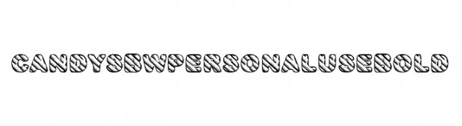
( Fonts by Billy Argel Fonts - www.billyargel.com - Personal-use only. For commercial use please contact owner. )
A bold, playful font with a unique striped pattern and rounded characters.
 تنزيل 88 التنزيلات@WebFont
 -
( Fonts by Graphics Bam )
A playful, hand-drawn comic-style font with bold outlines and irregular shapes.
![Sloppy Comic تنزيل الخطوط]() تنزيل 88 التنزيلات@WebFont
تنزيل 88 التنزيلات@WebFont -
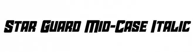
( Fonts by Iconian Fonts - Daniel Zadorozny - Personal-use only. For commercial use please contact owner. )
A bold, italic, and angular font with a futuristic style.
![Star Guard Mid-Case Italic تنزيل الخطوط]() تنزيل 88 التنزيلات@WebFont
تنزيل 88 التنزيلات@WebFont -
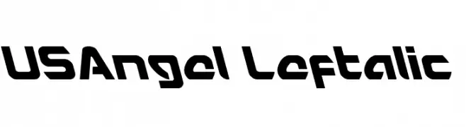
( Fonts by Iconian Fonts )
A bold, angular font with a futuristic and dynamic style.
![USAngel Leftalic تنزيل الخطوط]() تنزيل 88 التنزيلات@WebFont
تنزيل 88 التنزيلات@WebFont -
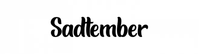
( Fonts by Jimtype Studio - Personal-use only. For commercial use please contact owner. )
A bold, playful script font with a handwritten feel.
![Sadtember تنزيل الخطوط]() تنزيل 88 التنزيلات@WebFont
تنزيل 88 التنزيلات@WebFont -
( 'Sanz Fonts - sanzclouds.blogspot.com )
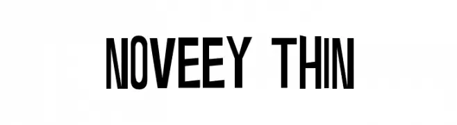
A modern, bold font with tall, narrow uppercase letters and cohesive design.
![Noveey Thin تنزيل الخطوط]() تنزيل 88 التنزيلات@WebFont
تنزيل 88 التنزيلات@WebFont -
( GeelynEdits - plus.google.com/u/0/108461348931992643310/ )
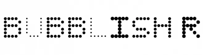
A playful, dotted font with a bubble-like appearance, perfect for creative projects.
![BUBBLISH Regular تنزيل الخطوط]() تنزيل 88 التنزيلات@WebFont
تنزيل 88 التنزيلات@WebFont -
![Ron's Font تنزيل الخطوط]() تنزيل 88 التنزيلات@WebFont
تنزيل 88 التنزيلات@WebFont -
( Fonts by Michael Muranaka - muraknockout.com - Personal-use only. For commercial use please contact owner. )
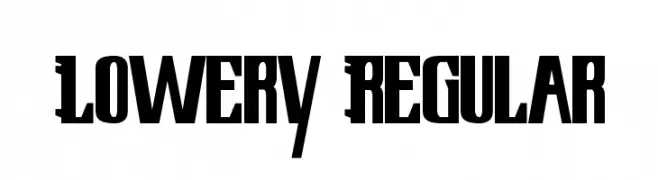
A bold, angular font with a modern and geometric style.
![Lowery Regular تنزيل الخطوط]() تنزيل 88 التنزيلات@WebFont
تنزيل 88 التنزيلات@WebFont -
( Fonts by YOFonts - Yasuhiro Yamaoka - yoworks.com - Personal-use only. For commercial use please contact owner. )
A modern, oblique sans-serif font with clean lines and a minimalist design.
![Eau Sans Book Old-styled Figures Oblique تنزيل الخطوط]() تنزيل 88 التنزيلات@WebFont
تنزيل 88 التنزيلات@WebFont -
( Fonts by Socialh. Personal-use only. For commercial use please contact owner. )
Minimalist outlined social media and web icons in rounded squares.
![SOCIAL OUTLINE ICONS تنزيل الخطوط]() تنزيل 88 التنزيلات@WebFont
تنزيل 88 التنزيلات@WebFont -
( Fonts by Cat.B - Agathe M.Joyce - Personal-use only. For commercial use please contact owner. )
A bold, expressive handwritten font with dynamic cursive strokes.
![Glamatrix تنزيل الخطوط]() تنزيل 88 التنزيلات@WebFont
تنزيل 88 التنزيلات@WebFont -
( A Spoonful of Sugar - www.asos.jp.org/ )
A sleek, modern italic font with bold, smooth curves.
![asos19101357 BoldItalic تنزيل الخطوط]() تنزيل 88 التنزيلات@WebFont
تنزيل 88 التنزيلات@WebFont -
( Fonts by Shanaya Studio )
A bold, angular font with a geometric and edgy style.
![Wilkey تنزيل الخطوط]() تنزيل 88 التنزيلات@WebFont
تنزيل 88 التنزيلات@WebFont -
( Fonts by Daniel Zadorozny - www.iconian.com - Personal-use only. For commercial use please contact owner. )
A bold, angular, and italicized font with a dynamic, modern style.
![Dagger Dancer Title Italic تنزيل الخطوط]() تنزيل 88 التنزيلات@WebFont
تنزيل 88 التنزيلات@WebFont -
( Fonts by Daniel Zadorozny - www.iconian.com )
A bold, geometric font with a three-dimensional, futuristic design.
![Halfshell Hero Platinum Italic تنزيل الخطوط]() تنزيل 88 التنزيلات@WebFont
تنزيل 88 التنزيلات@WebFont -
( Fonts by dcoxy )
A dynamic, brush-stroke font with an artistic and expressive style.
![Watch Out تنزيل الخطوط]() تنزيل 88 التنزيلات@WebFont
تنزيل 88 التنزيلات@WebFont -
( Noto is a trademark of Google Inc. Noto fonts are open source. All Noto fonts are published under the SIL Open Font License, Version 1.1 )
Not a valid font sample.
![Noto Serif Myanmar ExtraLight تنزيل الخطوط]() تنزيل 88 التنزيلات@WebFont
تنزيل 88 التنزيلات@WebFont -
( Fonts by Sean Type )
![Best Holiday تنزيل الخطوط]() تنزيل 88 التنزيلات@WebFont
تنزيل 88 التنزيلات@WebFont -
( Fonts by Breh Creative - Vavad Harahap - Personal-use only. For commercial use please contact owner. )
A bold, slanted script font with smooth curves and dynamic energy.
![flourground تنزيل الخطوط]() تنزيل 88 التنزيلات@WebFont
تنزيل 88 التنزيلات@WebFont -
( Iconian Fonts - Daniel Zadorozny - www.iconian.com )
A bold, 3D outline font with a futuristic and geometric design.
![Drosselmeyer 3D تنزيل الخطوط]() تنزيل 88 التنزيلات@WebFont
تنزيل 88 التنزيلات@WebFont -
( Iconian Fonts - Daniel Zadorozny - www.iconian.com )
A futuristic, striped font with a bold, geometric design.
![Replicant Chrome تنزيل الخطوط]() تنزيل 88 التنزيلات@WebFont
تنزيل 88 التنزيلات@WebFont -
( Vladimir Nikolic - www.coroflot.com/vladimirnikolic )
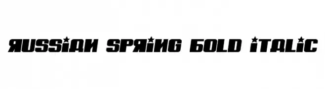
A bold, italic font with a geometric, decorative style ideal for impactful headlines.
![Russian Spring Bold Italic تنزيل الخطوط]() تنزيل 88 التنزيلات@WebFont
تنزيل 88 التنزيلات@WebFont -
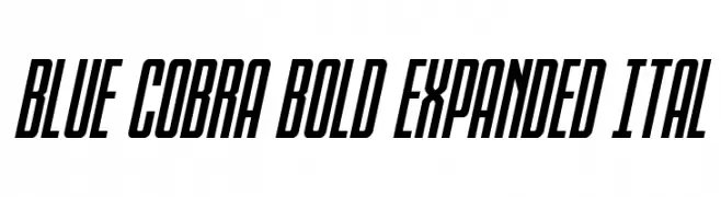
( Fonts by Daniel Zadorozny - www.iconian.com - Personal-use only. For commercial use please contact owner. )
A bold, expanded, and italic font with a modern, dynamic style.
![Blue Cobra Bold Expanded Ital تنزيل الخطوط]() تنزيل 88 التنزيلات@WebFont
تنزيل 88 التنزيلات@WebFont -
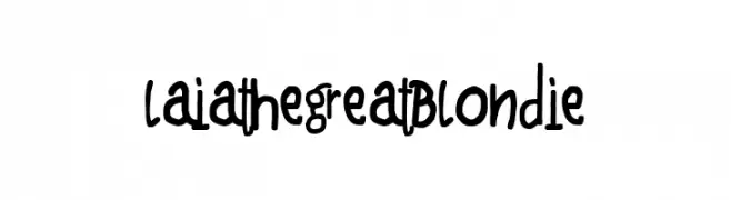
( Fonts by Woodcutter Manero - http://www.woodcutter.es - Personal-use only. For commercial use please contact owner. )
A playful, handwritten font with quirky, decorative elements.
![Laia the Great Blondie تنزيل الخطوط]() تنزيل 88 التنزيلات@WebFont
تنزيل 88 التنزيلات@WebFont -
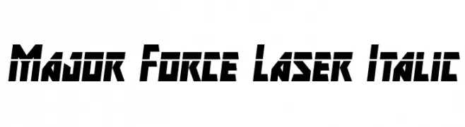
( Fonts by Iconian Fonts )
A bold, futuristic font with sharp angles and an italic slant, perfect for sci-fi themes.
![Major Force Laser Italic تنزيل الخطوط]() تنزيل 88 التنزيلات@WebFont
تنزيل 88 التنزيلات@WebFont -
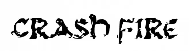
( Fonts by wep - Wahyu Eka Prasetya - Personal-use only. For commercial use please contact owner. )
A bold, fiery font with jagged, flame-like strokes.
![CRASH FIRE تنزيل الخطوط]() تنزيل 88 التنزيلات@WebFont
تنزيل 88 التنزيلات@WebFont -
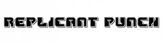
( Iconian Fonts - Daniel Zadorozny - www.iconian.com )
A bold, futuristic font with geometric and angular design elements.
![Replicant Punch تنزيل الخطوط]() تنزيل 88 التنزيلات@WebFont
تنزيل 88 التنزيلات@WebFont -
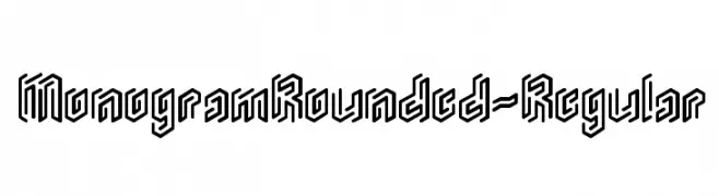
( Studio Dot by dot - Sjoerd Kulsdom - www.dotbydot.nl/fonts )
A bold, geometric font with rounded edges and a monogram style.
![MonogramRounded-Regular تنزيل الخطوط]() تنزيل 88 التنزيلات@WebFont
تنزيل 88 التنزيلات@WebFont -
( Fonts by sRB-Powers - Personal-use only. For commercial use please contact owner. )
A playful, bold font with dynamic, irregular letterforms and a whimsical style.
![sparrow [sRB] تنزيل الخطوط]() تنزيل 88 التنزيلات@WebFont
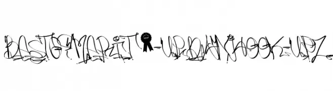
تنزيل 88 التنزيلات@WebFont -
![best of merit 9 -URBAN HOOK-UPZ تنزيل الخطوط]() تنزيل 88 التنزيلات@WebFont
تنزيل 88 التنزيلات@WebFont -
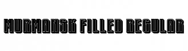
( Fonts by Vladimir Nikolic - https://www.creativefabrica.com/product/educated-deers/ref/144265/ - Personal-use only. For commercial use please contact owner. )
A bold, geometric font with thick outlines and strong contrast.
![Murmansk Filled Regular تنزيل الخطوط]() تنزيل 88 التنزيلات@WebFont
تنزيل 88 التنزيلات@WebFont -
( Fonts by Mozatype - Personal-use only. For commercial use please contact owner. )
A playful, hand-drawn font with a whimsical and slightly spooky style.
![HELLOGHOST تنزيل الخطوط]() تنزيل 88 التنزيلات@WebFont
تنزيل 88 التنزيلات@WebFont -
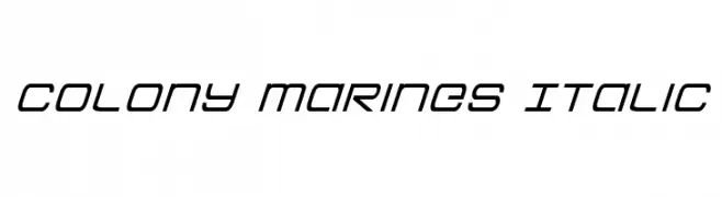
( Fonts by Iconian Fonts )
A sleek, modern italic font with a futuristic and dynamic style.
![Colony Marines Italic تنزيل الخطوط]() تنزيل 88 التنزيلات@WebFont
تنزيل 88 التنزيلات@WebFont -
![PiratsSymbolsArtefacts تنزيل الخطوط]() تنزيل 88 التنزيلات@WebFont
تنزيل 88 التنزيلات@WebFont


![sparrow [sRB] تنزيل الخطوط](https://d144mzi0q5mijx.cloudfront.net/img/S/P/sparrow-sRB.webp)

ما هي أبرز الخطوط الآن؟
تحظى CANDYS BW PERSONAL USE Bold, Sloppy Comic, Star Guard Mid-Case Italic, USAngel Leftalic and Sadtember بشعبية لخطوطها النظيفة وتطبيقاتها الواسعة — من الهوية البصرية إلى الصفحات المقصودة والملصقات.
أي الخطوط تُستخدم كثيرًا في الشعارات؟
تُعد السان سيريف الهندسية (مثل Poppins وعائلات على نمط Gotham) خيارًا شائعًا لعلامات نظيفة قابلة للتوسع. ولإضفاء طابع ودي، تبقى السكريبت واليدوية خيارًا كلاسيكيًا. اجمع عنوانًا بارزًا مع خط نصي محايد لتحقيق التوازن والتميّز.
كم مرة يتم تحديث قائمة أعلى الخطوط؟
نحدّثها بانتظام استنادًا إلى التنزيلات والنشاط الفعلي. عُد إليها كثيرًا لاكتشاف النجوم الصاعدة مبكرًا.
💡 نصيحة: أضف هذه الصفحة إلى العلامات — تتغير الاتجاهات بسرعة وقد تُلهم خطوط اليوم الرائجة إعادة العلامة غدًا.